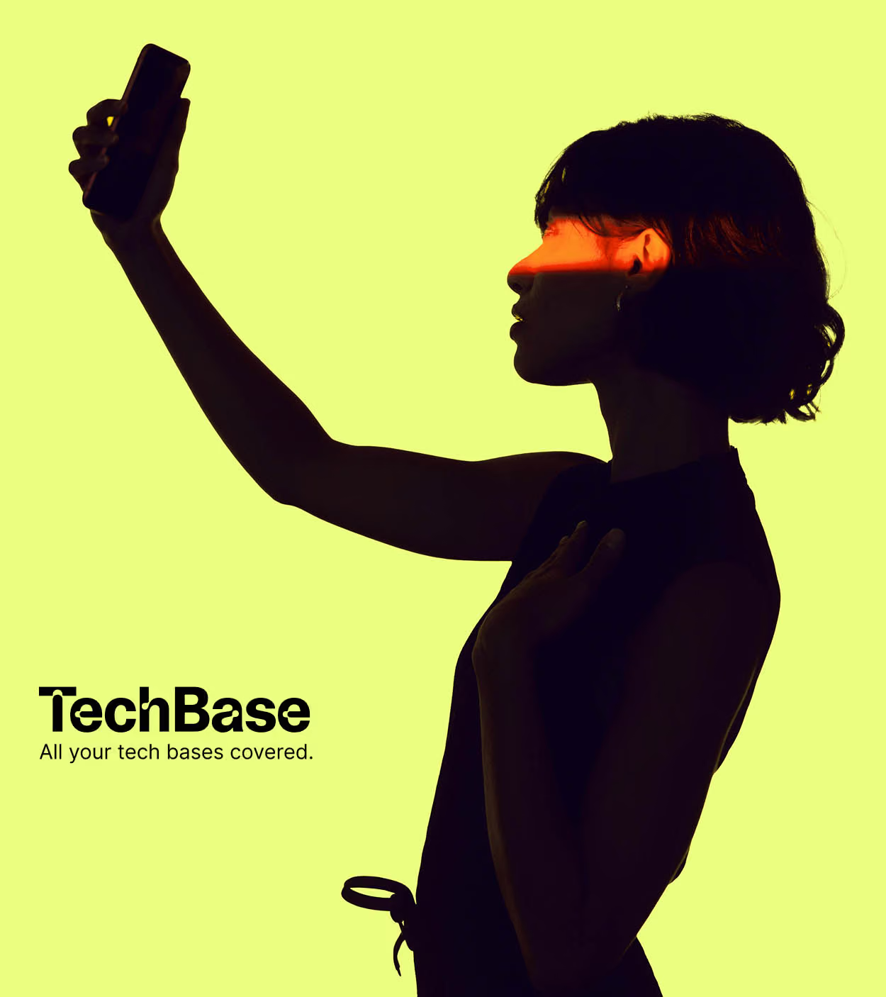
TechBase
All your tech bases covered.
Introducing DotDot. Daily routines for the next generation.
We worked with Jacqui Felgate and the DotDot team to create a skincare brand for tweens built around one simple mission. To make everyday self-care feel simple, fun and easy to integrate into daily routines, now and in the future.
From the identity and packaging to the tone of voice, art direction and the wider brand world, we created a brand world that feels playful without feeling childish, giving tweens something that feels distinctly their own. At the heart of the brand is the idea that small, consistent routines can build healthy habits and confidence over time. This thinking comes to life through the distinctive dot motif, using repetition as a symbol of daily ritual.
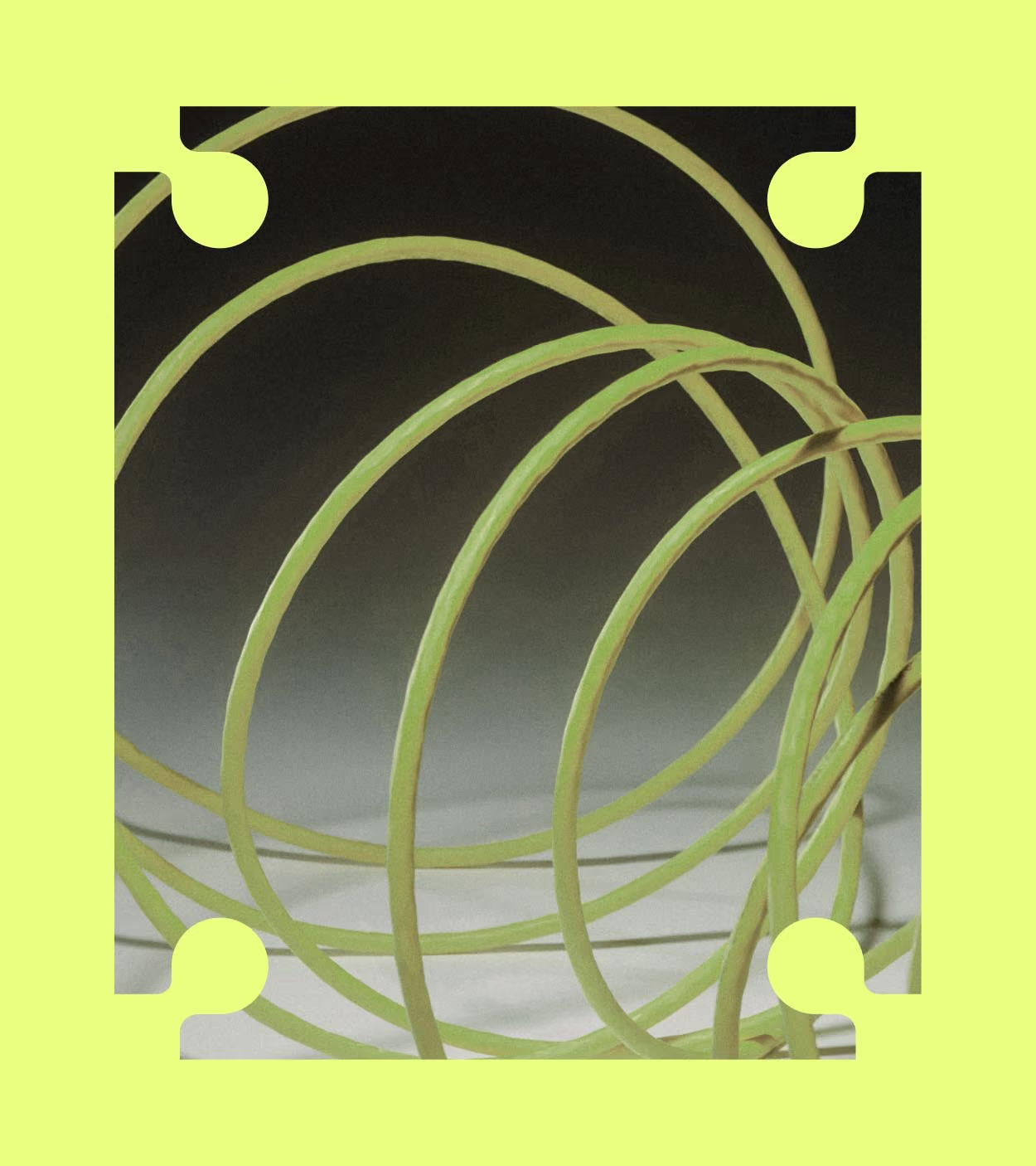
Technology brings us together. TechBase’s identity draws on this idea, using cables as a metaphor for the connections technology creates around the globe. These forms also reflect the journeys that connect people and places through air travel, bringing both ideas together at the heart of the brand.
A connected monogram and palette
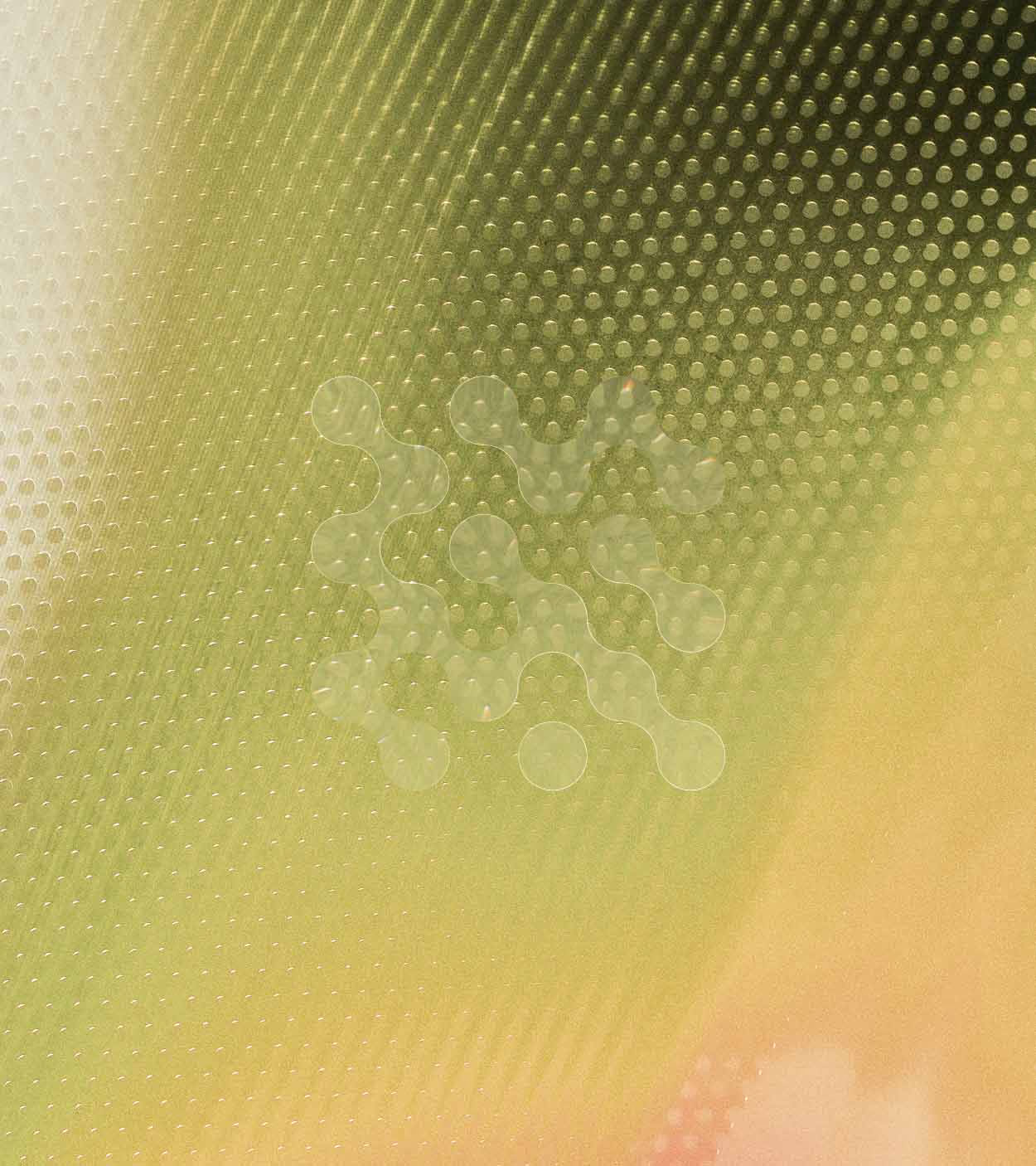
TechBase’s monogram supports the wordmark as a key identifier of the brand, building on the idea of technology creating connections around the globe. Taking inspiration from road signs and map icons used to identify places and services, the symbol positions TechBase as a place to stop, recharge and pick up what you need along your journey.
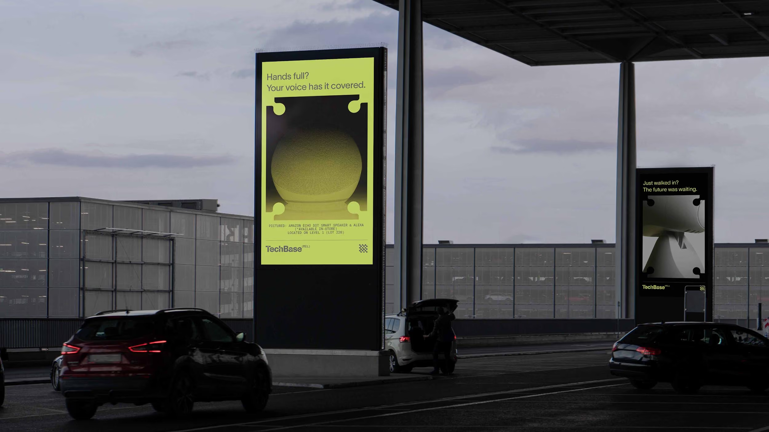
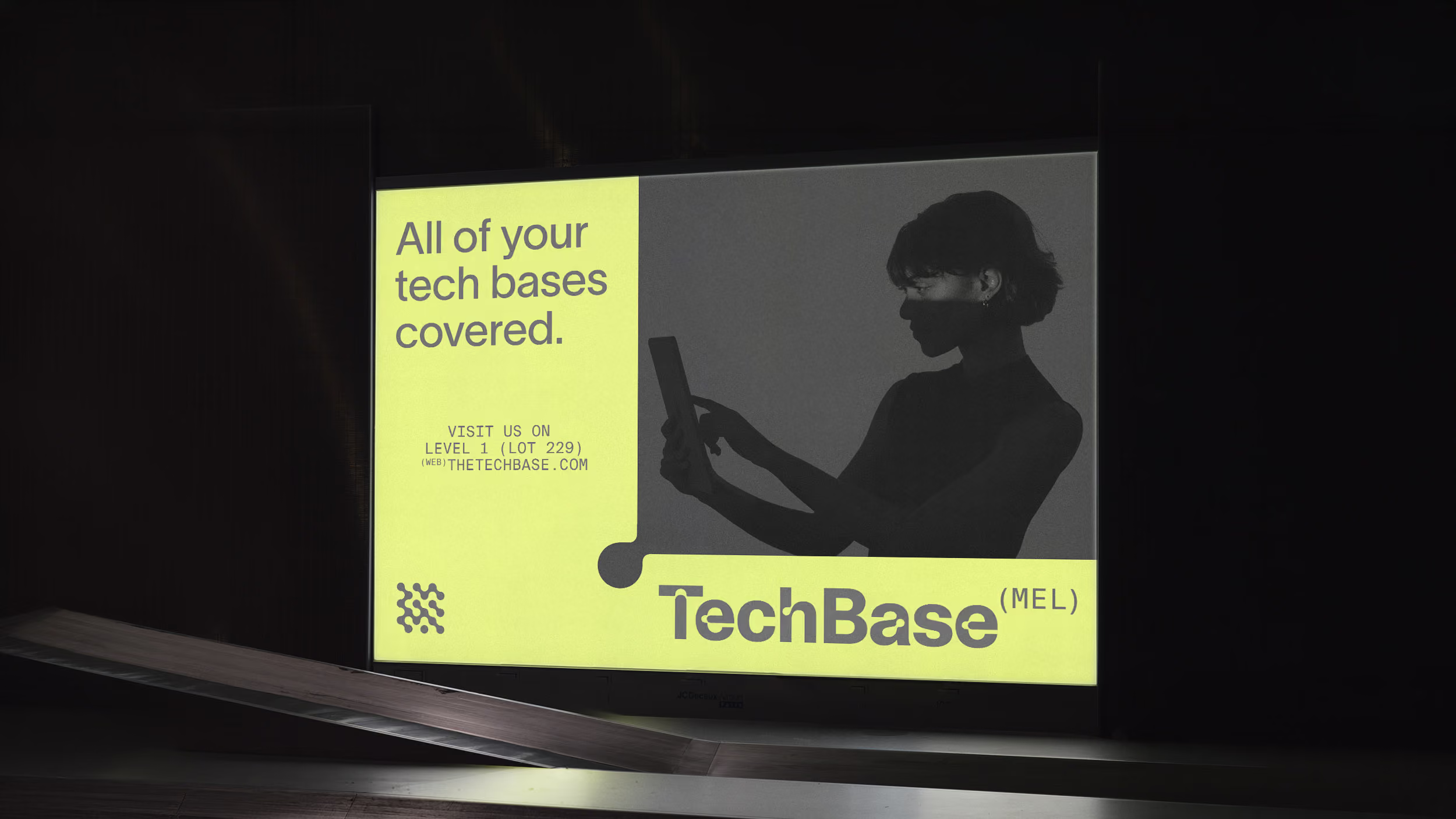
The colour palette balances a neutral foundation with a distinctive accent. Tech Neon leads the palette, giving TechBase a recognisable presence in the busy airport environment, supported by shades of grey, black and white. The colours adapt across the identity, from large backgrounds and store accent walls to smaller details in typography, logos and icons.
The colour palette balances a neutral foundation with a distinctive accent. Tech Neon leads the palette, giving TechBase a recognisable presence in the busy airport environment, supported by shades of grey, black and white. The colours adapt across the identity, from large backgrounds and store accent walls to smaller details in typography, logos and icons.
Typography that connects
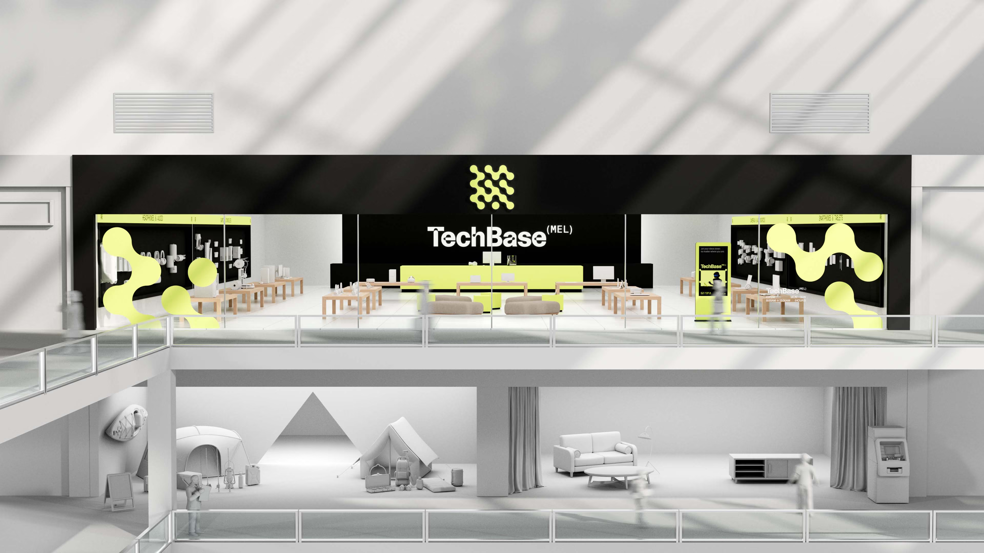
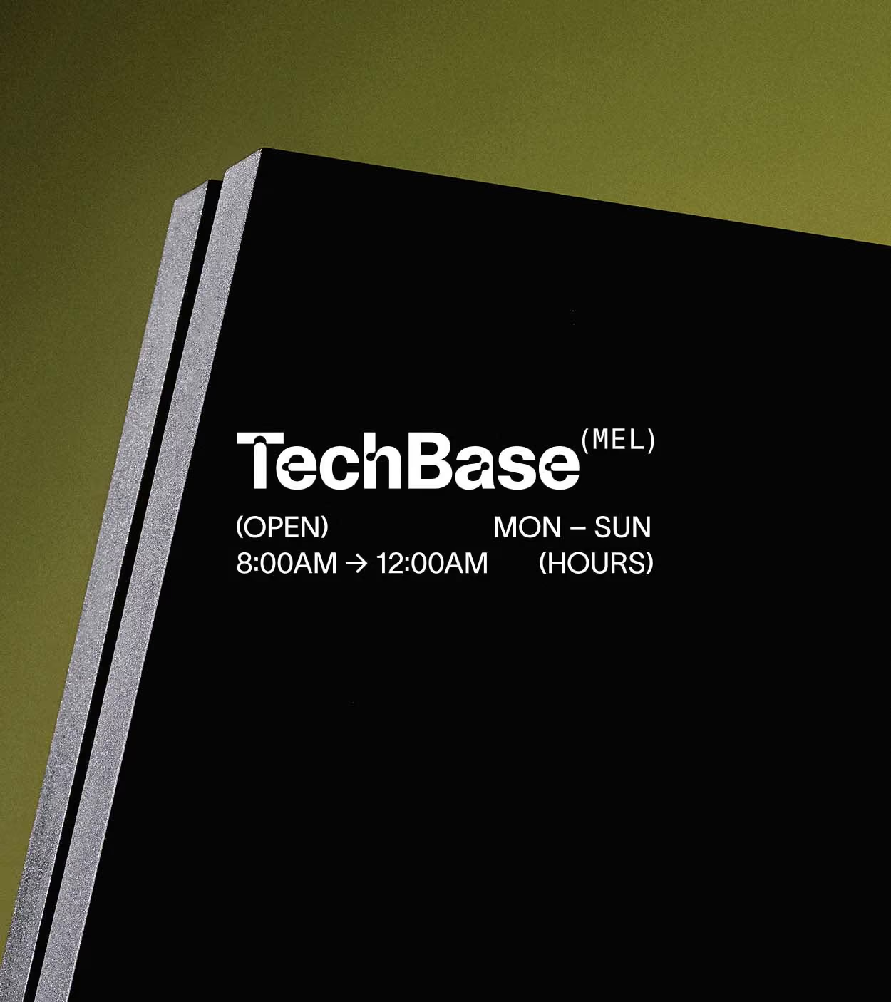
TechBase’s typography draws on the visual language of technology and electronics. The display typeface reinterprets the light traps used in the 1960s and 70s to improve legibility on television screens. Its distinctive cutouts also echo the shapes of cables and ports, extending the idea of connection into the letterforms.
The body typeface complements these forms with a reference to typewriters and computer code, bringing a functional, technical feel to the identity.
The body typeface complements these forms with a reference to typewriters and computer code, bringing a functional, technical feel to the identity.
A global identity with a local connection
Each TechBase store is identified by its airport’s three-letter code, giving every location a sense of place within the global brand. These codes draw on the familiar language of air travel, adding to the technical look and feel of the identity while connecting each store to the airport it calls home.
Used across store signage and brand applications, the codes create a consistent way to distinguish each location, grounding the identity in the traveller’s journey.
Used across store signage and brand applications, the codes create a consistent way to distinguish each location, grounding the identity in the traveller’s journey.
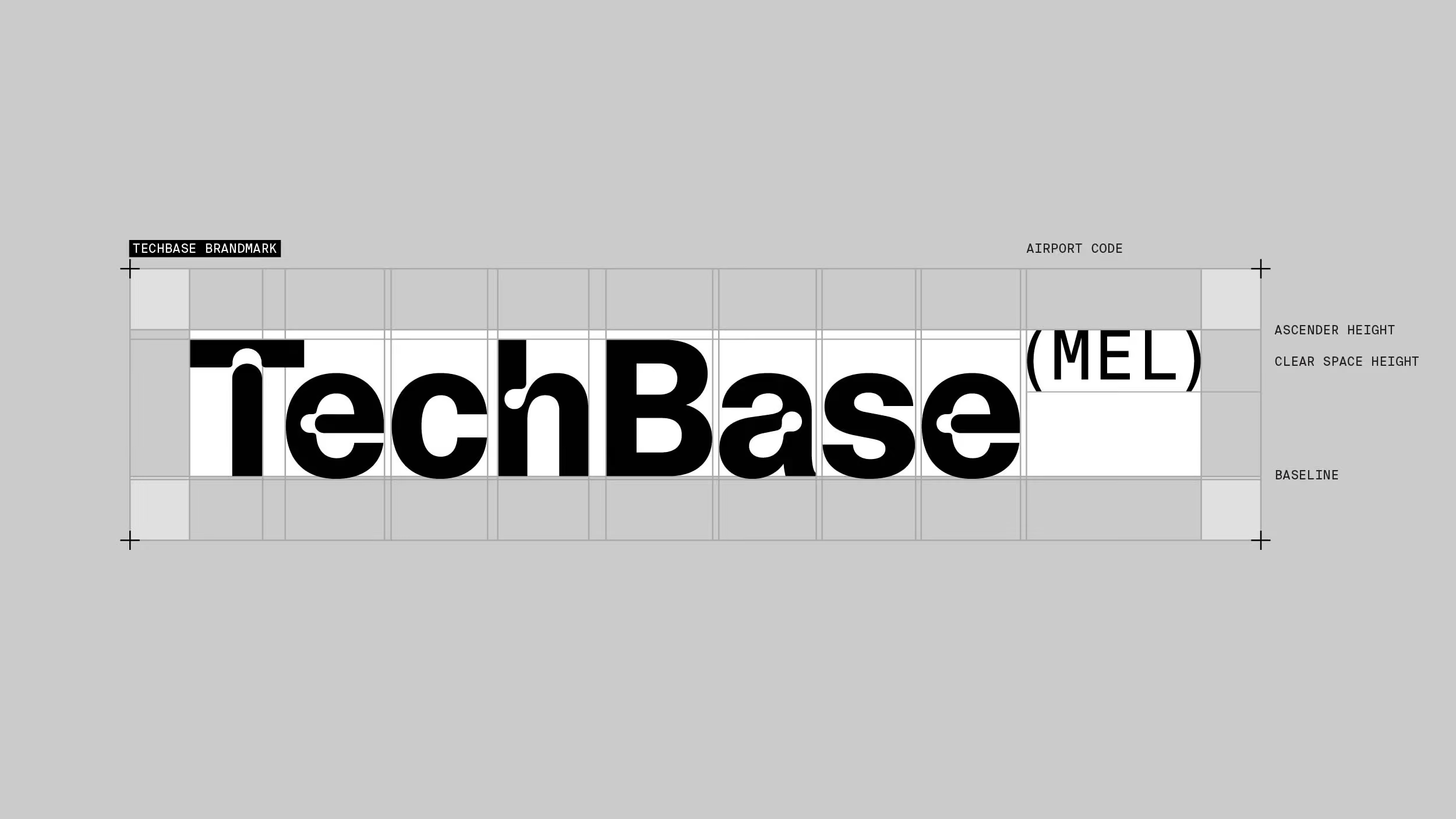
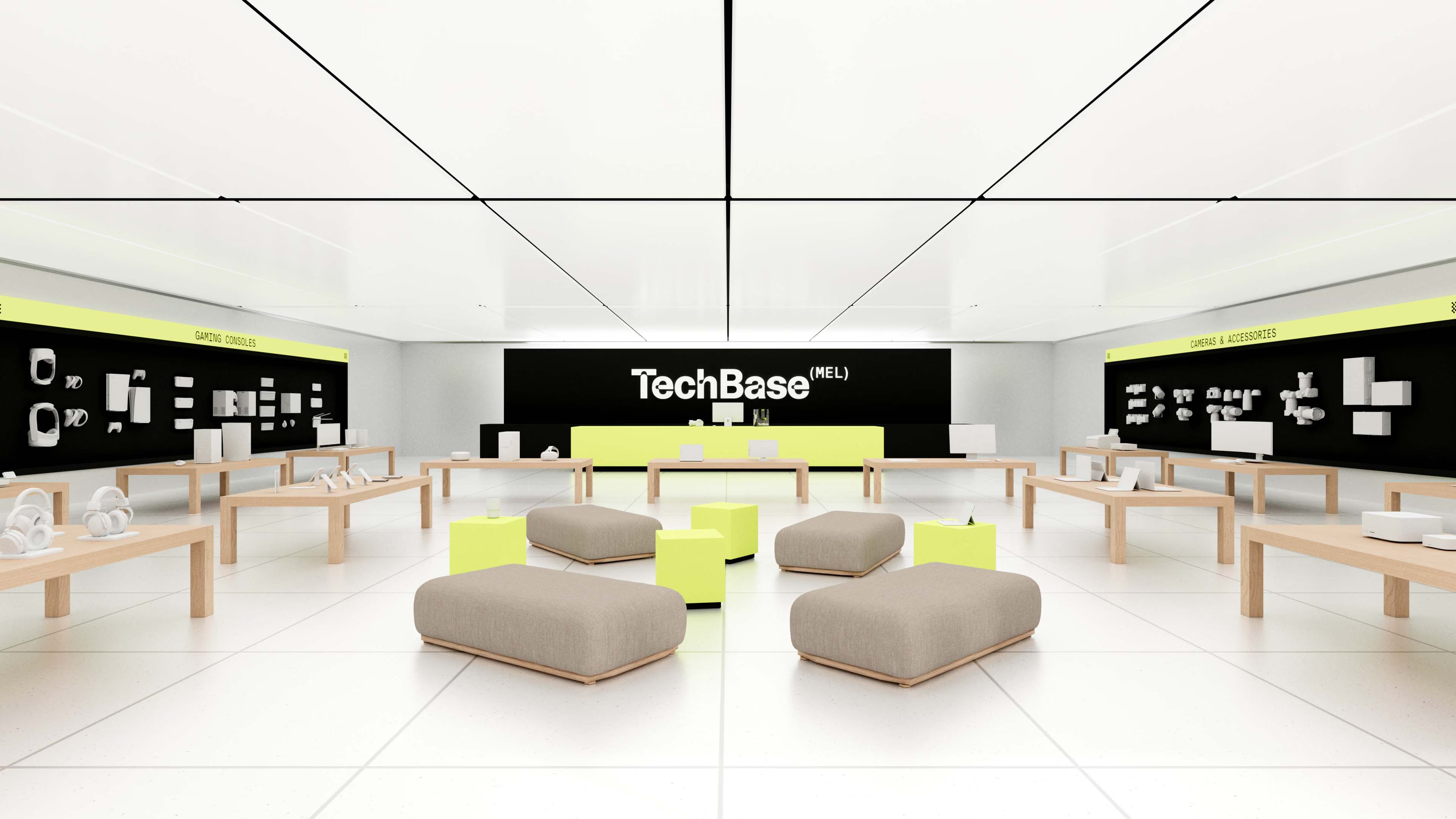
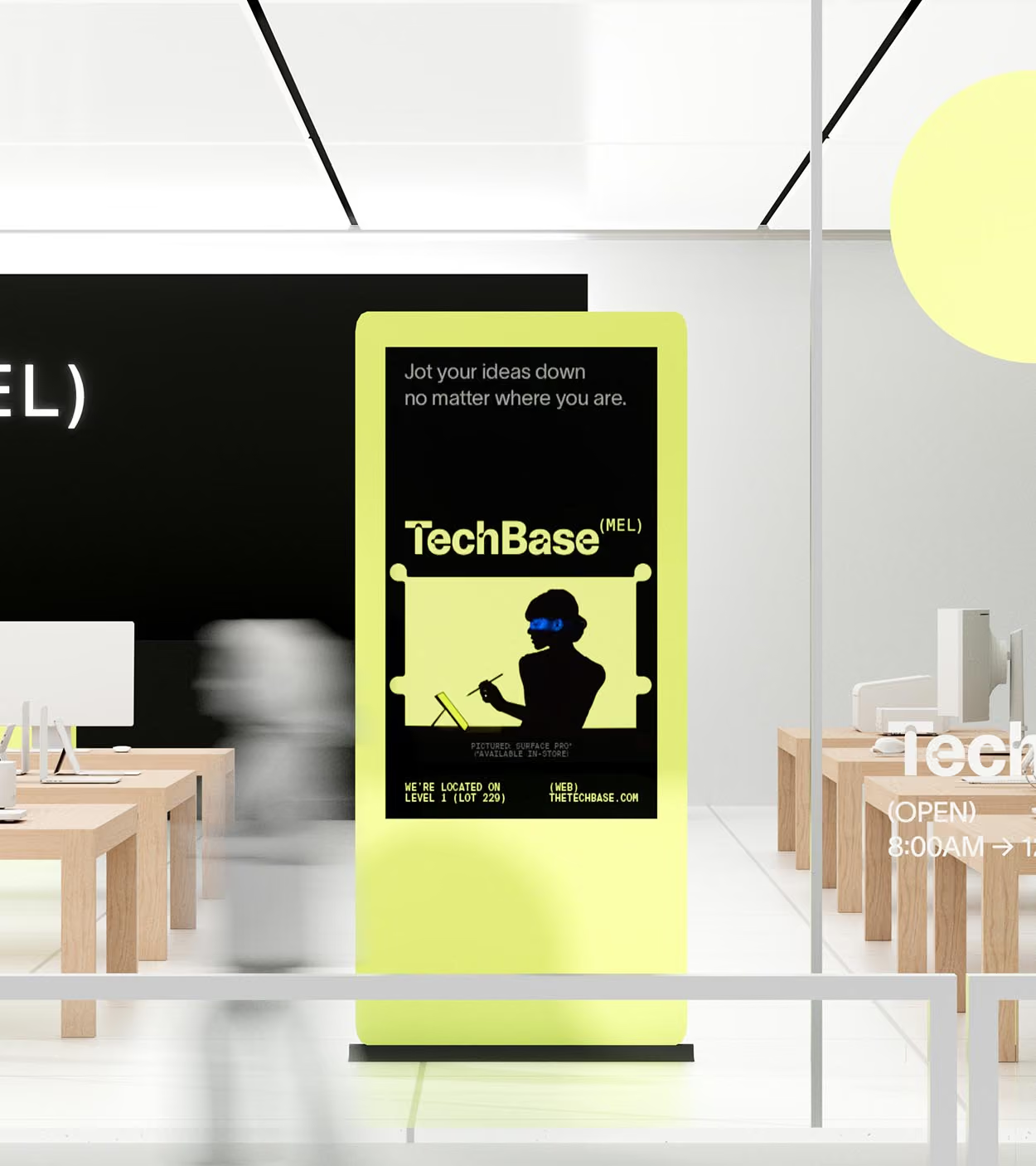
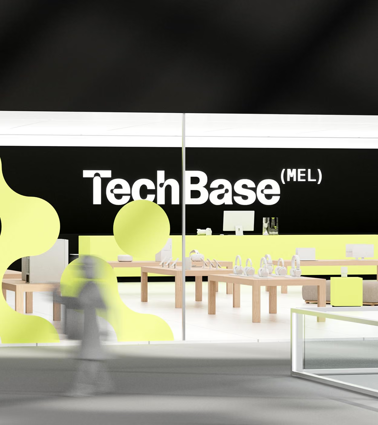
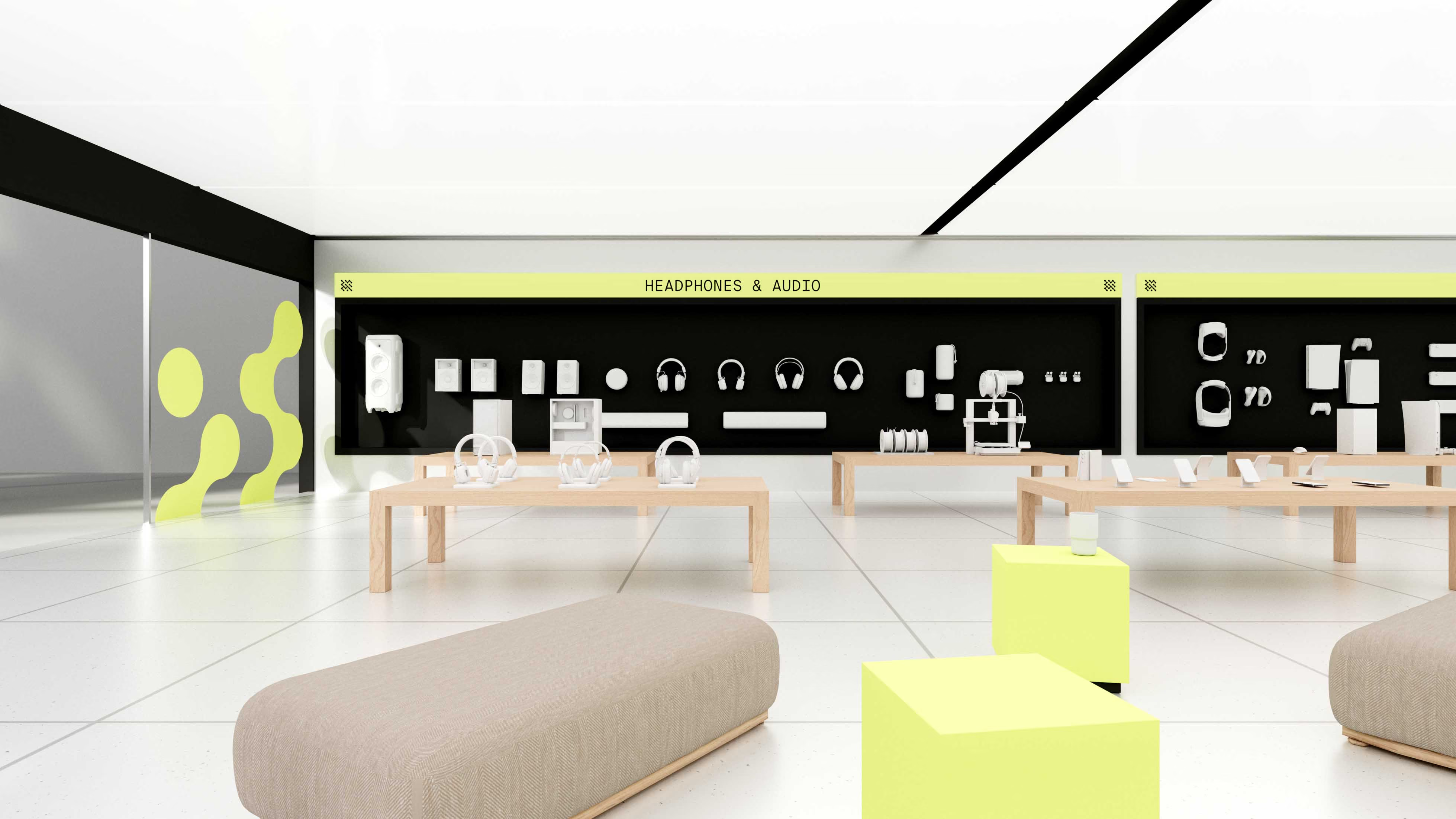
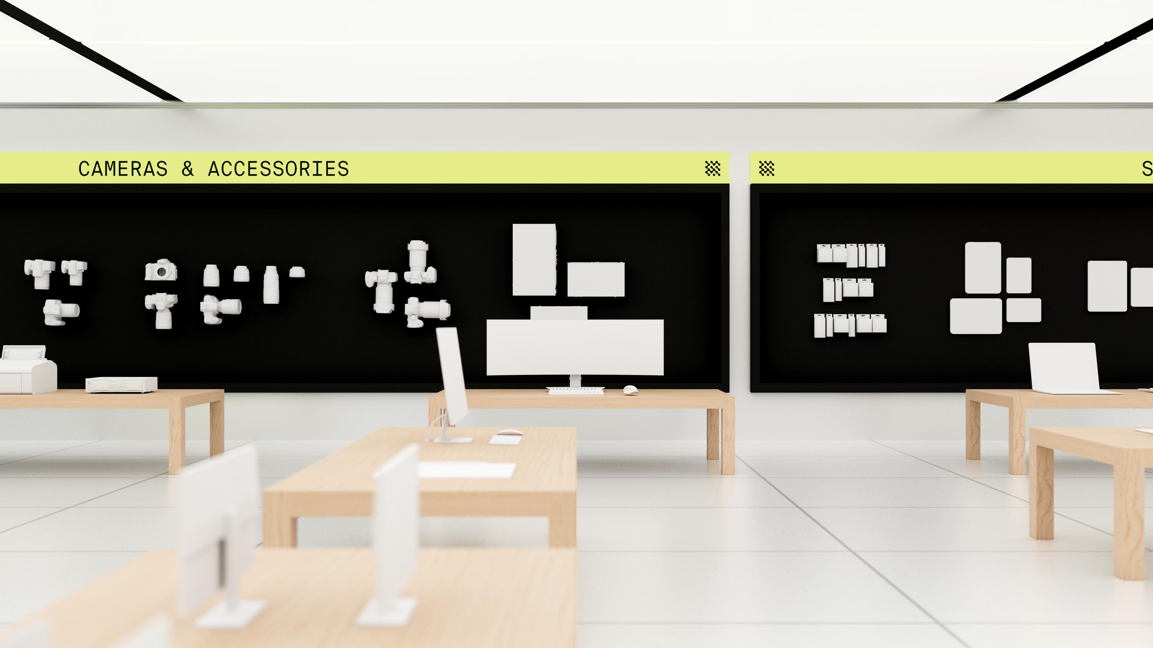
The store experience brings TechBase’s identity into the physical space through consistent branding and clear wayfinding, helping travellers find what they need with ease. Bright accents and clean, clinical metal finishes reflect the modernity of technology, while warm wood tones soften the space, creating an environment that feels contemporary, approachable and welcoming.
Rethinking what Tween skincare looks like.
Our research found that tweens were often more drawn to the look and sophistication of adult skincare brands than products designed specifically for their age group. The challenge was to capture that same sense of coolness and maturity through visual appeal, while creating a product genuinely made for younger, changing skin.
We designed DotDot’s packaging to feel elevated, desirable and grown-up, moving away from the overly youthful cues typical of tween skincare. Bold forms, considered colour and a refined visual system give the range the visual credibility of adult beauty, without losing its playful spirit. The result is skincare tweens can feel proud to own, use and show off.
We designed DotDot’s packaging to feel elevated, desirable and grown-up, moving away from the overly youthful cues typical of tween skincare. Bold forms, considered colour and a refined visual system give the range the visual credibility of adult beauty, without losing its playful spirit. The result is skincare tweens can feel proud to own, use and show off.
Credits
Design
Date Of Birth
3D Visuals
Date Of Birth