Sweets n’ Treats
The sweet spot
Aer Rianta International (ARI) approached us to create a global confectionery store brand that could expand their airport presence and offer worldwide. The brand needed to feel internationally appealing and easy to navigate, while still having its own distinct, ownable sense of place.
We created a brand world inspired by the charm and familiarity of a traditional neighbourhood grocery store, reimagined for the energy of an airport retail environment. Layered with whimsical details drawn from the playful vernacular of “Sweets & Treats”, the identity balances nostalgia, delight, and discovery, creating a store experience that feels both globally accessible and locally memorable.
A palette full of flavour
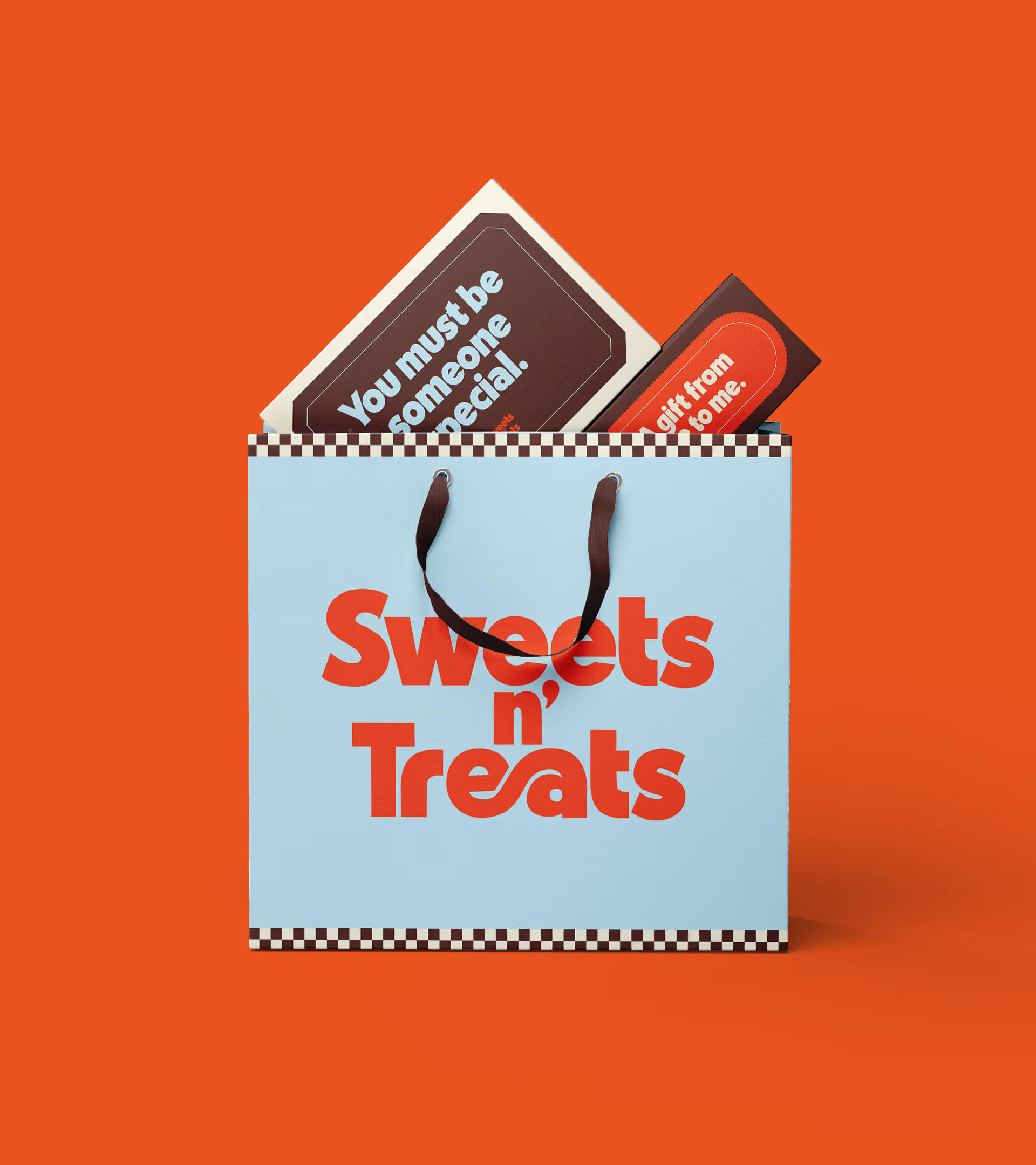
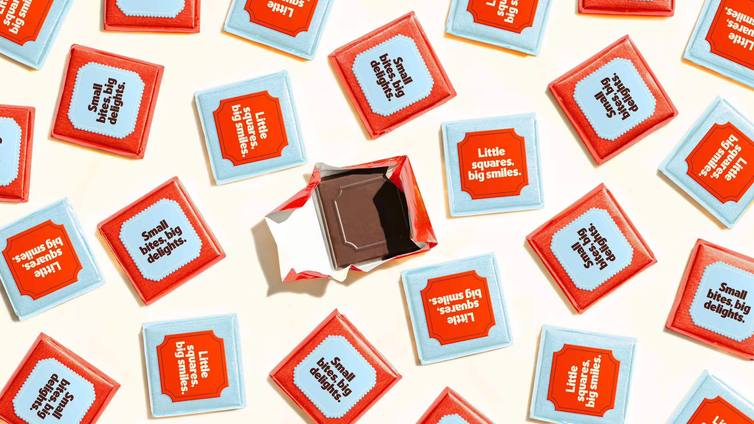
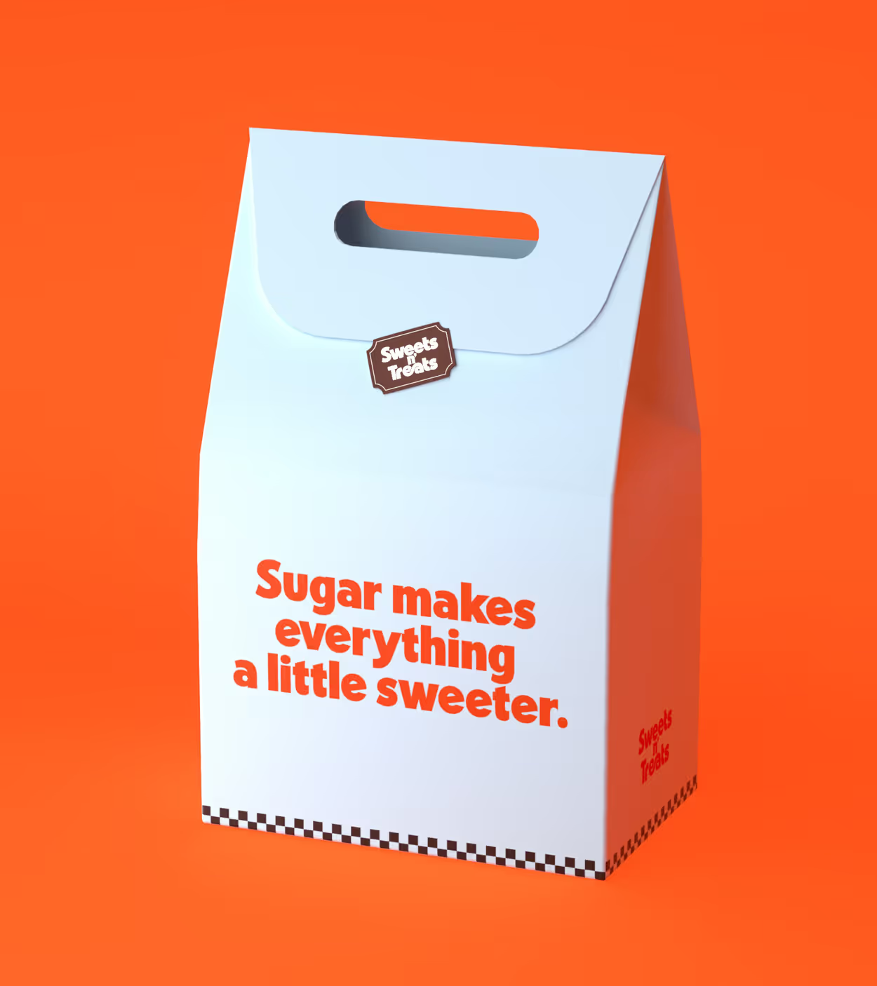
We created a bright, bold and ownable colour system designed to reflect the variety of products available at Sweets n’ Treats. Referencing candy, sherbet and chocolate, the palette feels delicious and full of energy, while still giving the brand a distinctive and recognisable visual identity.
This is paired with whimsical typefaces and custom letterforms within the logomark, creating a sense of connection, playfulness and nostalgia. Together, the colour and typography build a brand world that feels joyful, memorable and perfectly suited to the charm of a confectionery store.
This is paired with whimsical typefaces and custom letterforms within the logomark, creating a sense of connection, playfulness and nostalgia. Together, the colour and typography build a brand world that feels joyful, memorable and perfectly suited to the charm of a confectionery store.

A pick n' mix
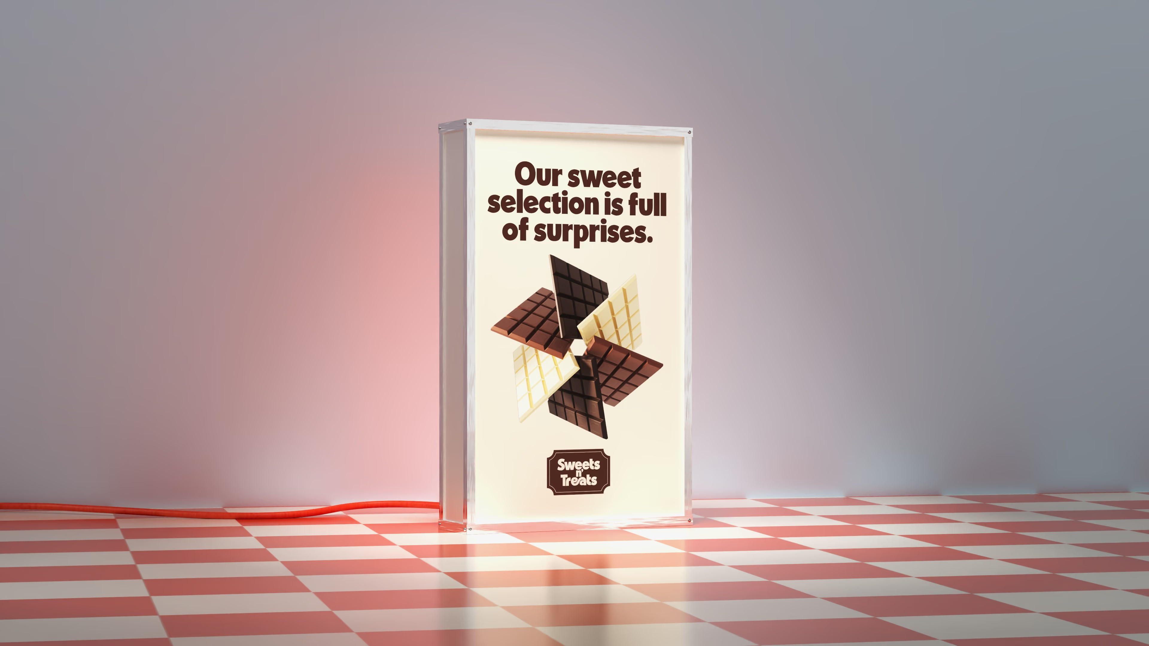
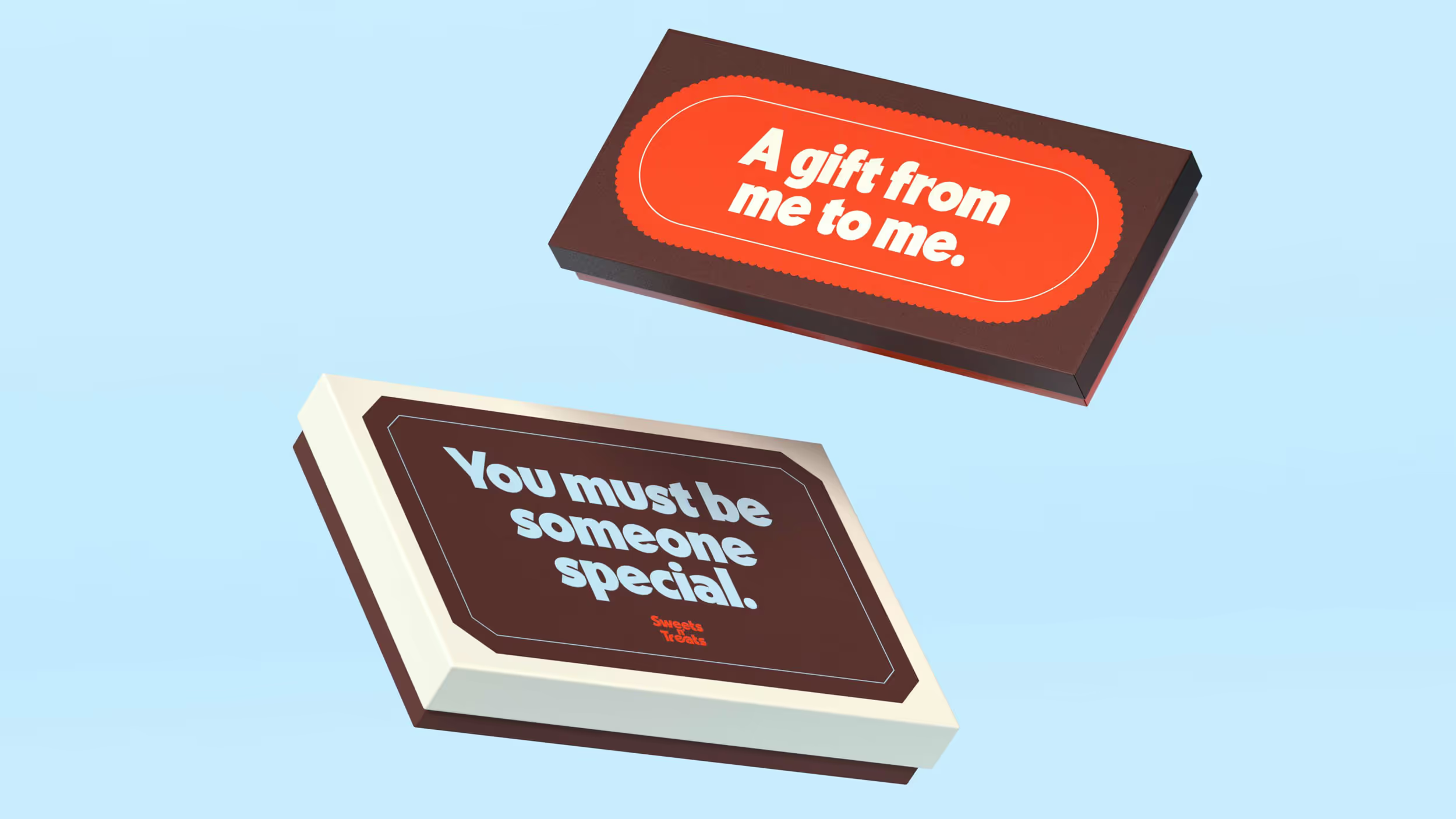
To bring the brand world together, we created a series of unique graphic shapes inspired by blocks of chocolate. These forms act as flexible framing devices across the identity, helping to create consistency while adding a playful confectionery cue.
Paired with a checkered pattern that nods to the retro charm of neighbourhood grocery stores, the system builds a visual language that feels nostalgic, distinctive, and full of character.
Paired with a checkered pattern that nods to the retro charm of neighbourhood grocery stores, the system builds a visual language that feels nostalgic, distinctive, and full of character.
A store full of sweet nostalgia
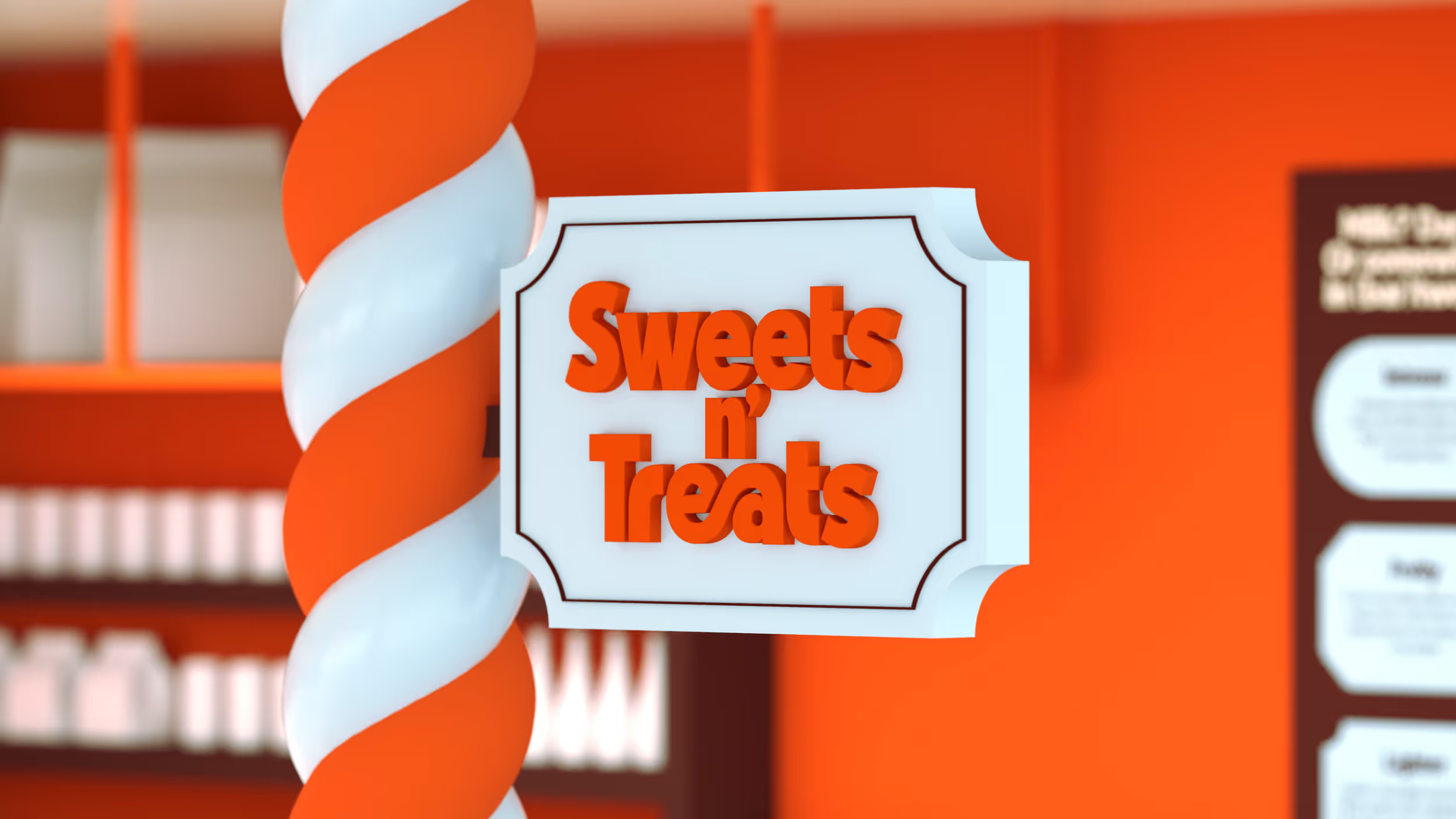
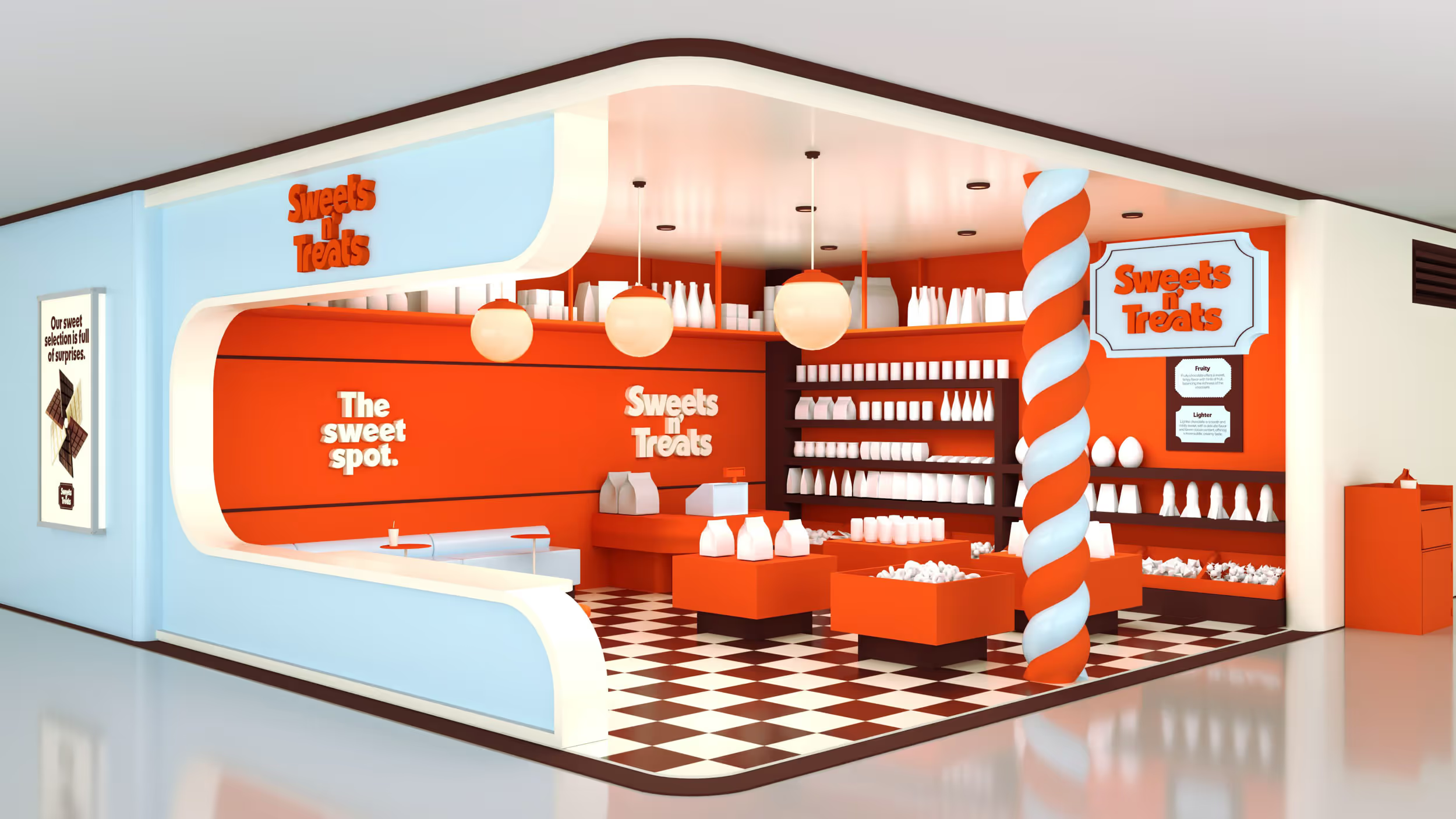
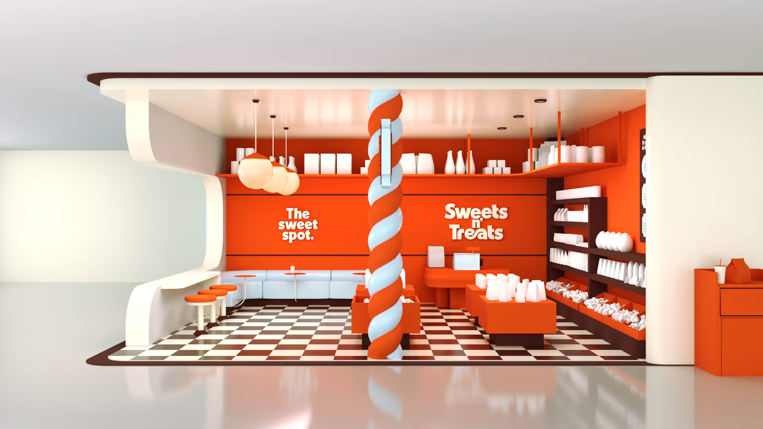
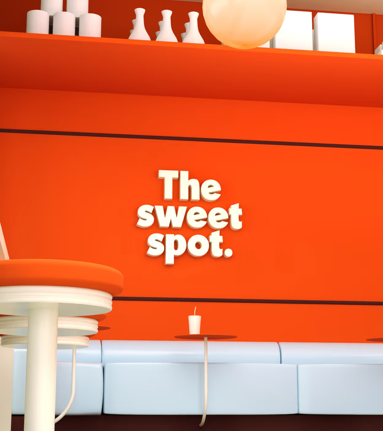
We created a brand world that extends directly into the store fit out, allowing Sweets n’ Treats to come to life in a bold and physical way. Designed to be hard to pass by, the space uses bright colours, playful graphics and distinctive brand assets to create an immediate sense of delight and discovery.
Drawing on the charm of nostalgic confectionery stores, the fit out balances retro cues with a more modern airport retail experience. The result is a store environment that feels joyful, memorable and full of character, inviting travellers to step inside, explore and take a little treat with them.
Drawing on the charm of nostalgic confectionery stores, the fit out balances retro cues with a more modern airport retail experience. The result is a store environment that feels joyful, memorable and full of character, inviting travellers to step inside, explore and take a little treat with them.
Design
Date Of Birth
3D Visuals
Date Of Birth