LVL UP Cans
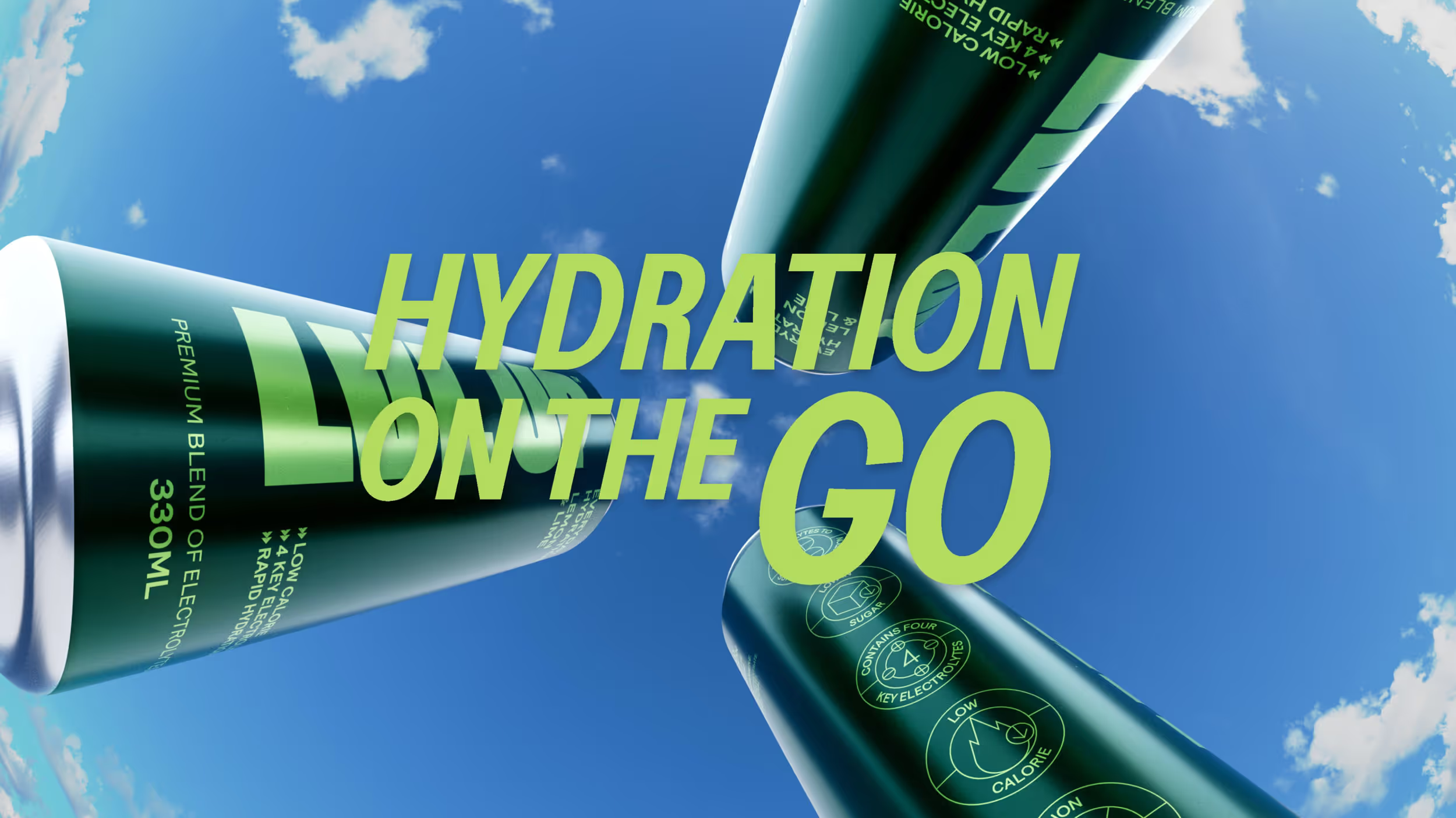
Hydration on the go
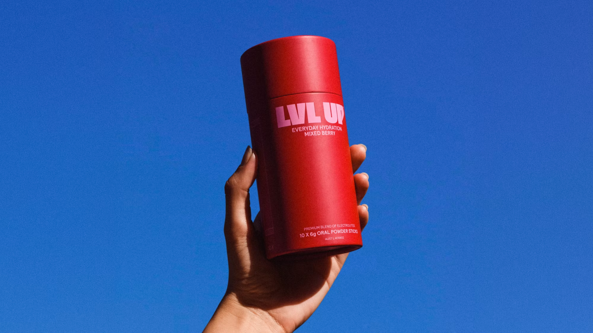
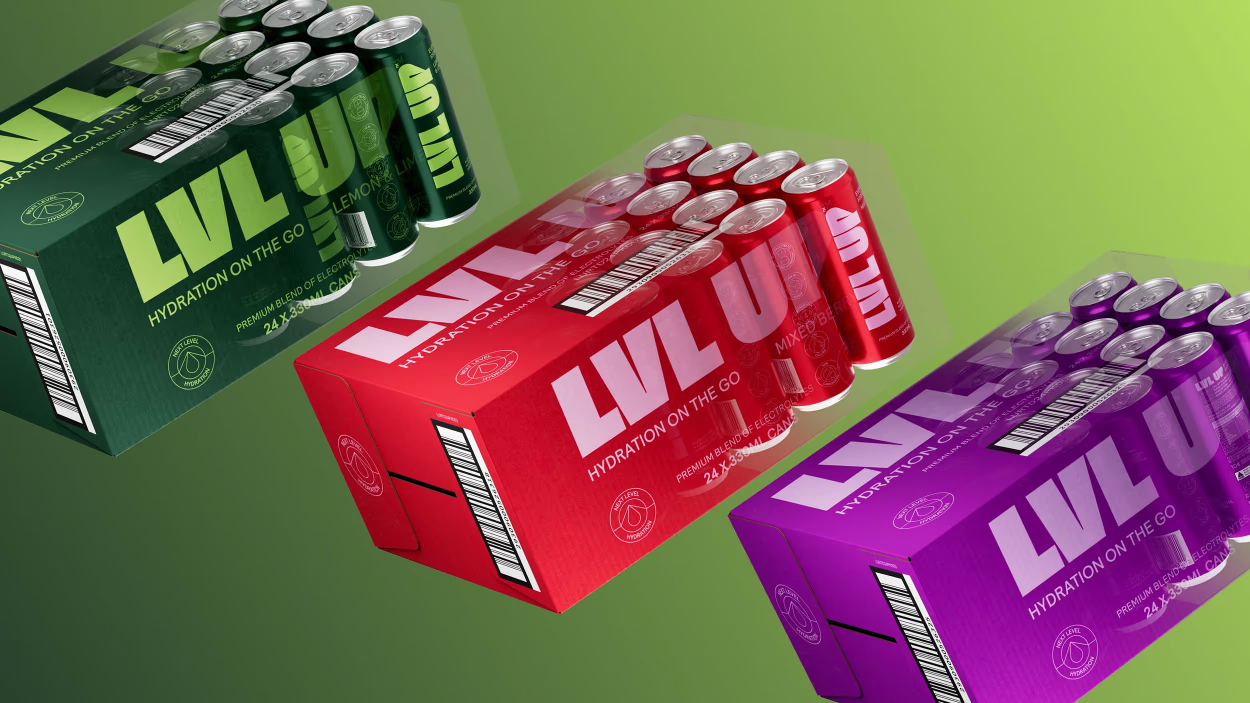
LVL UP approached us to evolve their existing hydration range into a more convenient format designed for life on the move. The opportunity was to take hydration beyond the desk, creating an easy, everyday solution that could be used whenever, wherever.
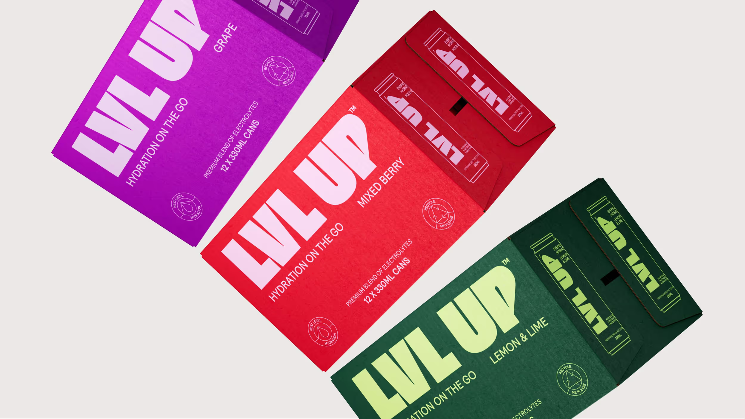
Staying true to LVL UP’s established brand codes, the design pushes the system into a more flexible and mobile world. The result is a suite of visuals and content that brings movement and convenience to life, reinforcing LVL UP as an accessible daily essential.
Flavour on the go
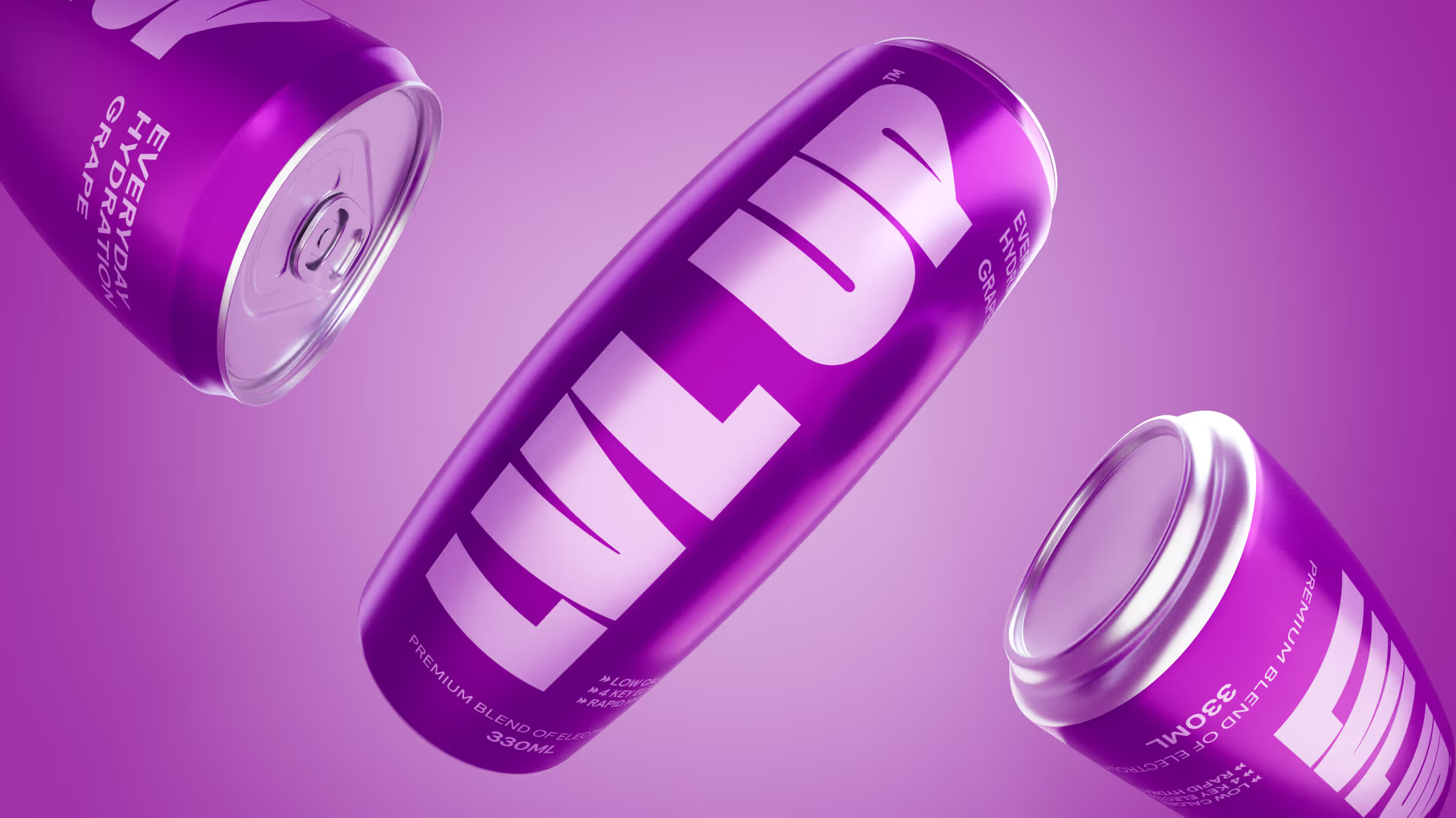
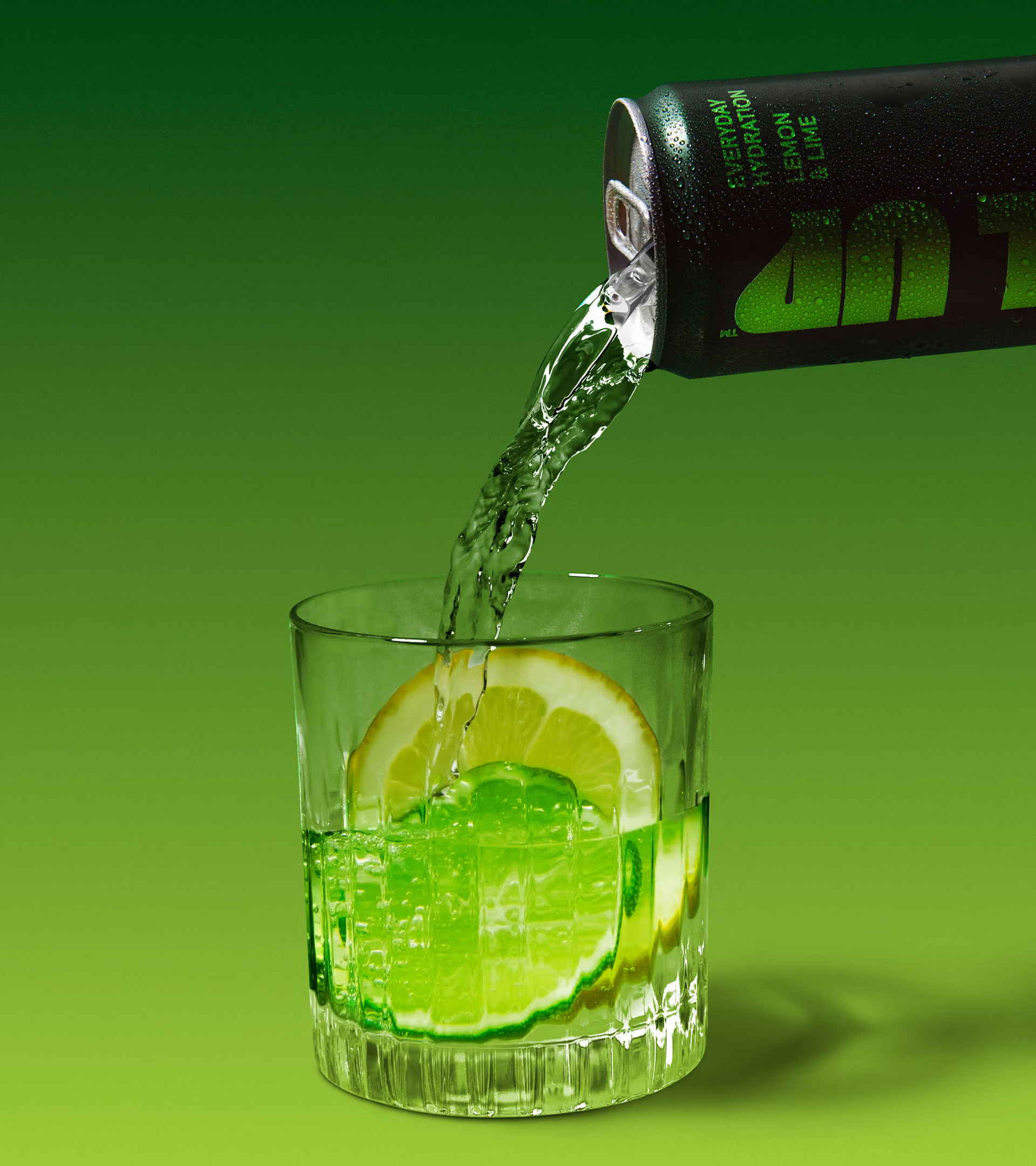
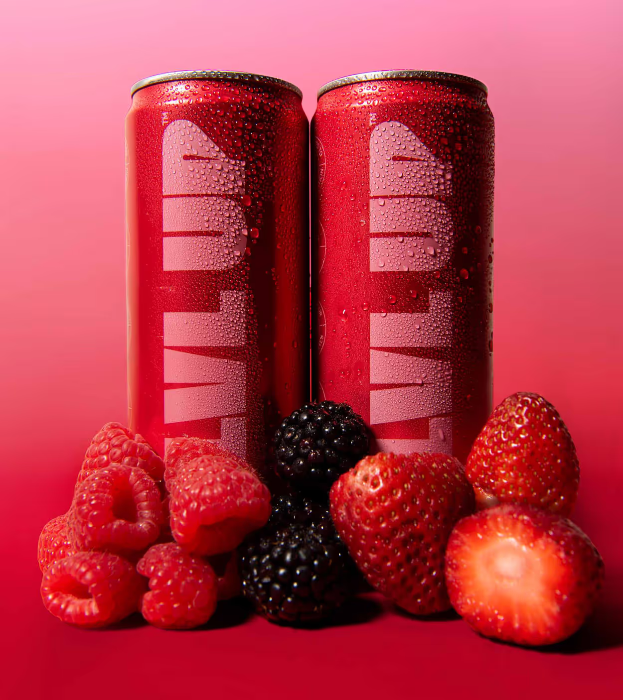
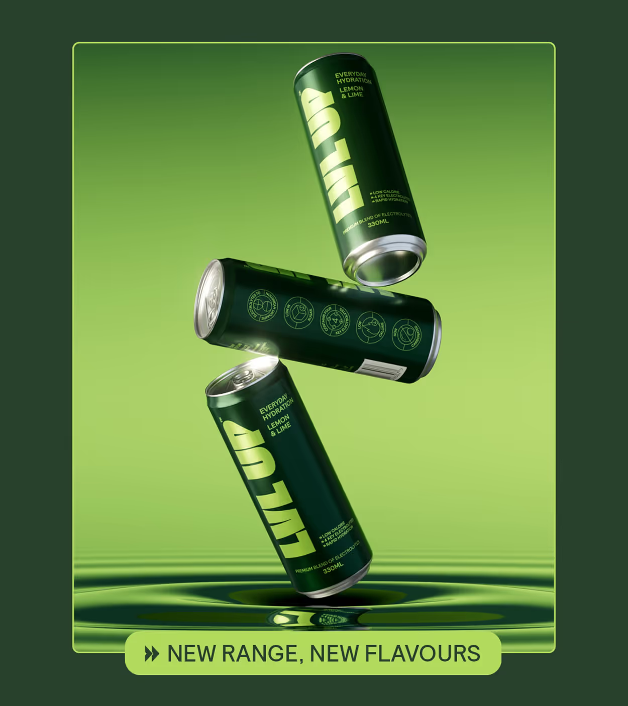
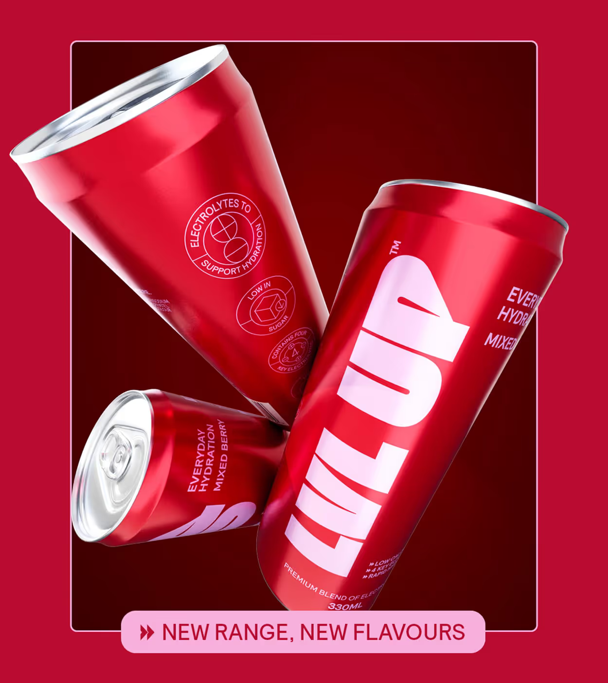
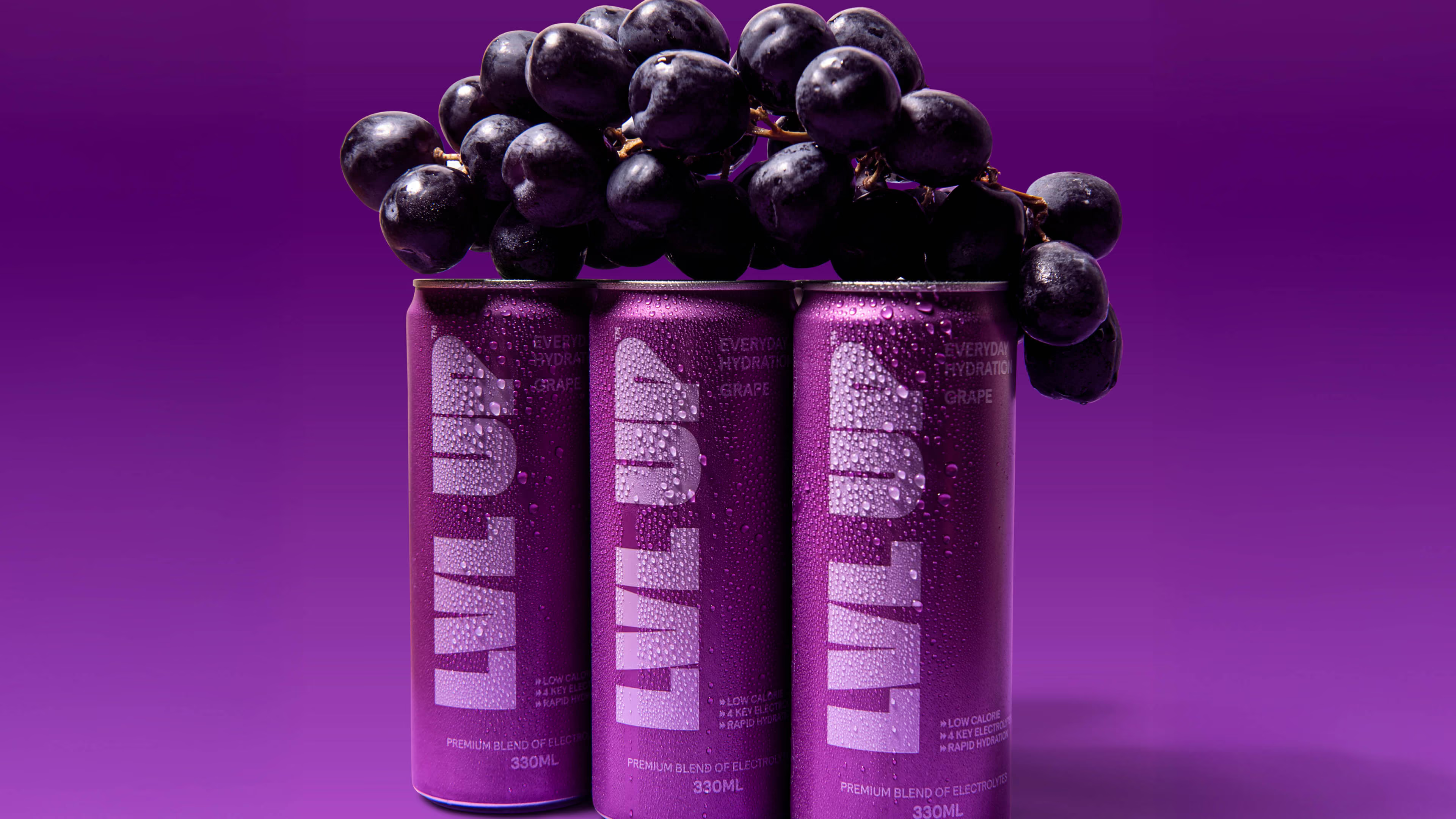
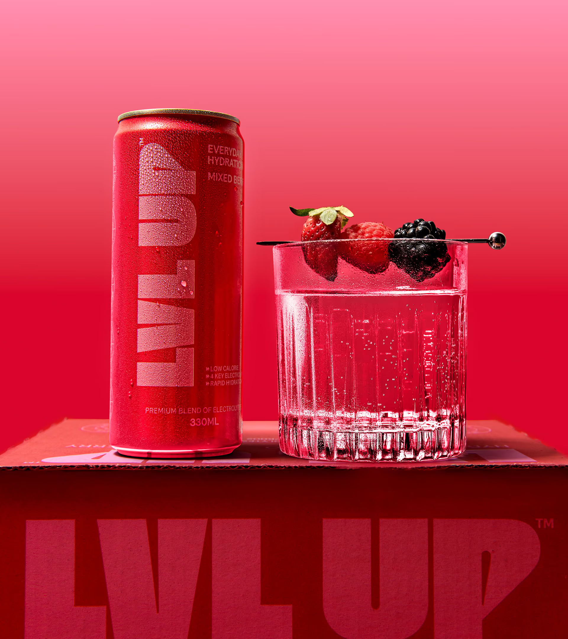
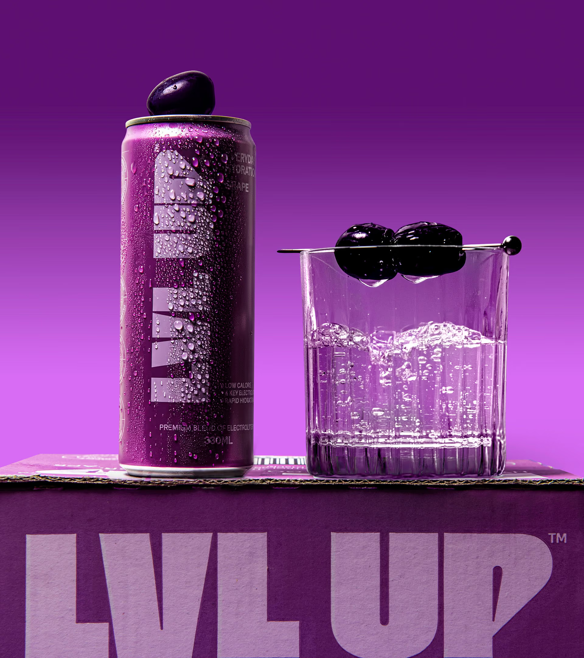
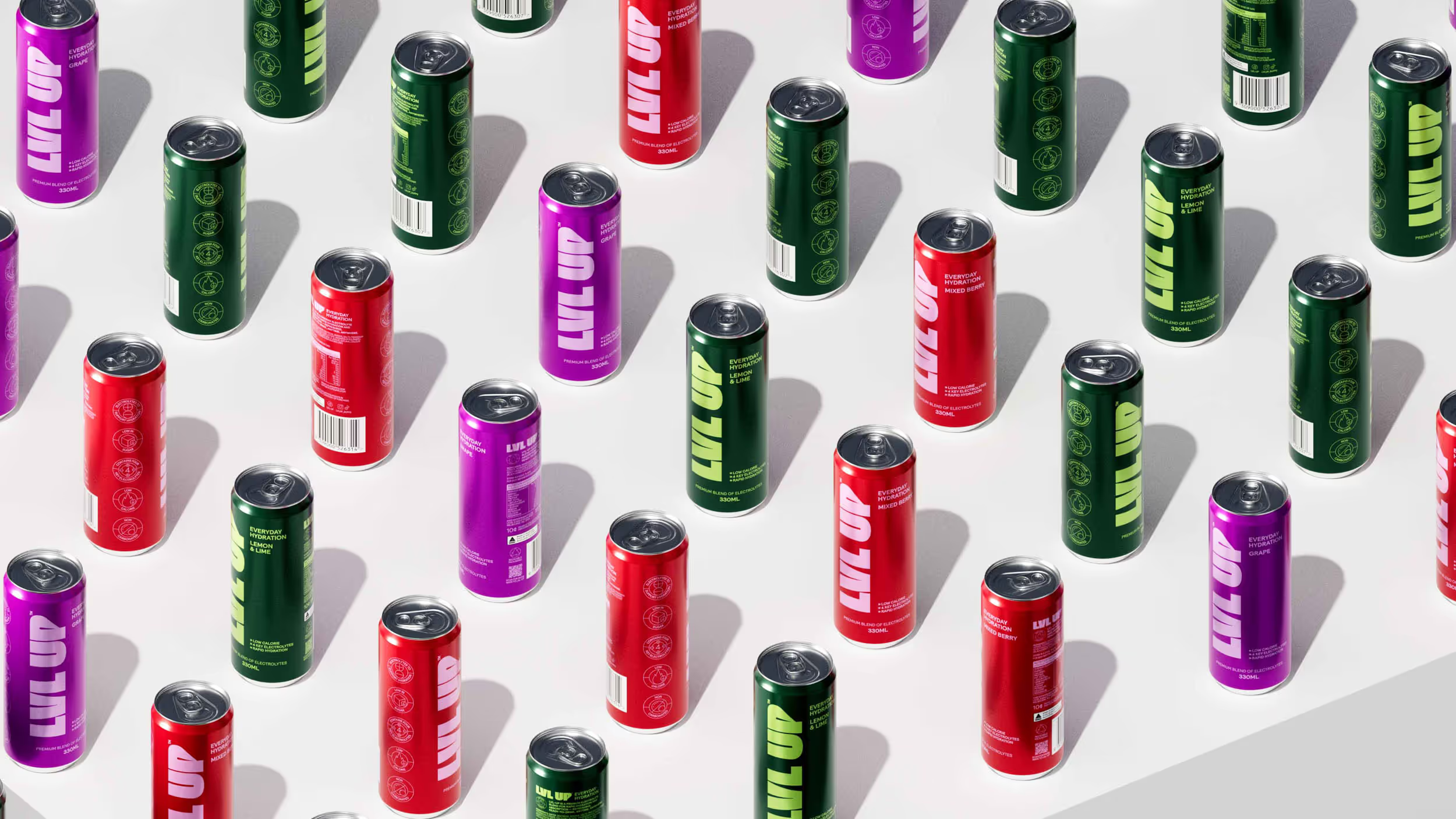
We positioned LVL UP as a flavour led hydration brand, pairing delicious taste with essential hydration on the go. Lead visuals hero the flavours through fruit cues, fresh water liquid imagery, and bright, colourful backgrounds that make each variant instantly recognisable.
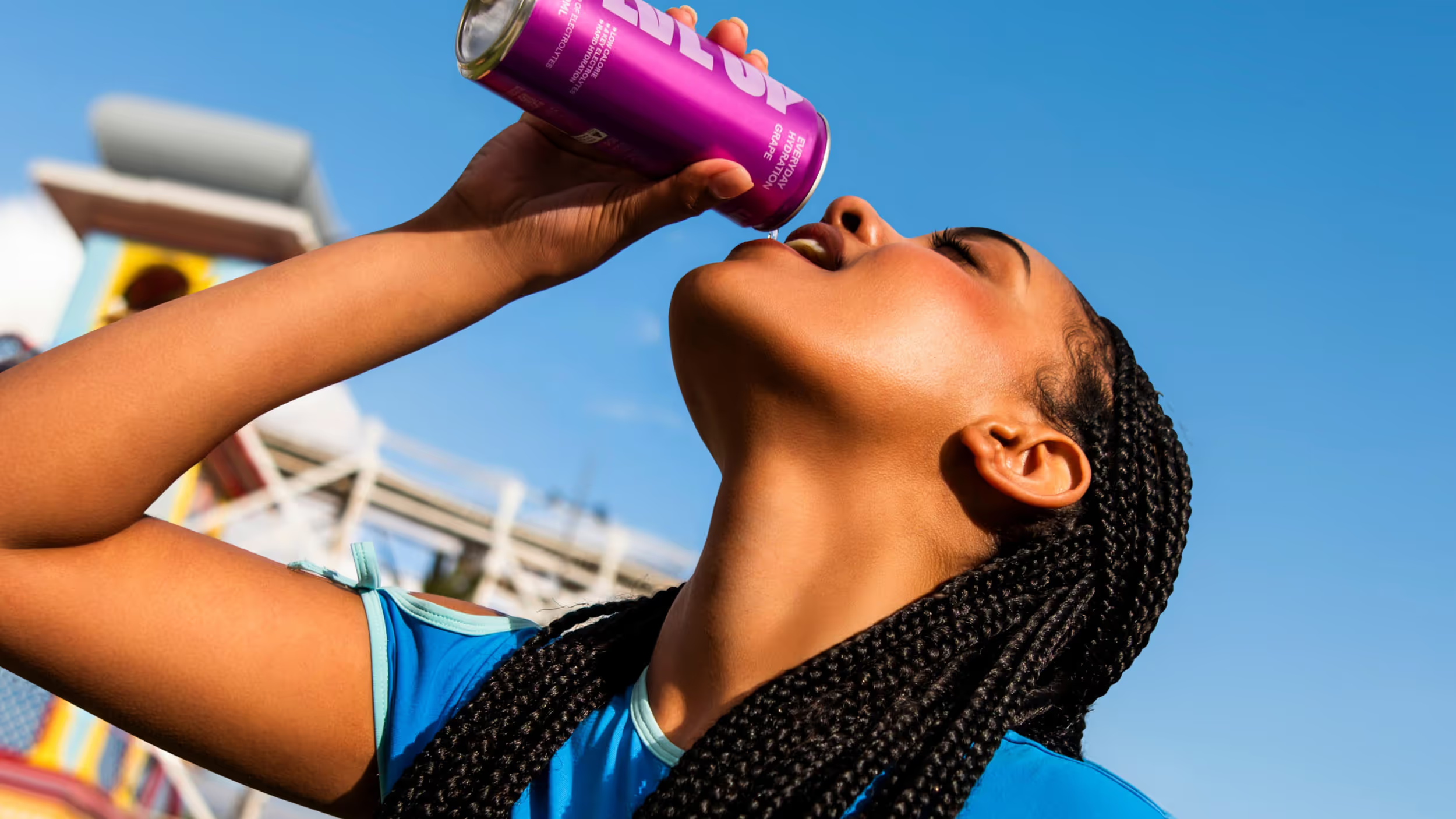
Hydration that moves with you
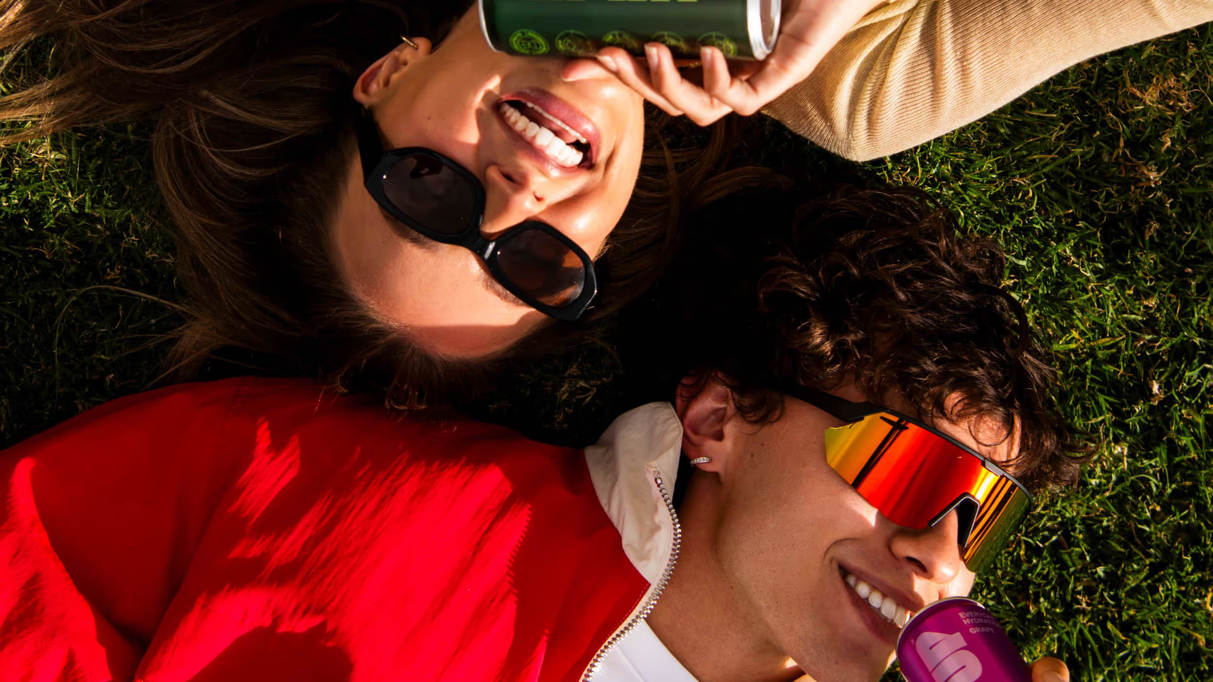
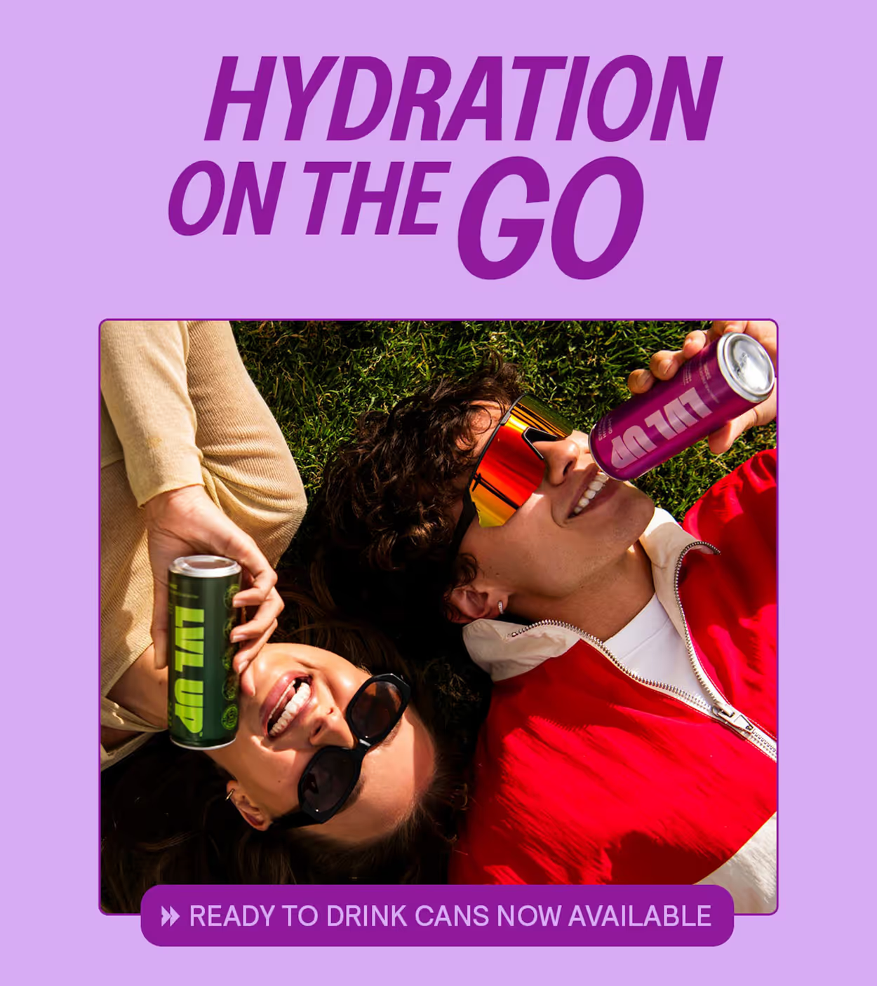
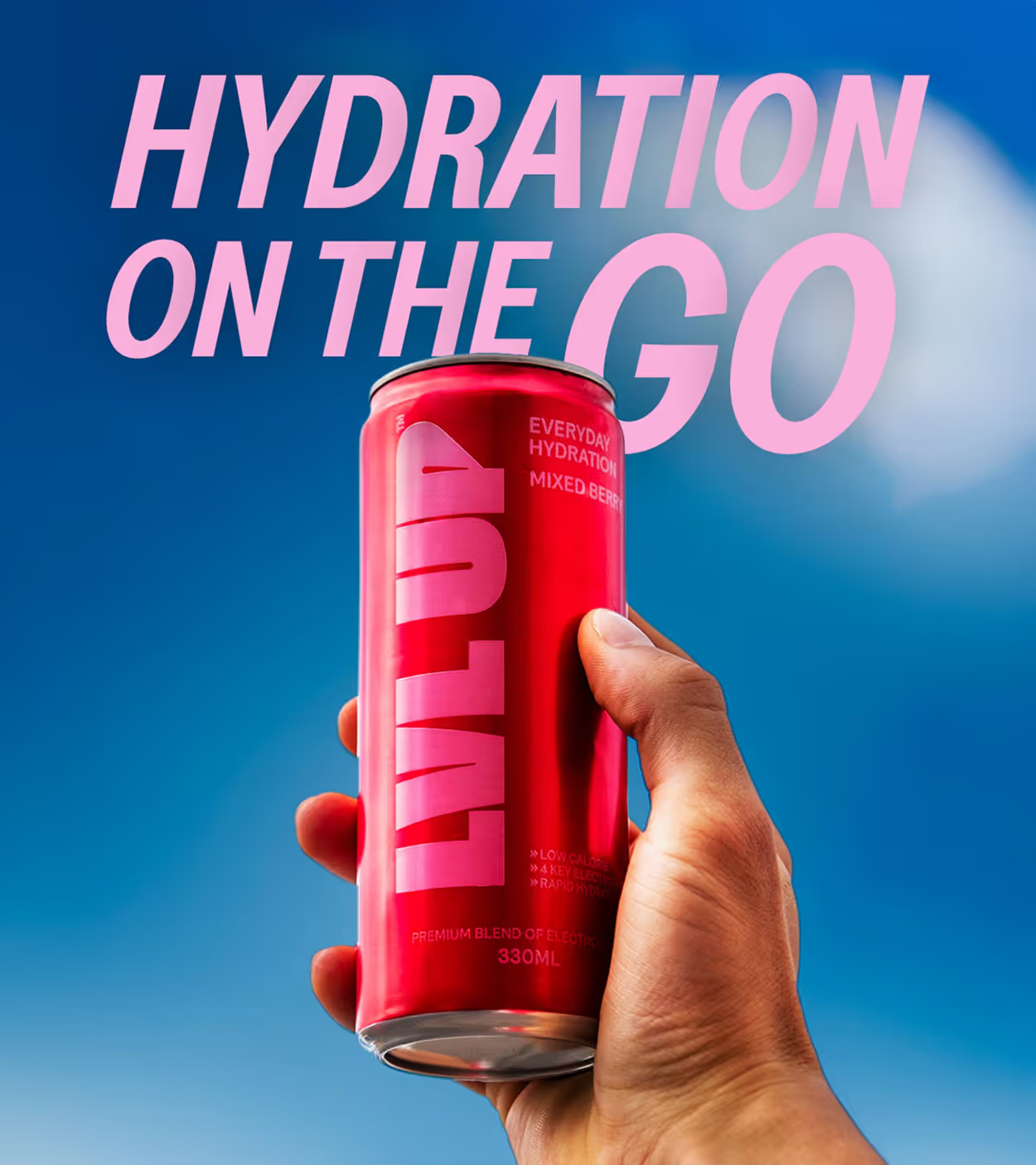
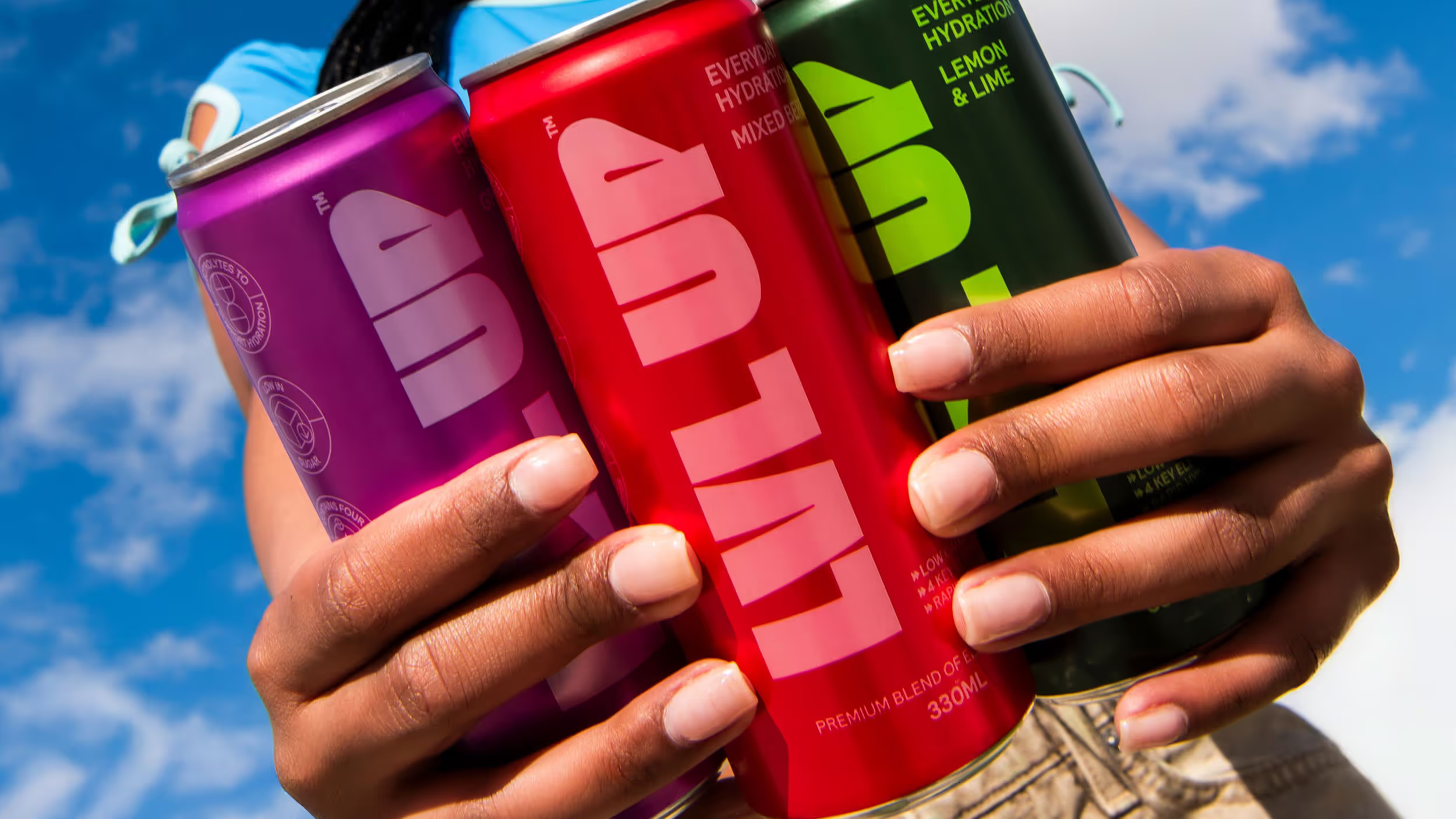
To reinforce LVL UP’s conviencience the campaign highlighted its on the go convenience through bright, colourful lifestyle photography with LVL UP wherever they needed hydration. Reinforcing LVL UP as Hydration on the Go, the imagery ties together the campaign with bright, poppy visuals and movement to highlight
A fresh take on hydration
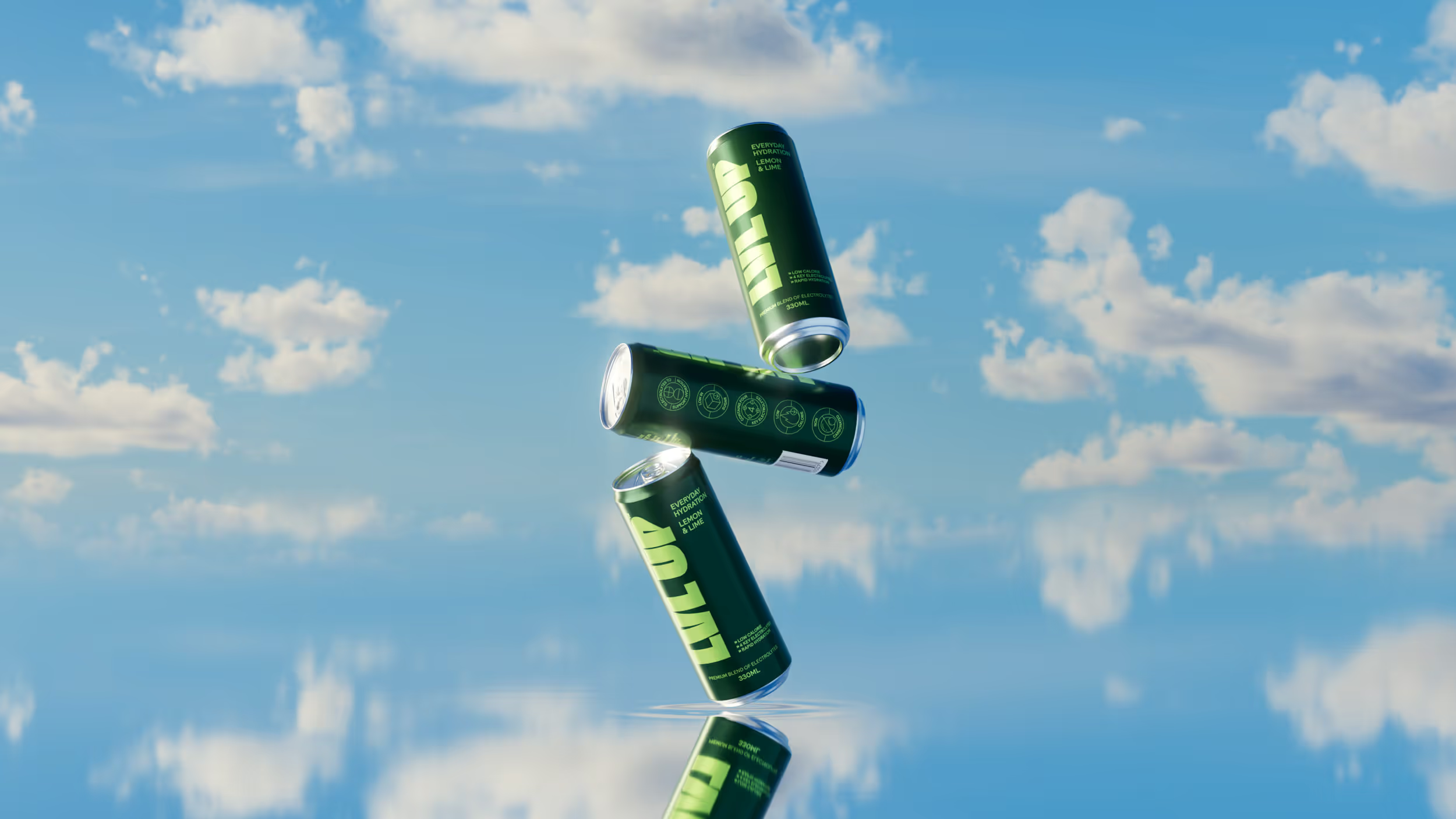
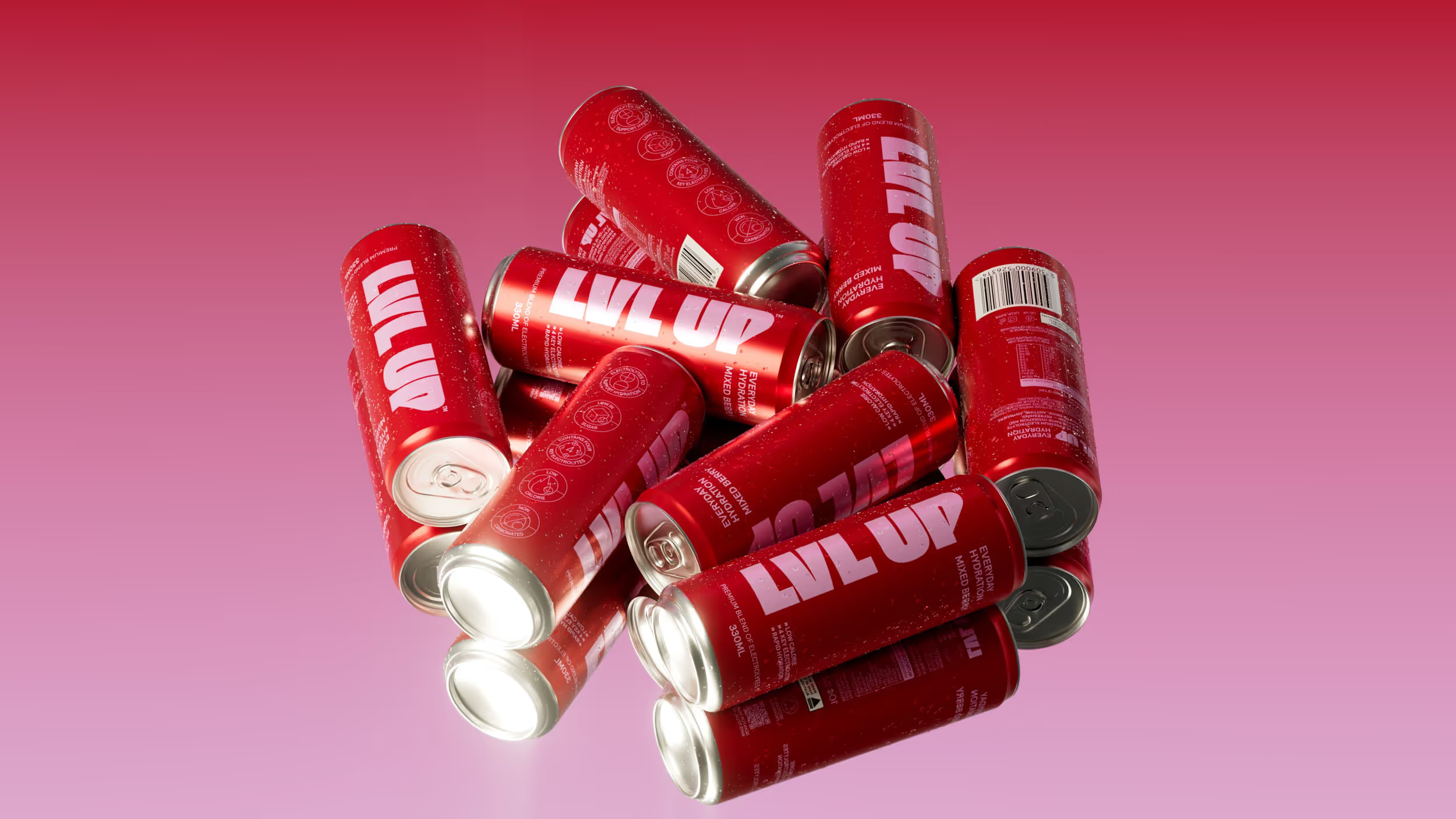
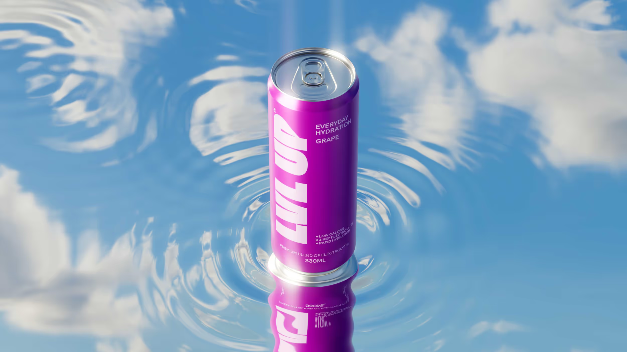
Building on this imagery, we created a series of visualisations that bring hydration to life in a more elevated way. Liquid forms wrap around and interact with the cans, with reflective, water-like surfaces picking up blue sky tones to create a fresh outdoor feel.
These visuals sit between lifestyle and abstraction, capturing freshness, fluidity and movement without becoming too literal. Together, they create a distinctive visual language that reinforces LVL UP as hydration designed for life on the go.
These visuals sit between lifestyle and abstraction, capturing freshness, fluidity and movement without becoming too literal. Together, they create a distinctive visual language that reinforces LVL UP as hydration designed for life on the go.
Design
Date Of Birth
3D Visuals
Date Of Birth