Respire
Experience breathing
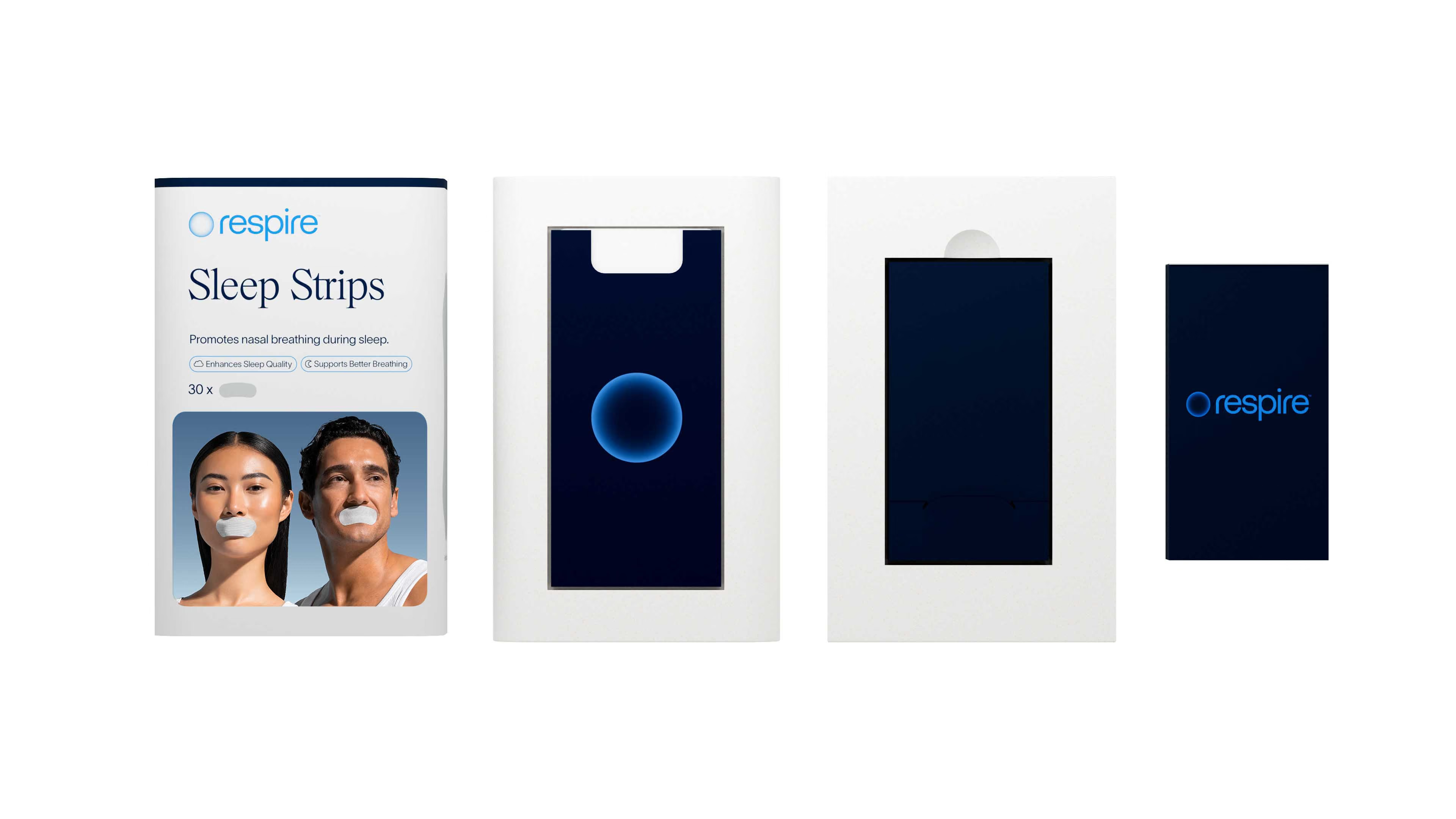
Respire came to us as a brand that was already performing. Strong online, loyal customers, a product that genuinely worked. The challenge wasn't to start from scratch. It was to elevate. To take a brand built for conversion and give it the identity to match its ambition. One worthy of premium retail shelves, wellness-conscious consumers, and a category it was redefining entirely.
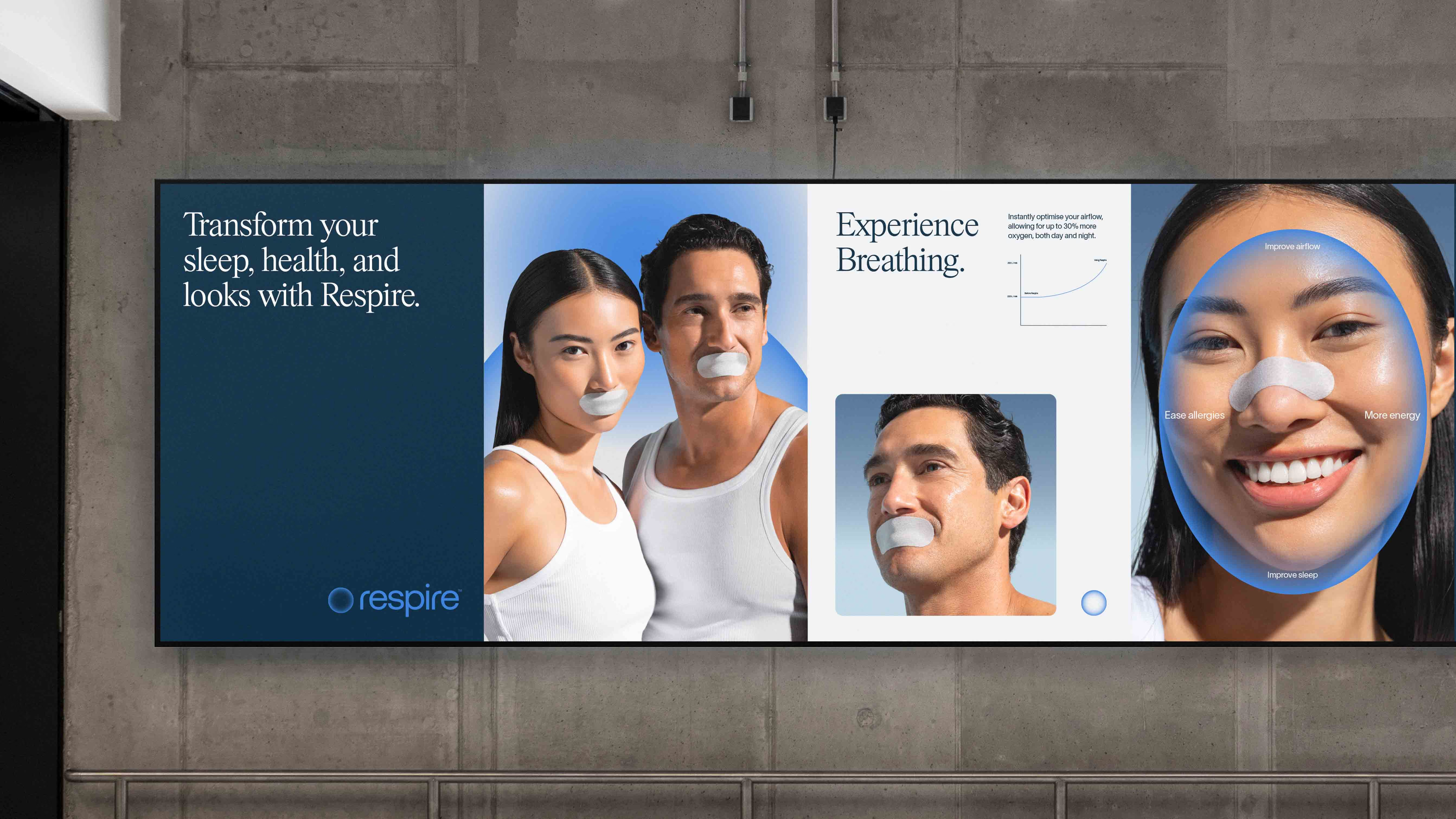
A New Identity. The Same Breath.
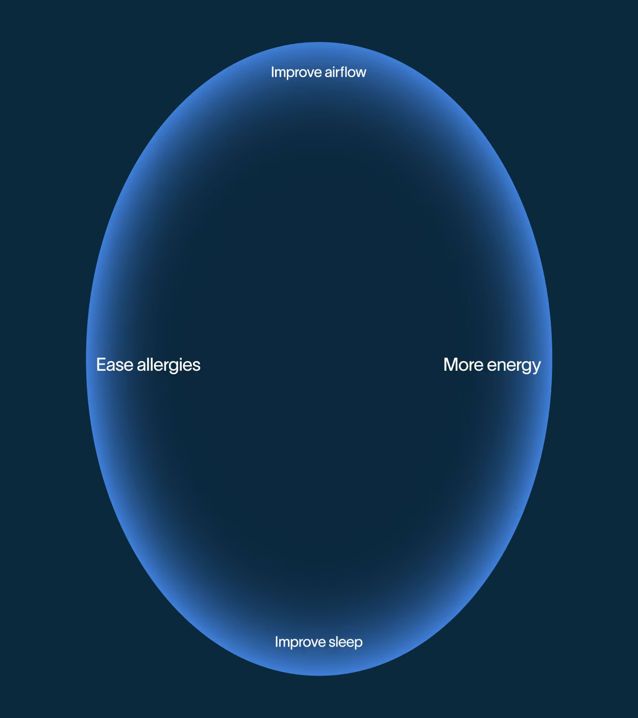
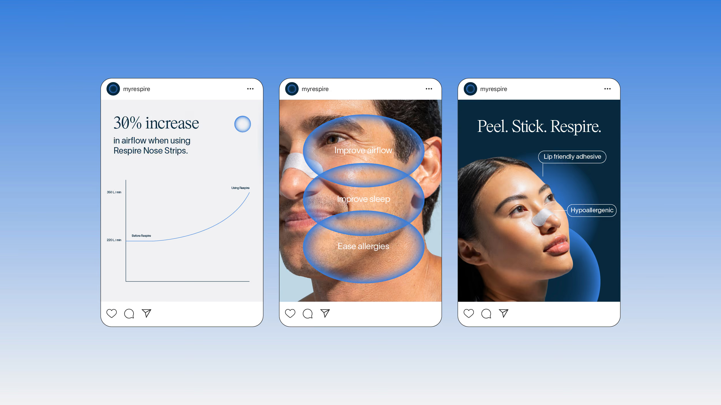
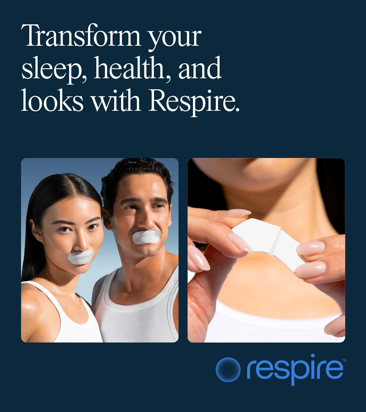
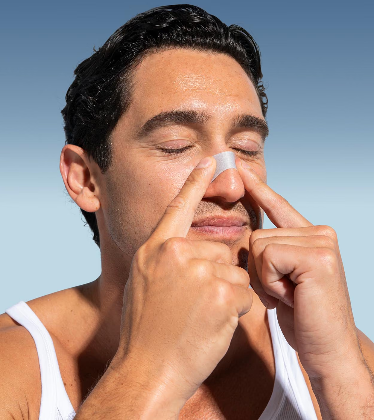
We created an entirely new identity system for Respire. A new symbol and wordmark built around the concept of breathing itself. Circular, open, expansive. An identity that communicates relaxation, wellness, and the quiet ritual of a good night's sleep. We stayed close to the existing brand equity, evolving rather than erasing, ensuring the loyal customer base recognised what they loved while the brand stepped confidently into its next chapter. Peel. Stick. Respire.
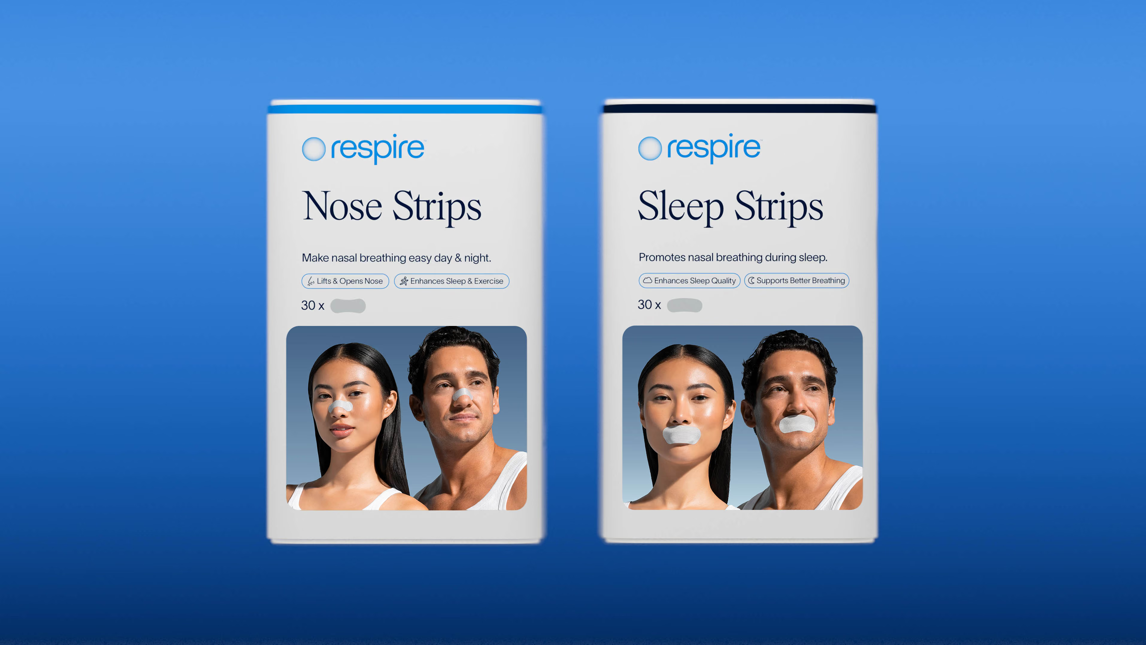
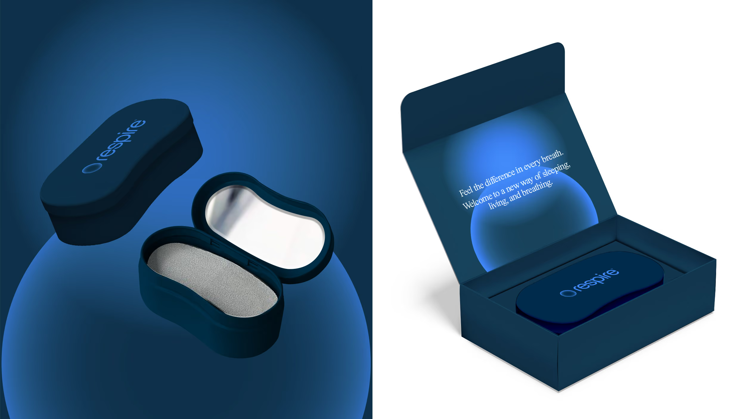
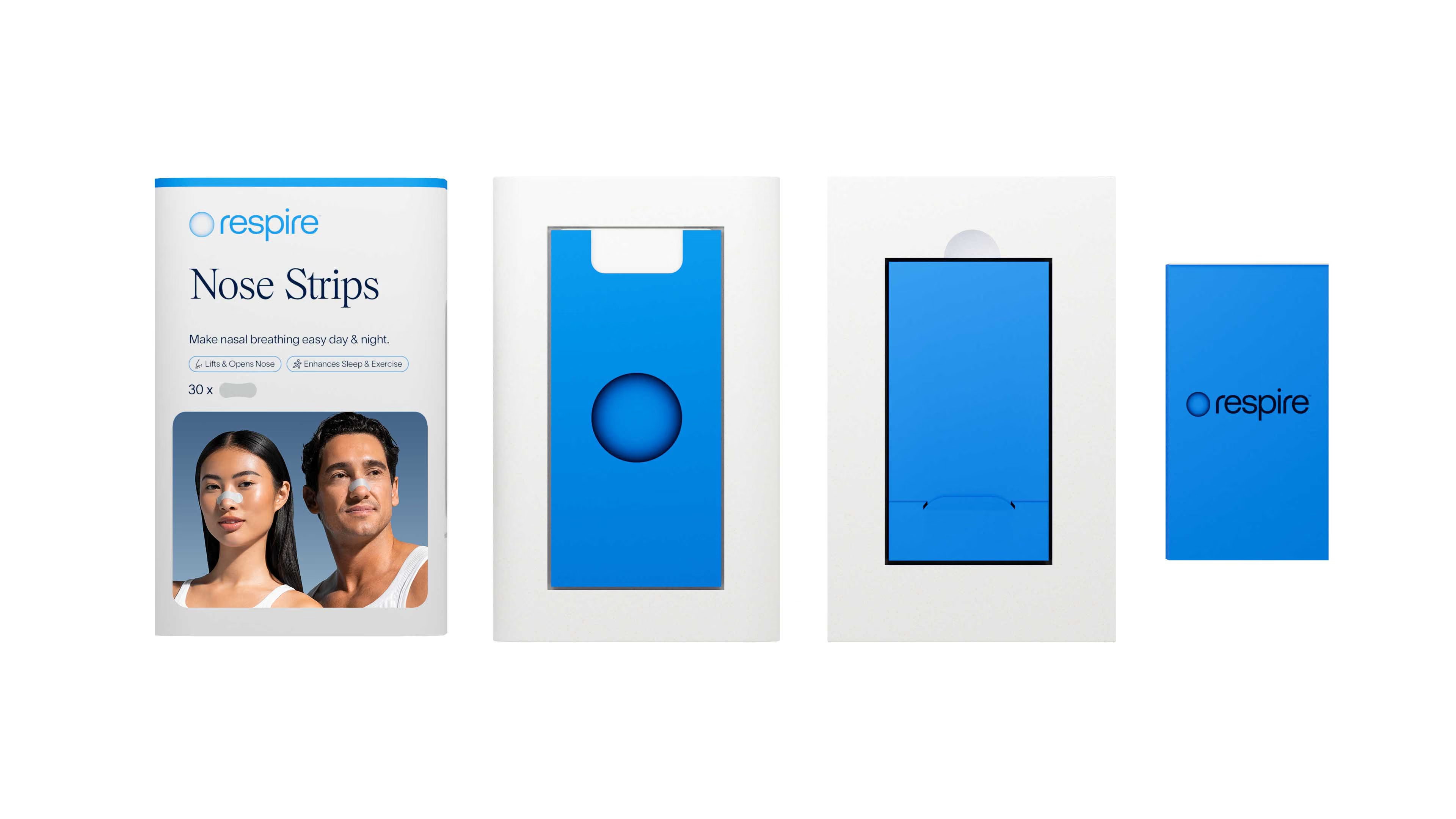
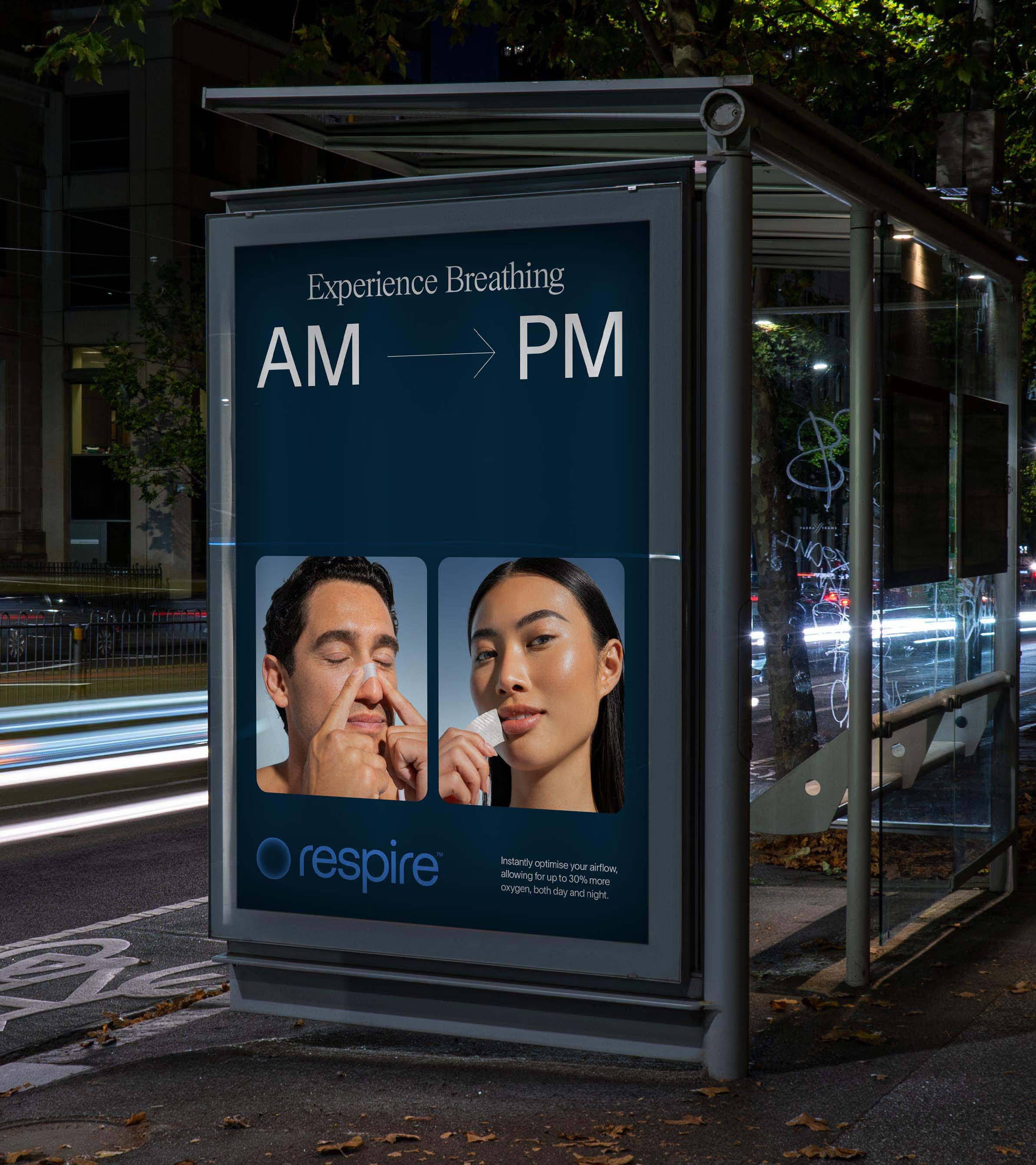
Beyond Sleep.
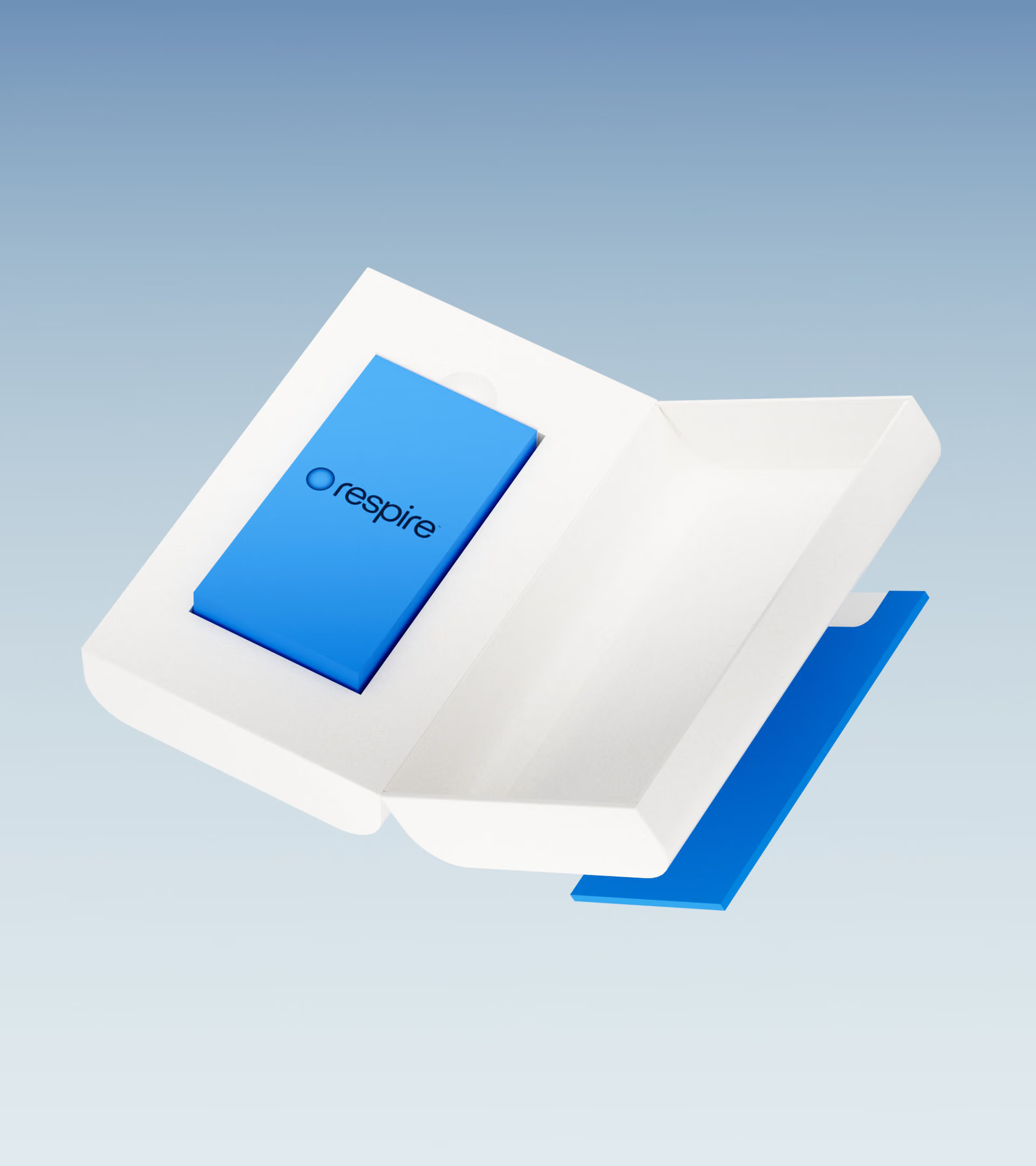
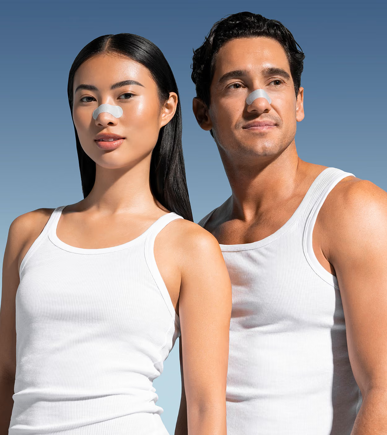
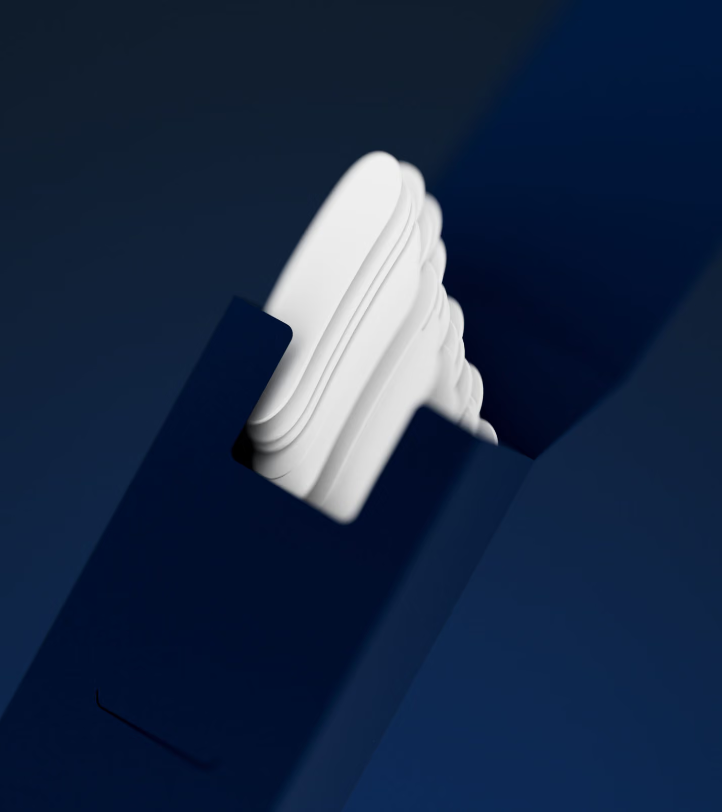
Respire isn't just a sleep product. It's an invitation to experience breathing differently, day and night. The new identity needed to carry that across every touchpoint, from packaging and retail display to social content and out-of-home. A brand world that felt as calm and considered as the product itself. One that made people stop, breathe, and reach.
Credits
Design
Date Of Birth
Photography
Chris Nardo, Nick Harding