Mirror Mirror
Beauty: to your standards
Mirror Mirror is an online directory designed to help cosmetic practitioners and clients find each other with greater ease and confidence. The challenge was to create a brand that could build trust and safety for both audiences, while still feeling approachable, warm and confident within a category that can often feel clinical or intimidating.
The identity was developed around the platform’s role as a point of connection, bringing future clients and cosmetic practitioners together in one trusted space. The design system balances professionalism with personality, using a bold and distinctive logo, youthful letterforms and a soft multi-coloured palette to create a brand that feels energetic, inclusive and reassuring.
A mark for connection
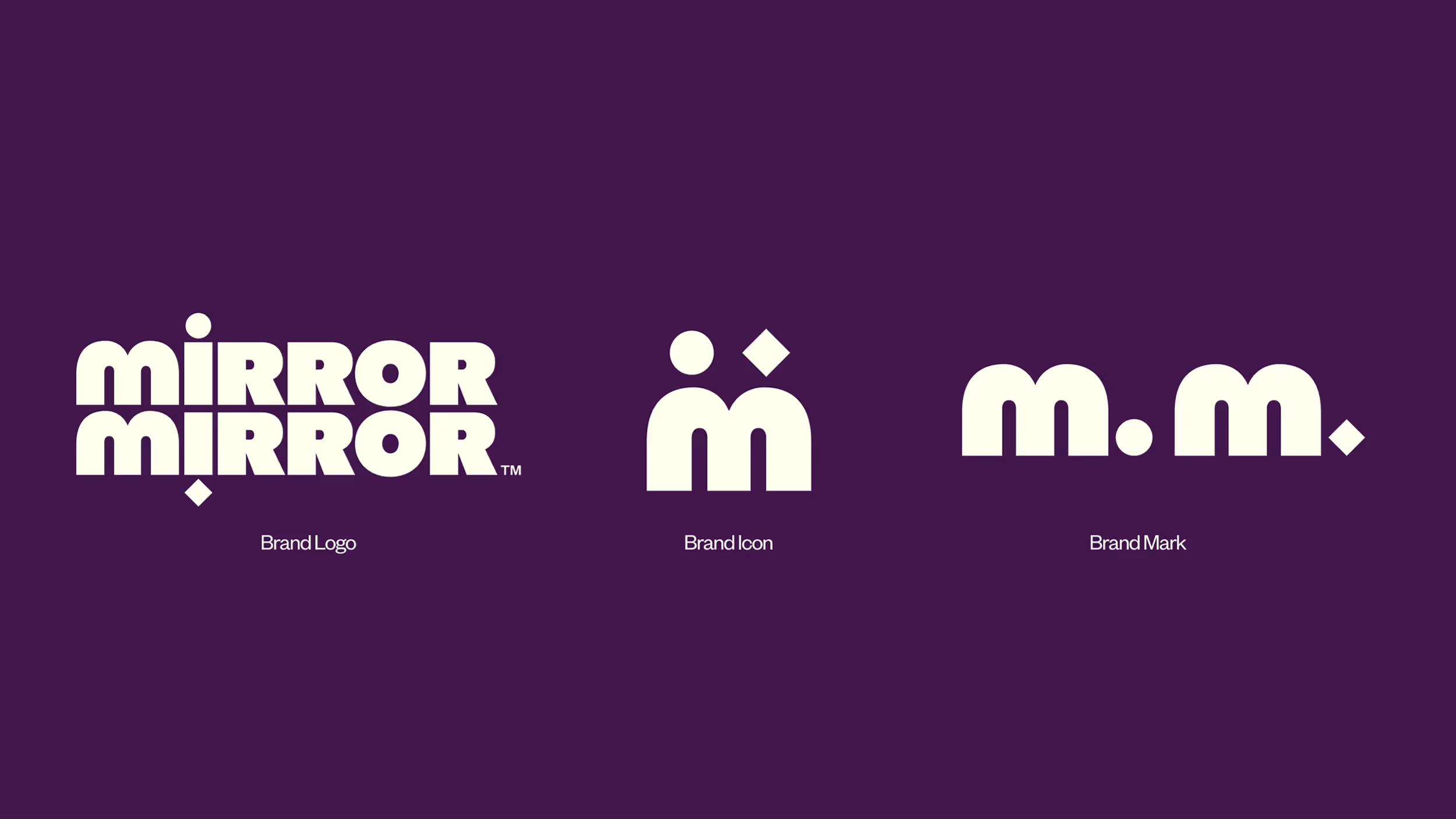
The brand logo is constructed as a custom mark inspired by the name Mirror Mirror, with the reflected ‘i’ directly expressing the idea of reflection. The mirrored letterform represents the connection between two people meeting face to face, reflecting the relationship between the platform’s two core audiences. The circular tittles of the ‘i’ represent clients, while the diamond tittle represents practitioners. This idea is extended into the M monogram, symbolising both audiences coming together through Mirror Mirror’s services.

Connection; Continued
To extend the shape system introduced through the logo, we created a custom version of Quadrant that incorporates a branded semicolon. Pulled from the forms of the logo, the semicolon becomes a distinctive brand-coded motif used across taglines, typography and key moments within the identity.
As a punctuation mark, the semicolon connects two or more ideas within a single sentence. It can also be used to list and organise information, much like a directory. This made it a natural fit for Mirror Mirror, reflecting the brand’s role as a platform for connection while leaving room for conversation, discovery and continuation.
As a punctuation mark, the semicolon connects two or more ideas within a single sentence. It can also be used to list and organise information, much like a directory. This made it a natural fit for Mirror Mirror, reflecting the brand’s role as a platform for connection while leaving room for conversation, discovery and continuation.
Beauty; Verified
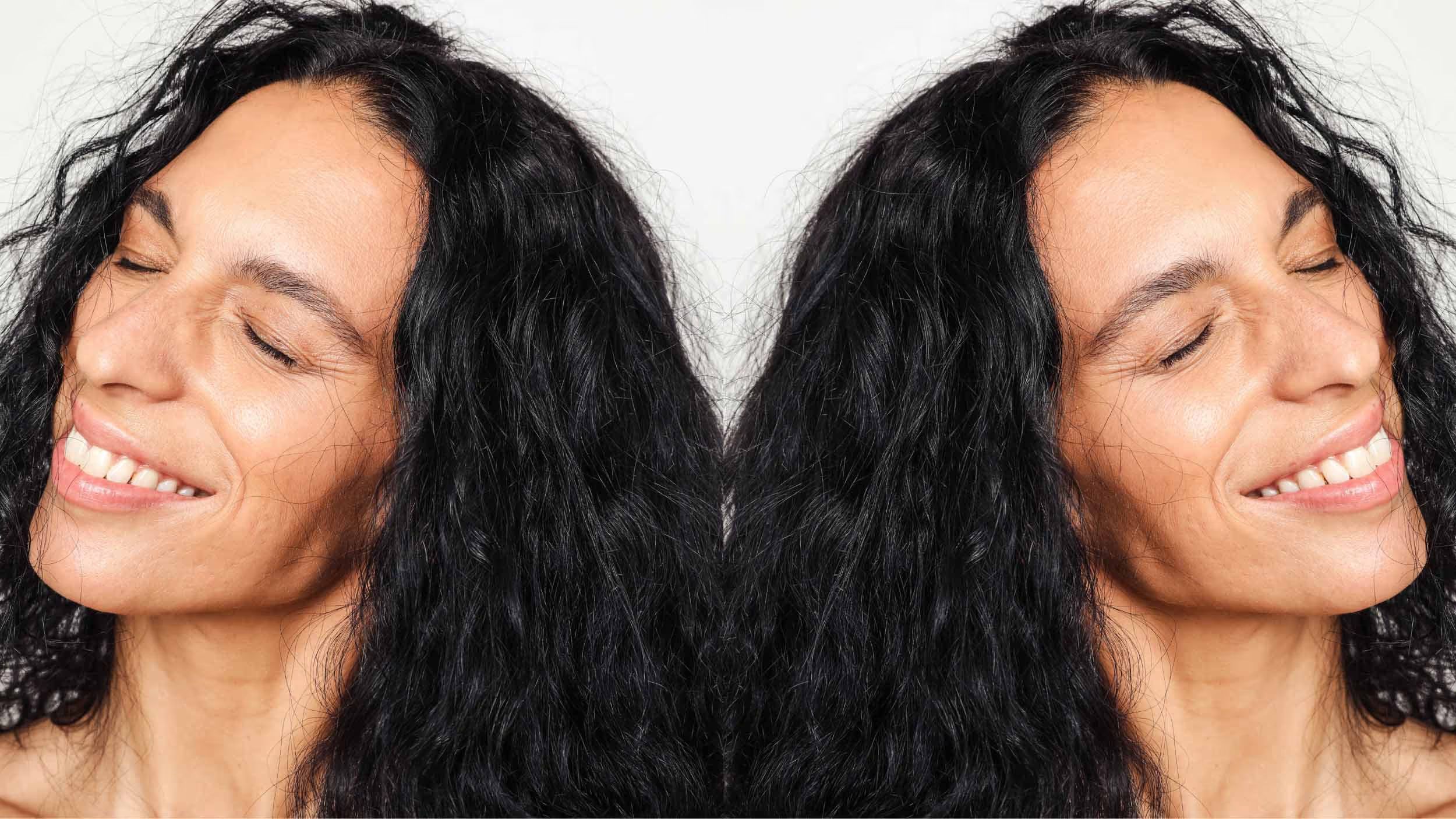
We also used the brand mark as an ownable verification device, helping to build trust and recognition for Mirror Mirror across both digital and physical touchpoints. Applied across practice locations, practitioner profiles and the website, the mark works like a stamp of approval, signalling trust, credibility and official recognition.
Rather than relying on a generic tick symbol, which can feel less distinctive across third-party applications such as clinic websites or social media posts, the brand mark creates a more ownable system. Over time, this gives Mirror Mirror a stronger symbol of legitimacy, helping the brand build recognition and trust within the category.
Rather than relying on a generic tick symbol, which can feel less distinctive across third-party applications such as clinic websites or social media posts, the brand mark creates a more ownable system. Over time, this gives Mirror Mirror a stronger symbol of legitimacy, helping the brand build recognition and trust within the category.


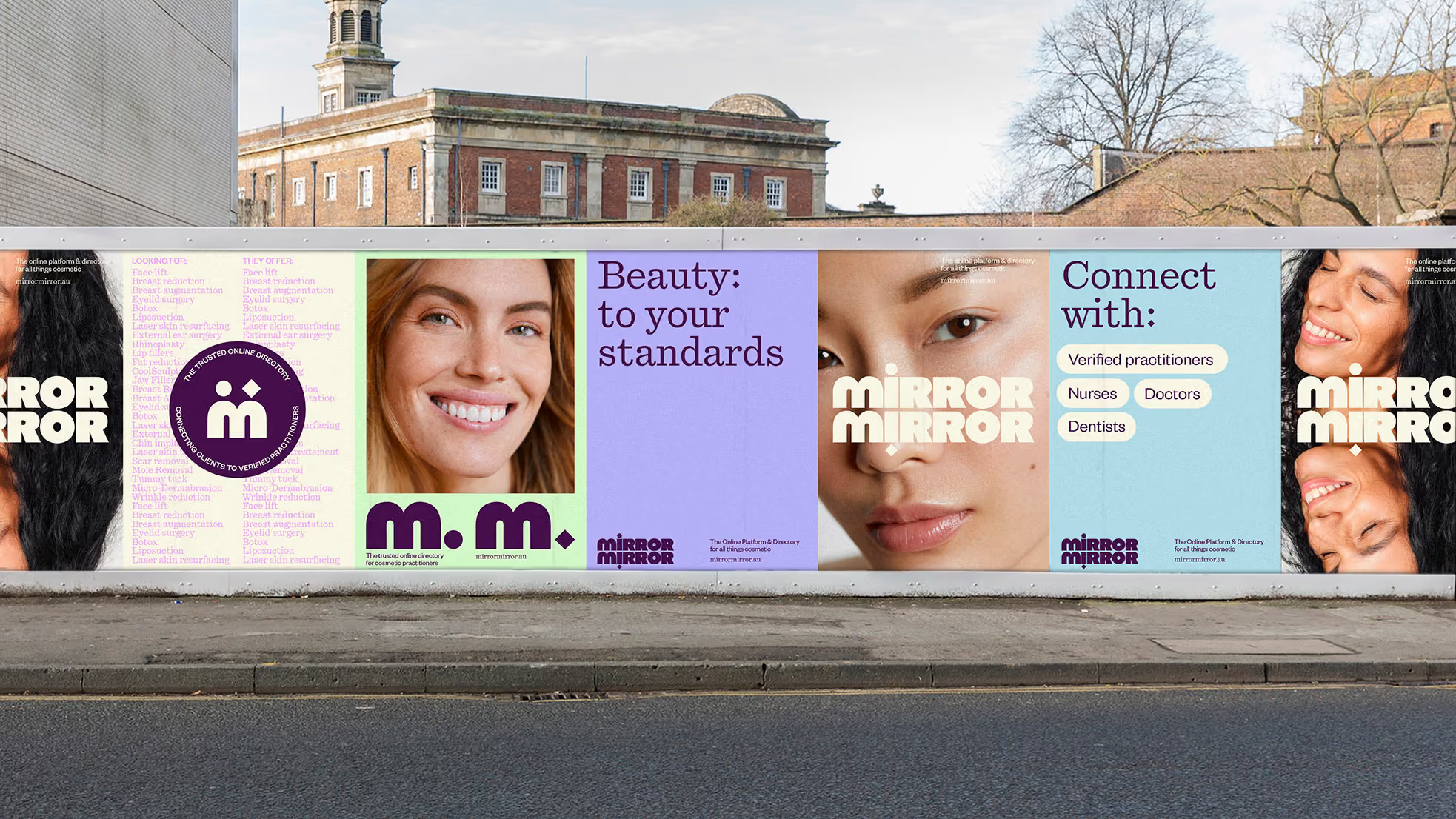

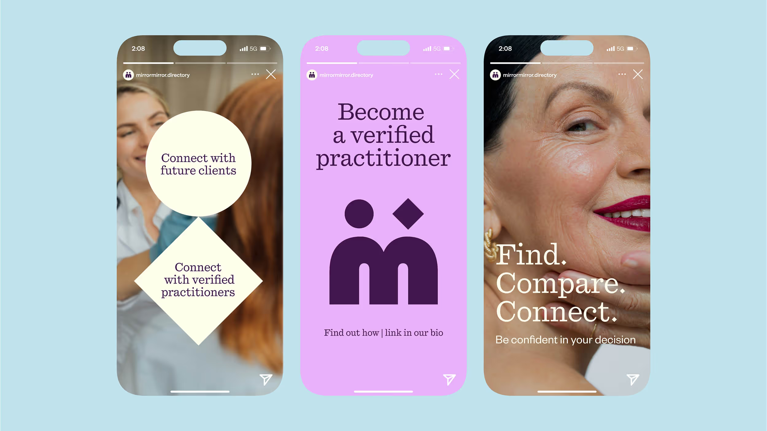
Mirror Mirror creates a brand experience built around trust, connection and clarity. By bringing both practitioners and clients into the centre of the identity, the brand feels professional without becoming clinical, and approachable without losing credibility.
From the reflected logo and custom typography to the branded semicolon and ownable verification mark, each element reinforces the platform’s role as a meeting point. The result is a warm, confident and distinctive identity that helps Mirror Mirror feel like a trusted destination for cosmetic practitioners and clients alike.
From the reflected logo and custom typography to the branded semicolon and ownable verification mark, each element reinforces the platform’s role as a meeting point. The result is a warm, confident and distinctive identity that helps Mirror Mirror feel like a trusted destination for cosmetic practitioners and clients alike.
Credits
Design
Date Of Birth
Typography
Vincent Chan