DotDot
Happy skin starts here
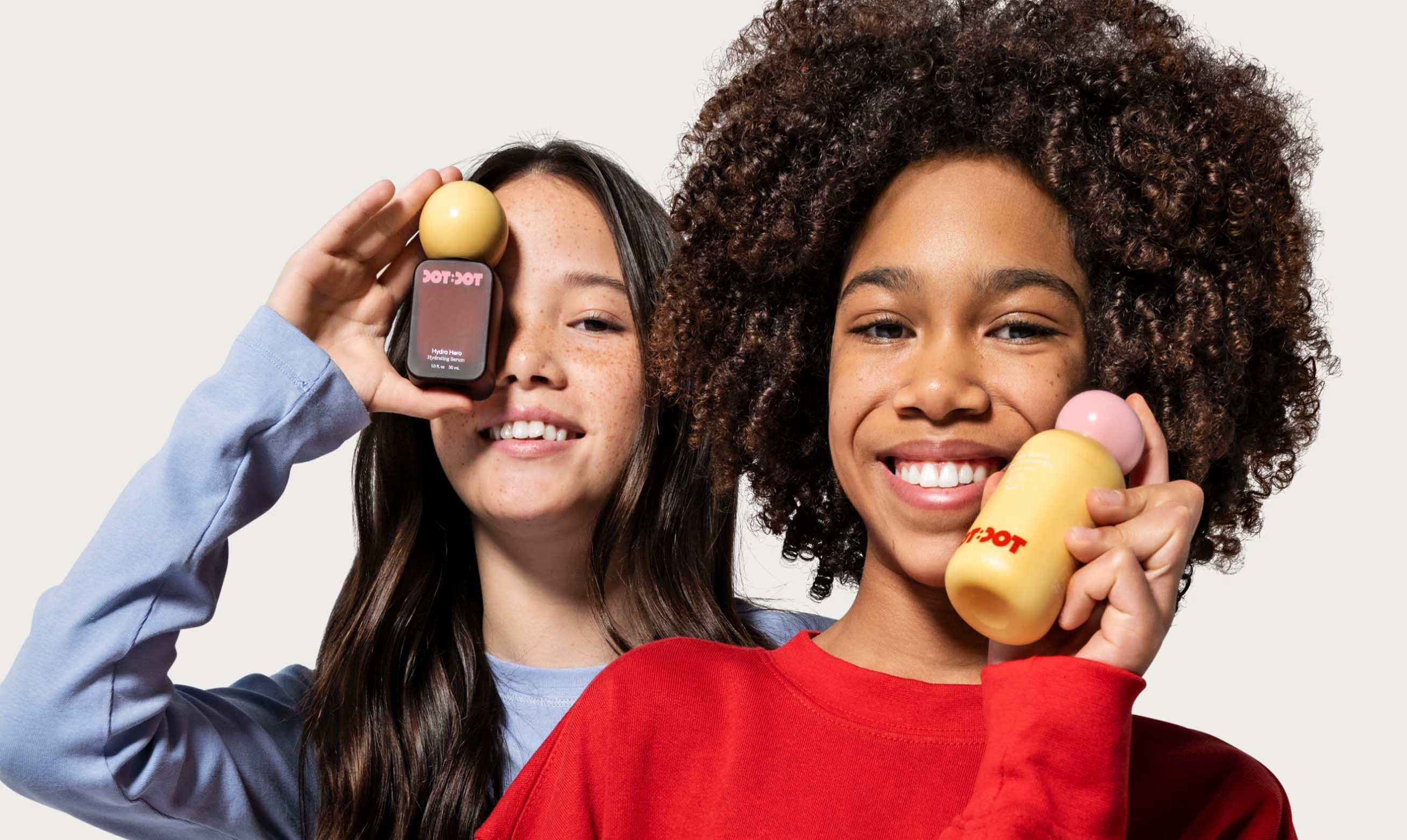
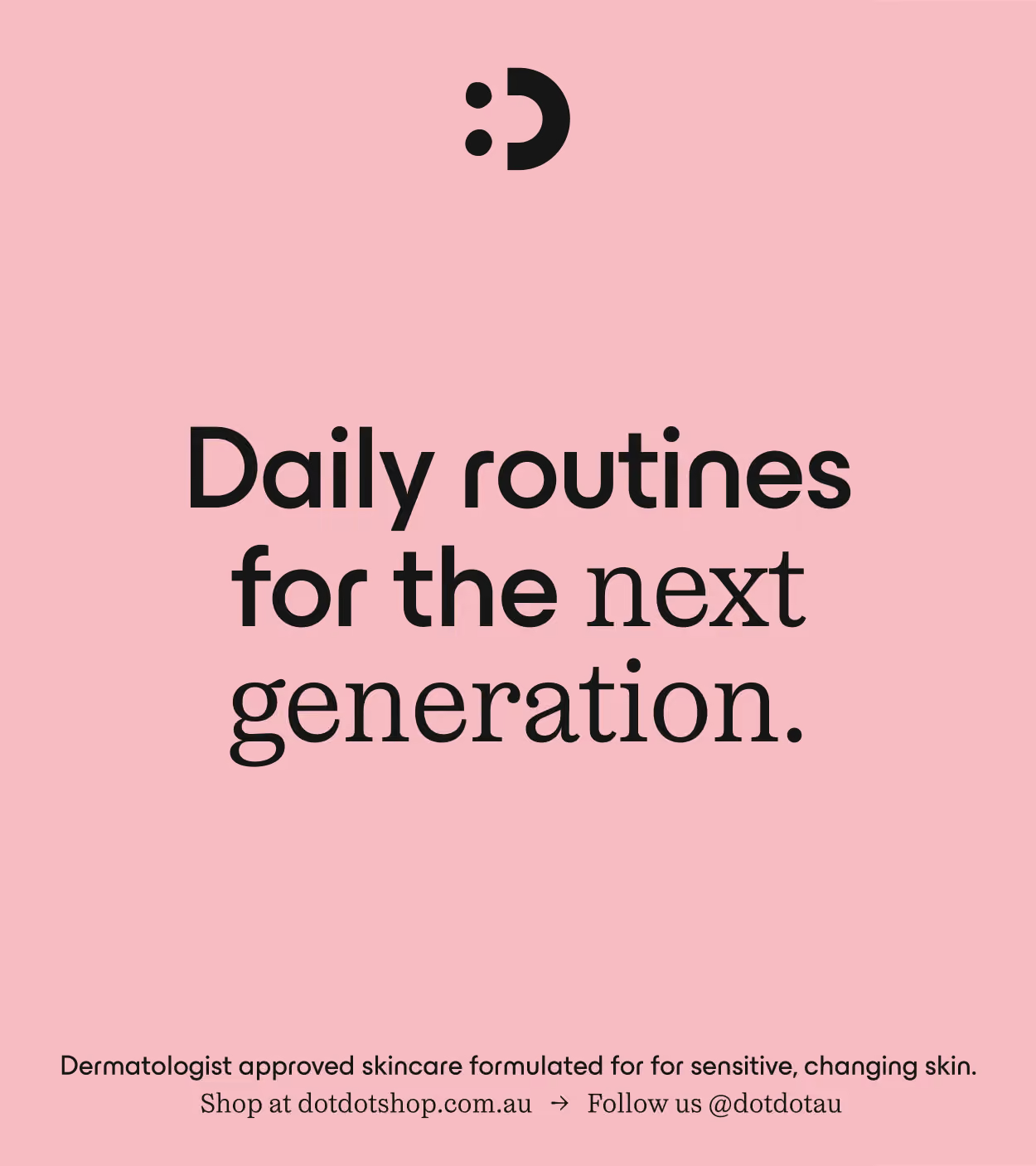
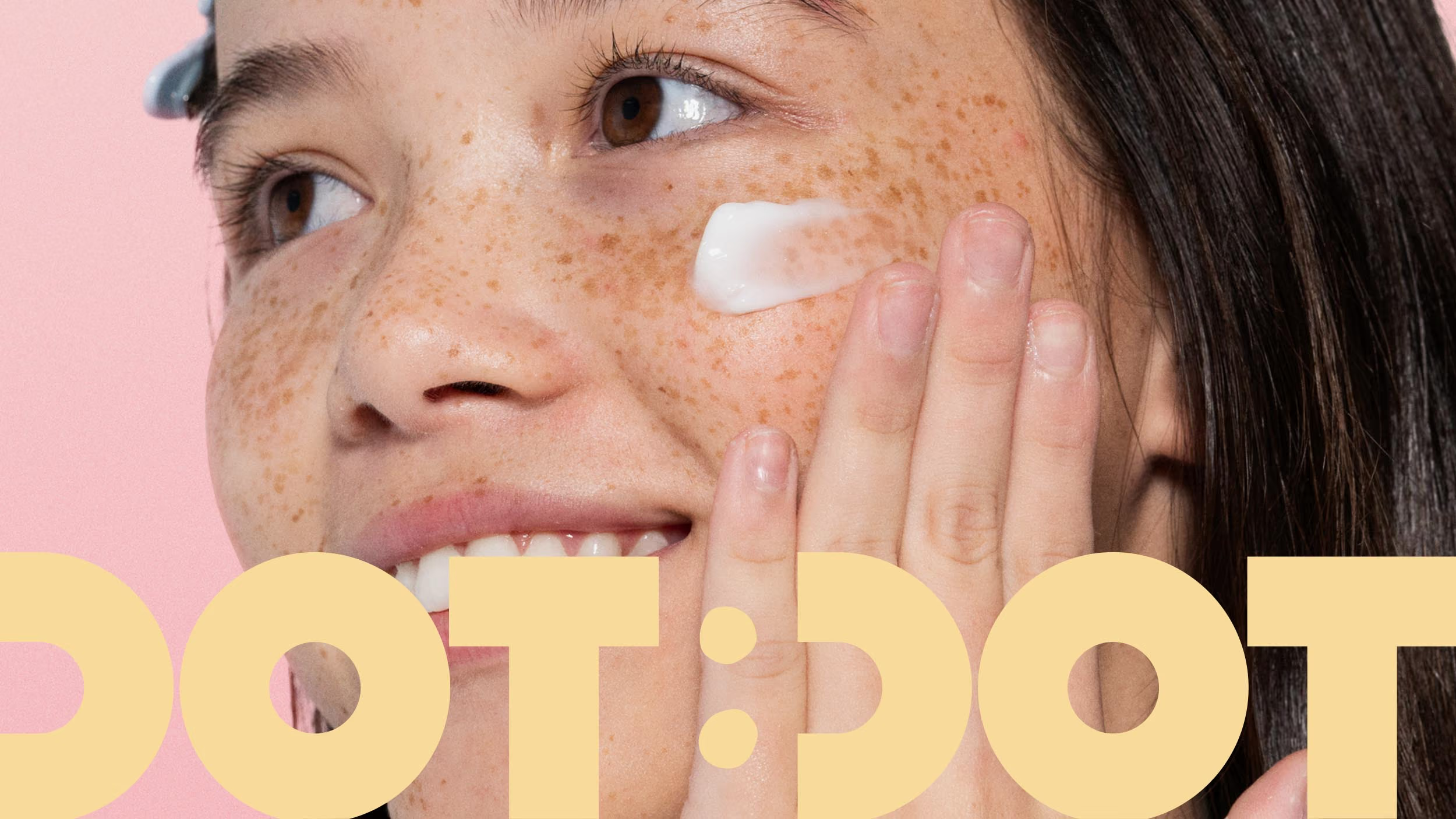
Introducing DotDot. Daily routines for the next generation.
We worked with Jacqui Felgate and the DotDot team to create a skincare brand for tweens built around one simple mission. To make everyday self-care feel simple, fun and easy to integrate into daily routines, now and in the future.
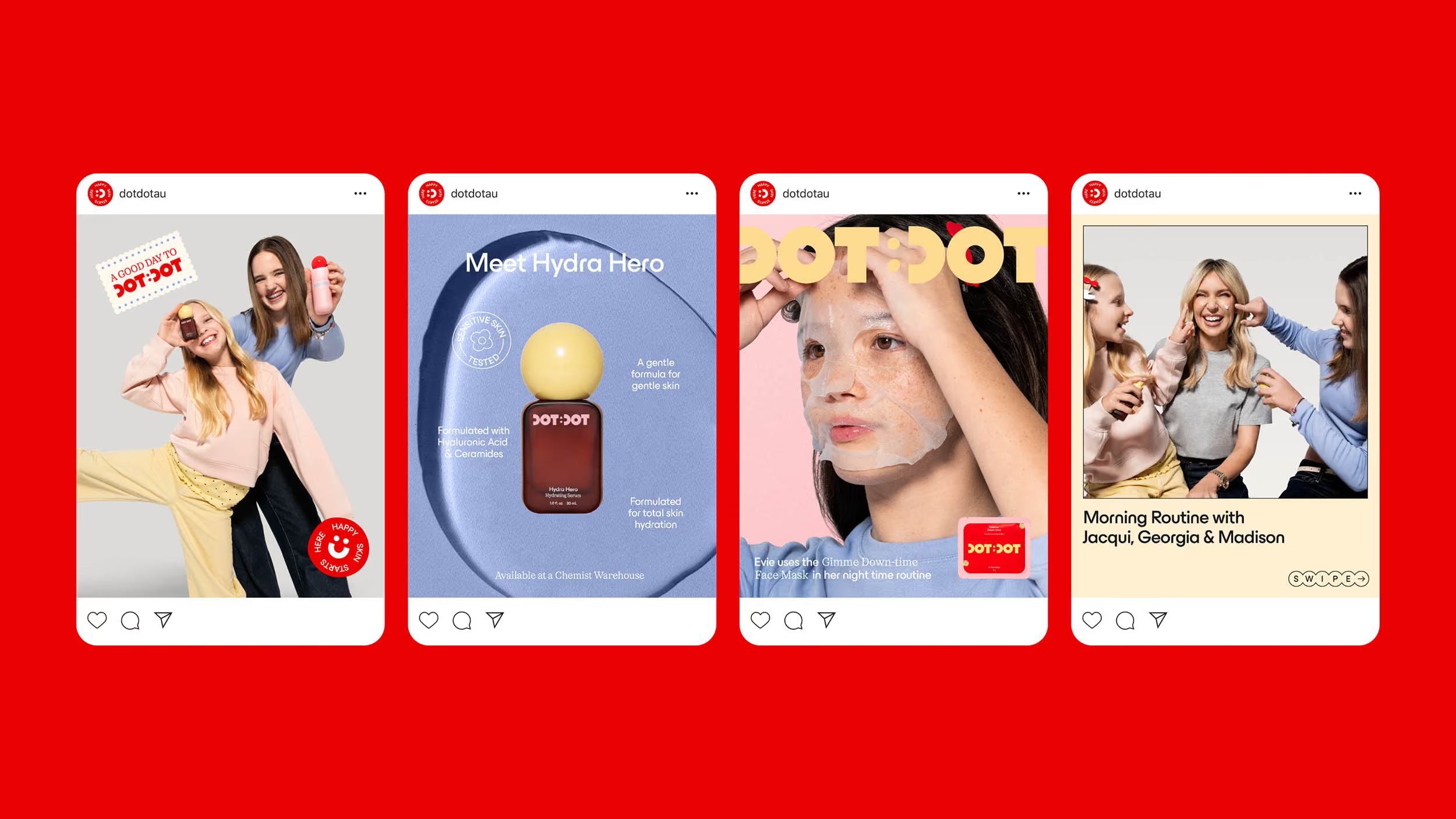
From the identity and packaging to the tone of voice, art direction and the wider brand world, we created a brand world that feels playful without feeling childish, giving tweens something that feels distinctly their own. At the heart of the brand is the idea that small, consistent routines can build healthy habits and confidence over time. This thinking comes to life through the distinctive dot motif, using repetition as a symbol of daily ritual.
Making Every Dot Count.
A bold geometric and custom wordmark that balances playfulness with structure and confidence. The colon detail that ties together the name, serves as a literal visualisation of the name “DotDot”. It also references the familiar language of a digital clock, connecting the identity back to daily routines and making time for self-care.
The organic forms of the dots nod to natural imperfection — a reflection of tweenhood itself and the process of learning and self-discovery. This dot motif anchors the brand identity, creating an ownable brand asset that’s unmistakably DotDot.
The organic forms of the dots nod to natural imperfection — a reflection of tweenhood itself and the process of learning and self-discovery. This dot motif anchors the brand identity, creating an ownable brand asset that’s unmistakably DotDot.
The brand mark is an element taken from the primary logo and slightly modified to work in standalone applications. Derived from the “:D” and “:)” smiley emoticons, it references the digital language tweens are familiar with and highlights the sense of joy and self-expression at the heart of DotDot. Pulling out the smile from the primary logo highlights its intentional form and makes the smiley face an instantly recognisable brand symbol.
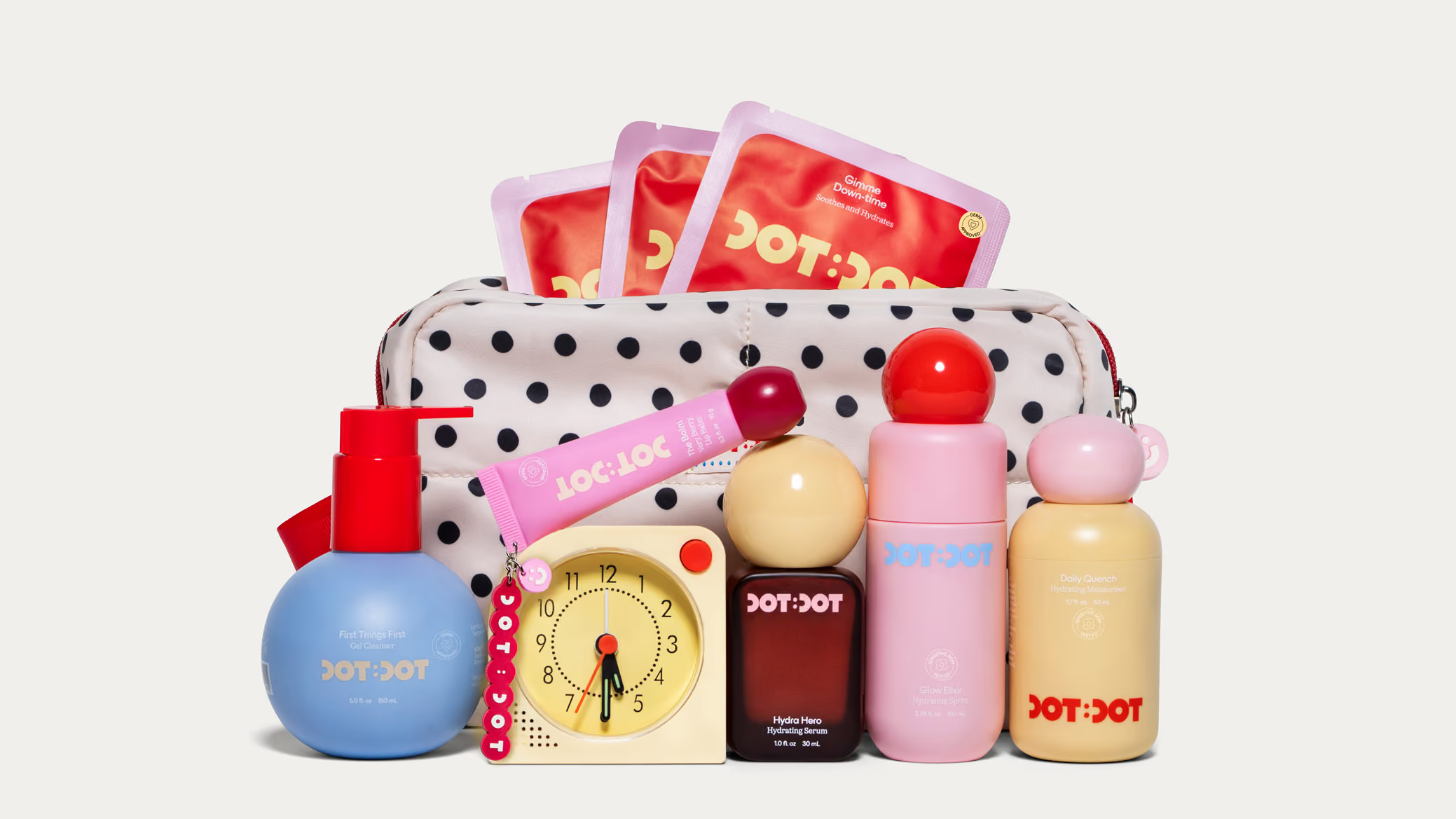
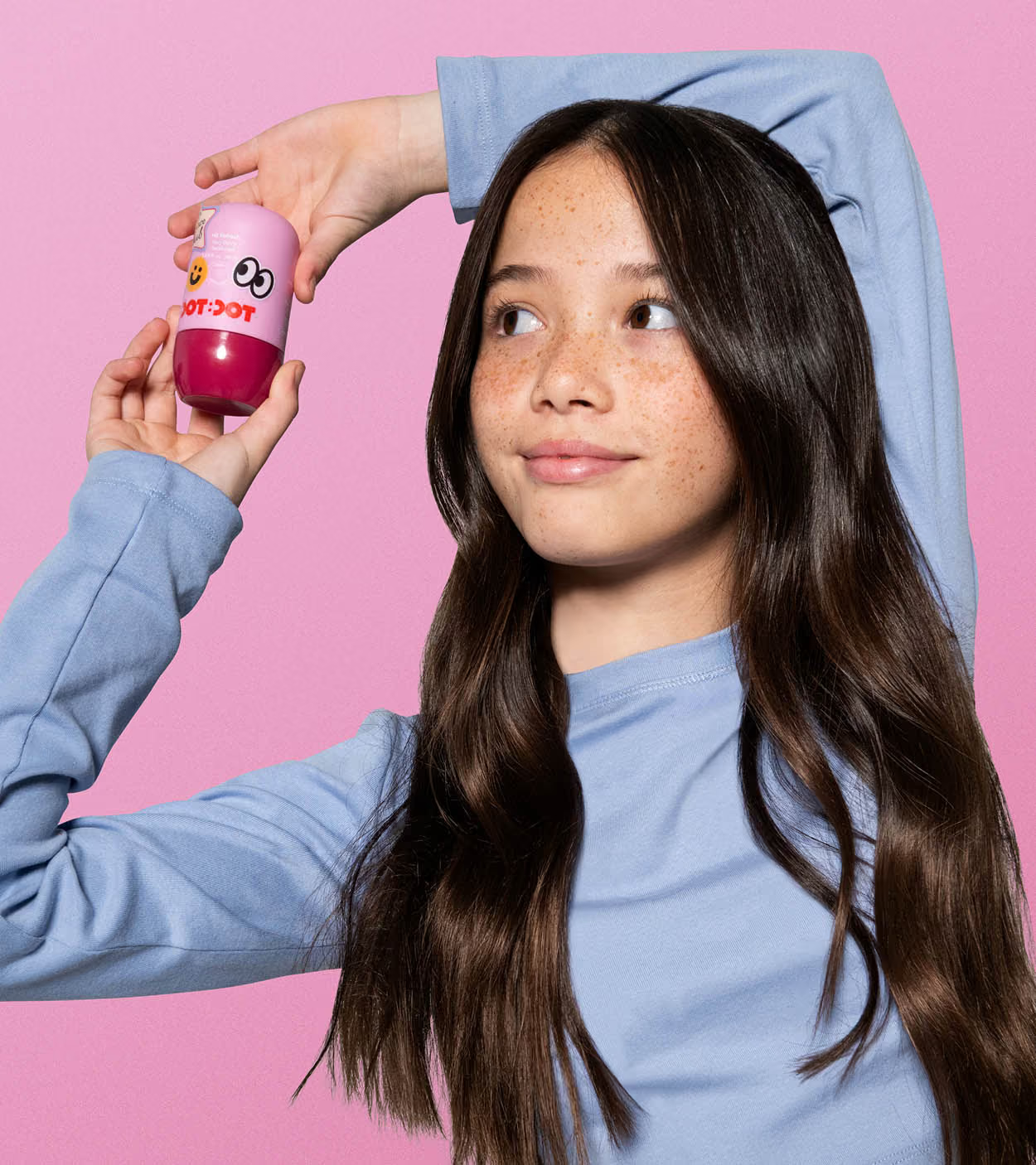
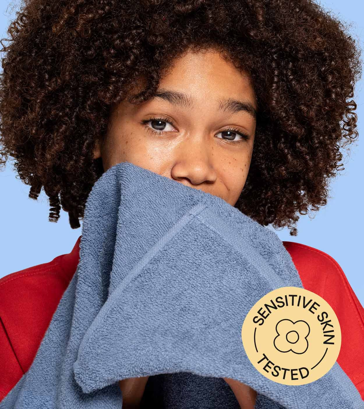
Rethinking what Tween skincare looks like.
Our research found that tweens were often more drawn to the look and sophistication of adult skincare brands than products designed specifically for their age group. The challenge was to capture that same sense of coolness and maturity through visual appeal, while creating a product genuinely made for younger, changing skin.
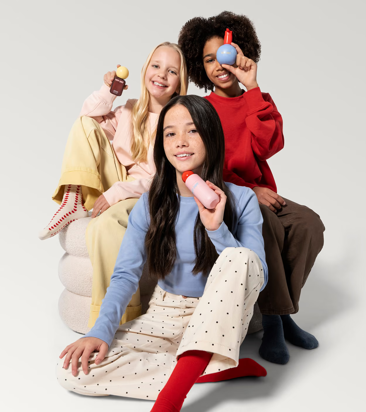
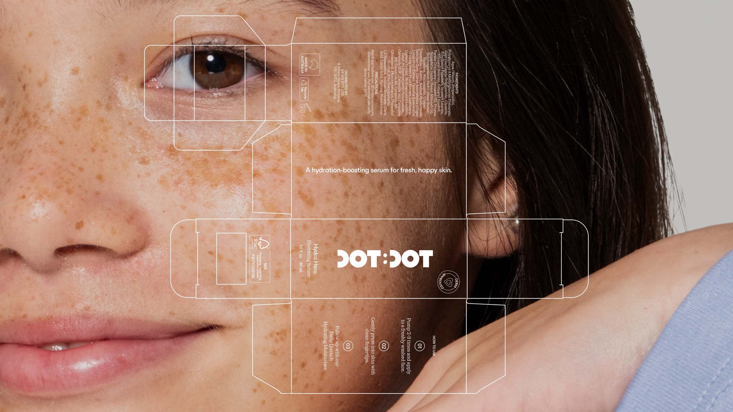
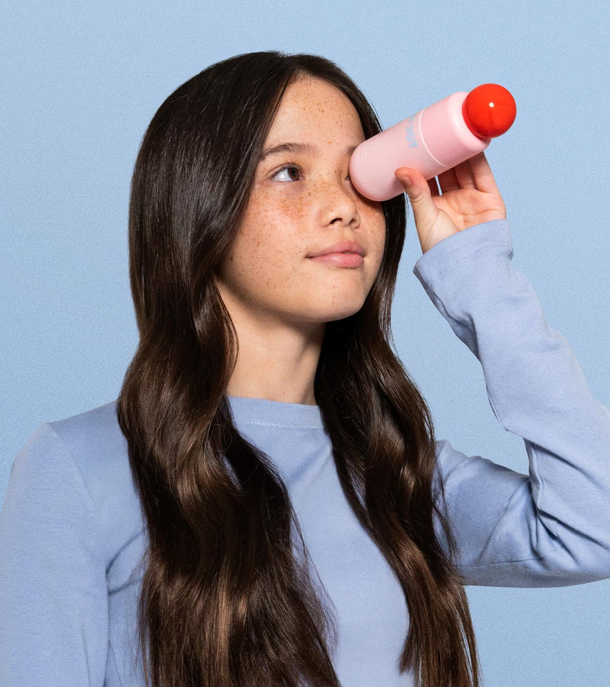
We designed DotDot’s packaging to feel elevated, desirable and grown-up, moving away from the overly youthful cues typical of tween skincare. Bold forms, considered colour and a refined visual system give the range the visual credibility of adult beauty, without losing its playful spirit. The result is skincare tweens can feel proud to own, use and show off.
We designed DotDot’s packaging to feel elevated, desirable and grown-up, moving away from the overly youthful cues typical of tween skincare. Bold forms, considered colour and a refined visual system give the range the visual credibility of adult beauty, without losing its playful spirit. The result is skincare tweens can feel proud to own, use and show off.
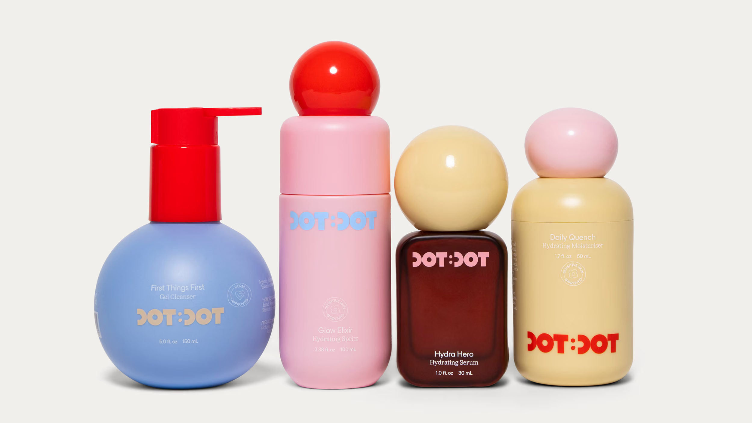
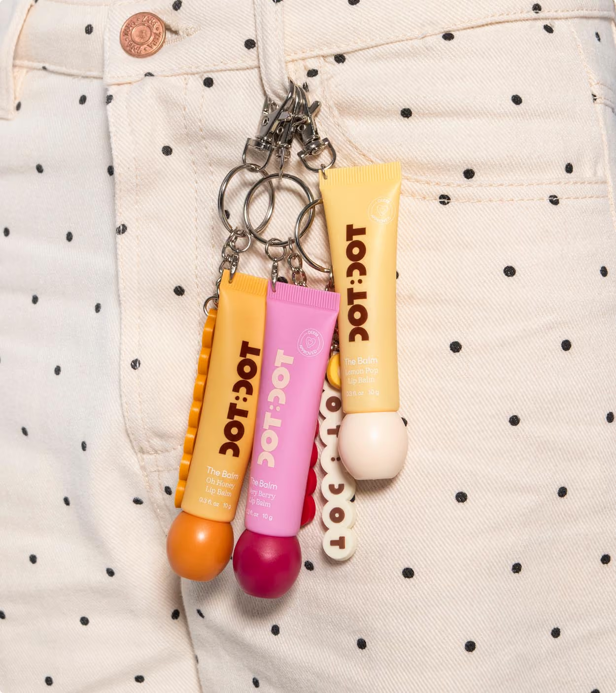
Tween sized packaging for tween sized hands...
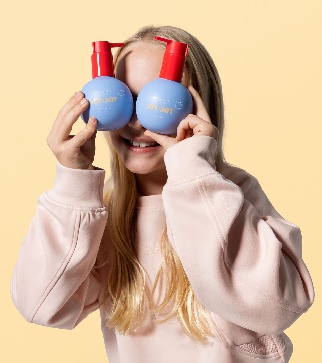
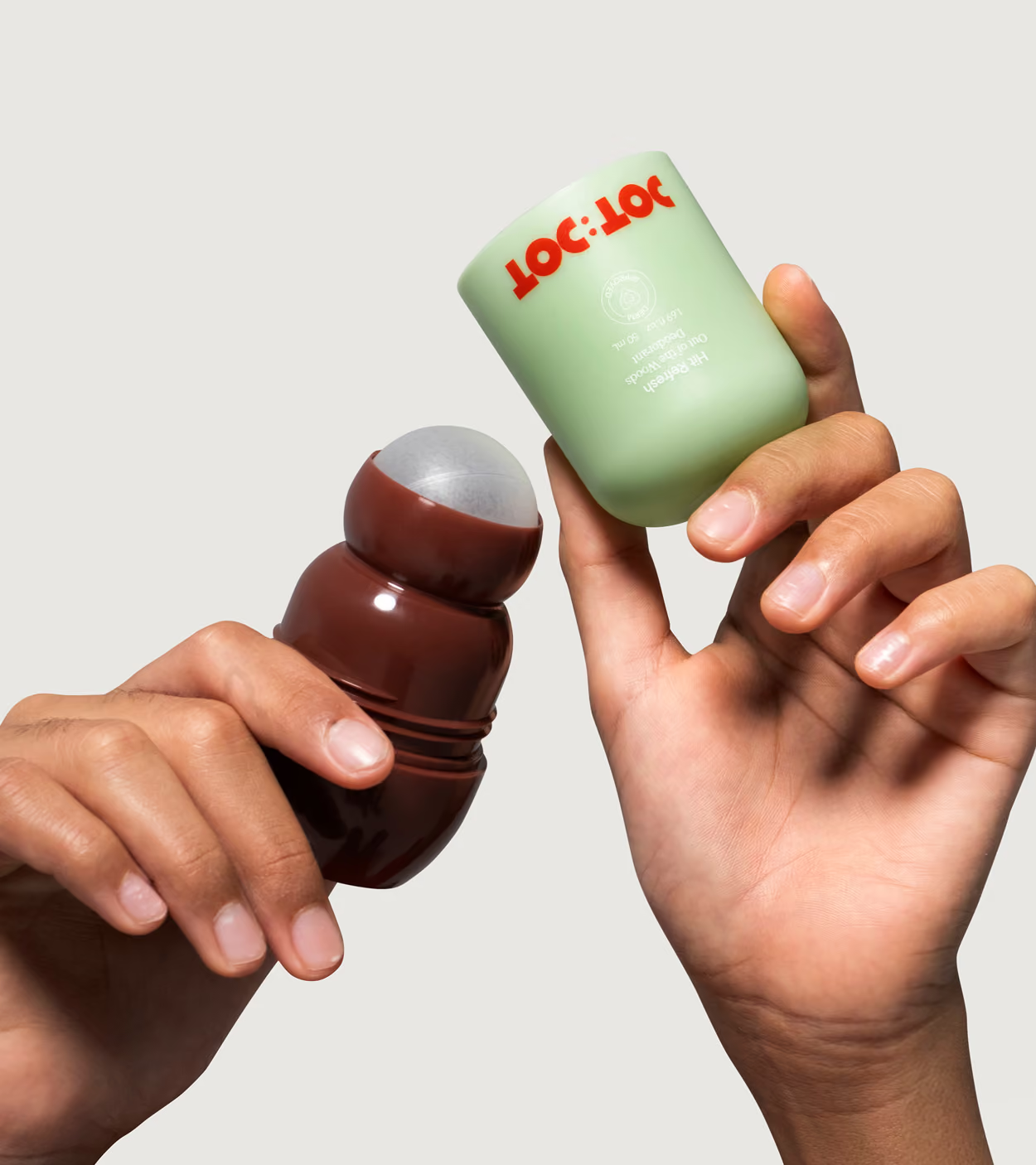
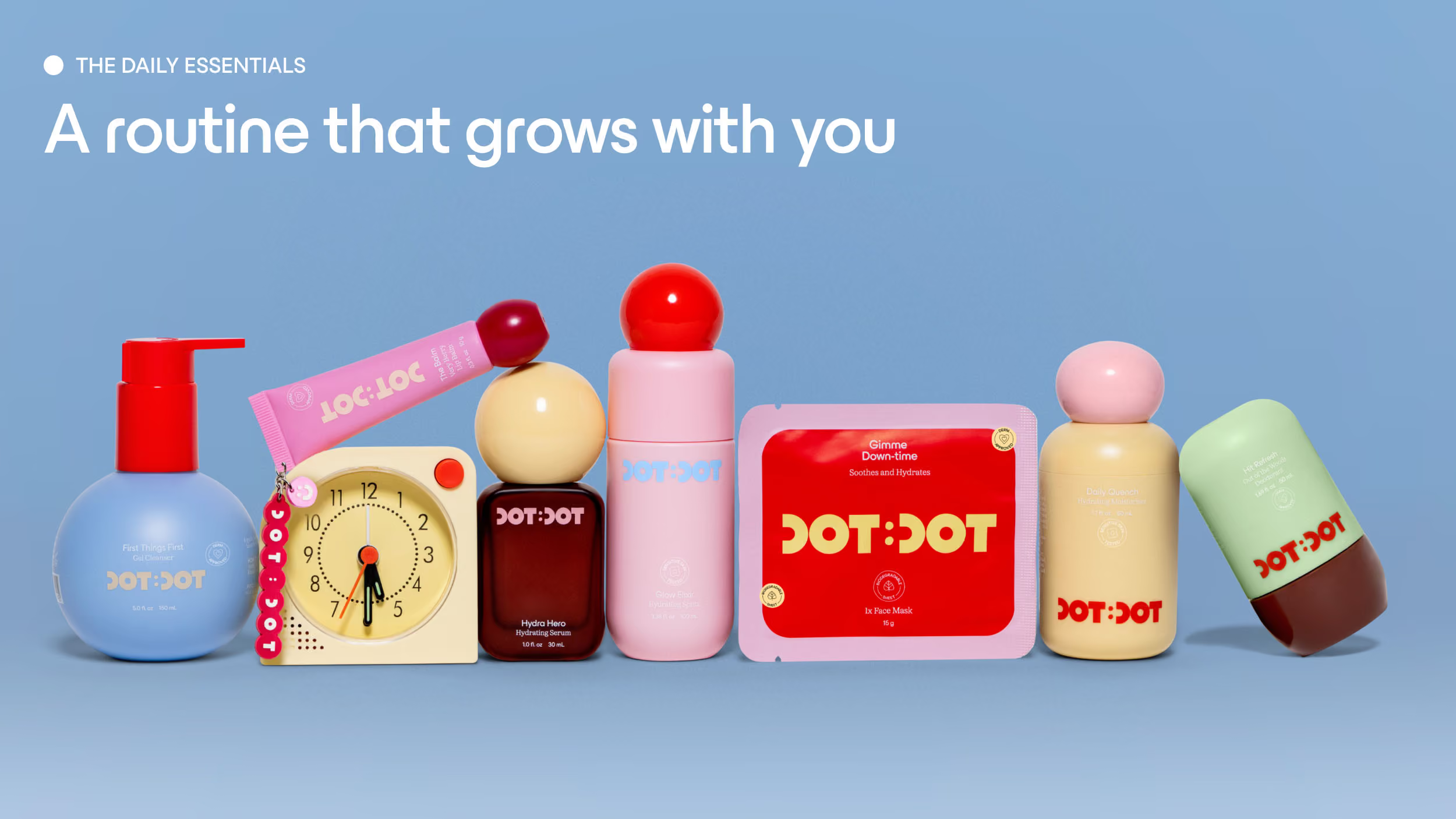
The packaging forms throughout the entire range is carefully curated with smaller hands in mind; with shapes that feel intuitive, comfortable and easy to hold, while still delivering the visual impact on shelf.
Its bold sculptural forms and shape variances between each product help with immediate recognisability and product distinction. Expressive colour blocking and other playful details in packaging give each product its own personality, while a consistent design system brings the range together.
Its bold sculptural forms and shape variances between each product help with immediate recognisability and product distinction. Expressive colour blocking and other playful details in packaging give each product its own personality, while a consistent design system brings the range together.

The Dot Dot com
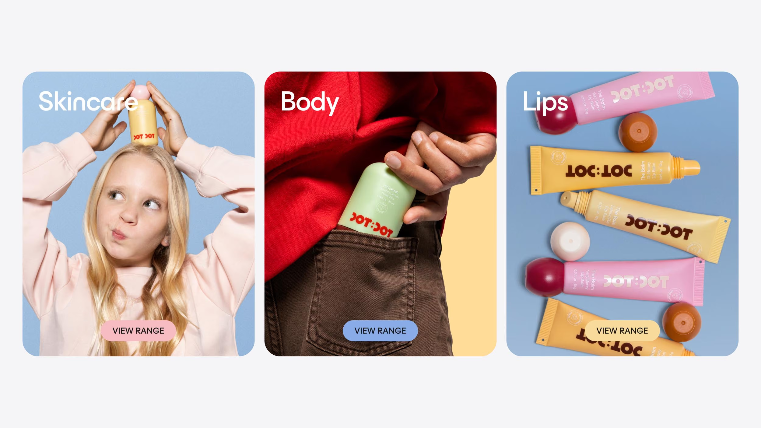
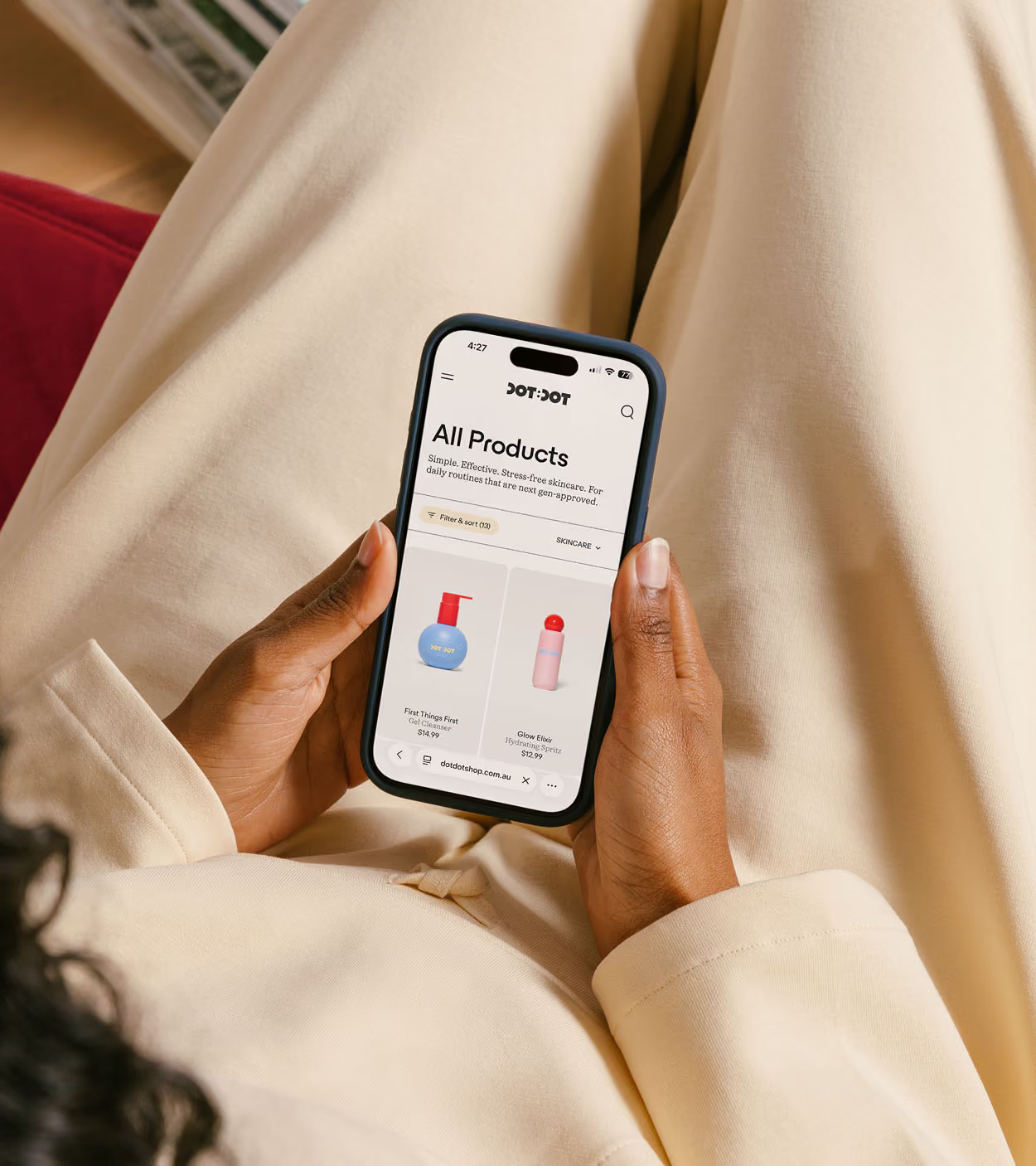
We extended DotDot’s identity into a digital experience that feels as expressive, intuitive and approachable as the brand itself. The website balances playful interactions with a clear, easy-to-navigate structure, helping younger audiences explore the range while giving parents simple access to product, formula and brand information.
The goal was to build a digital home that feels engaging without becoming overstimulating, translating DotDot’s world into an experience designed for both discovery and trust.
The goal was to build a digital home that feels engaging without becoming overstimulating, translating DotDot’s world into an experience designed for both discovery and trust.
Credits
Design
Date Of Birth
Photography
Chris Nardo, Nick Harding