Chemist Warehouse
Chemist Warehouse Optometry, originally known as Optometrist Warehouse, is an expanding arm of Chemist Warehouse, offering comprehensive eye testing, care and an extensive range of frames and lenses at affordable prices. The challenge was that the stores lacked a distinctive look and feel, often creating confusion with Chemist Warehouse and leaving the experience feeling less trusted, less ownable and at times mistaken for a store trying to imitate the parent brand.
The identity was developed to give Chemist Warehouse Optometry a more refined and ownable presence, while still leveraging the strength and recognition of the Chemist Warehouse name. Centred around a clear sub-brand architecture, the system keeps the Chemist Warehouse equity intact while creating a distinct brand world that communicates deep testing expertise, approachable pricing and a broader purpose of caring for the eyes of the nation.
The mark also needed to perform at smaller sizes across co-branded applications. This allowed independent practices to be endorsed by Chemist Warehouse Optometry, while still giving optometrists the autonomy to prioritise clinical investment, local relevance and their own practice identity.
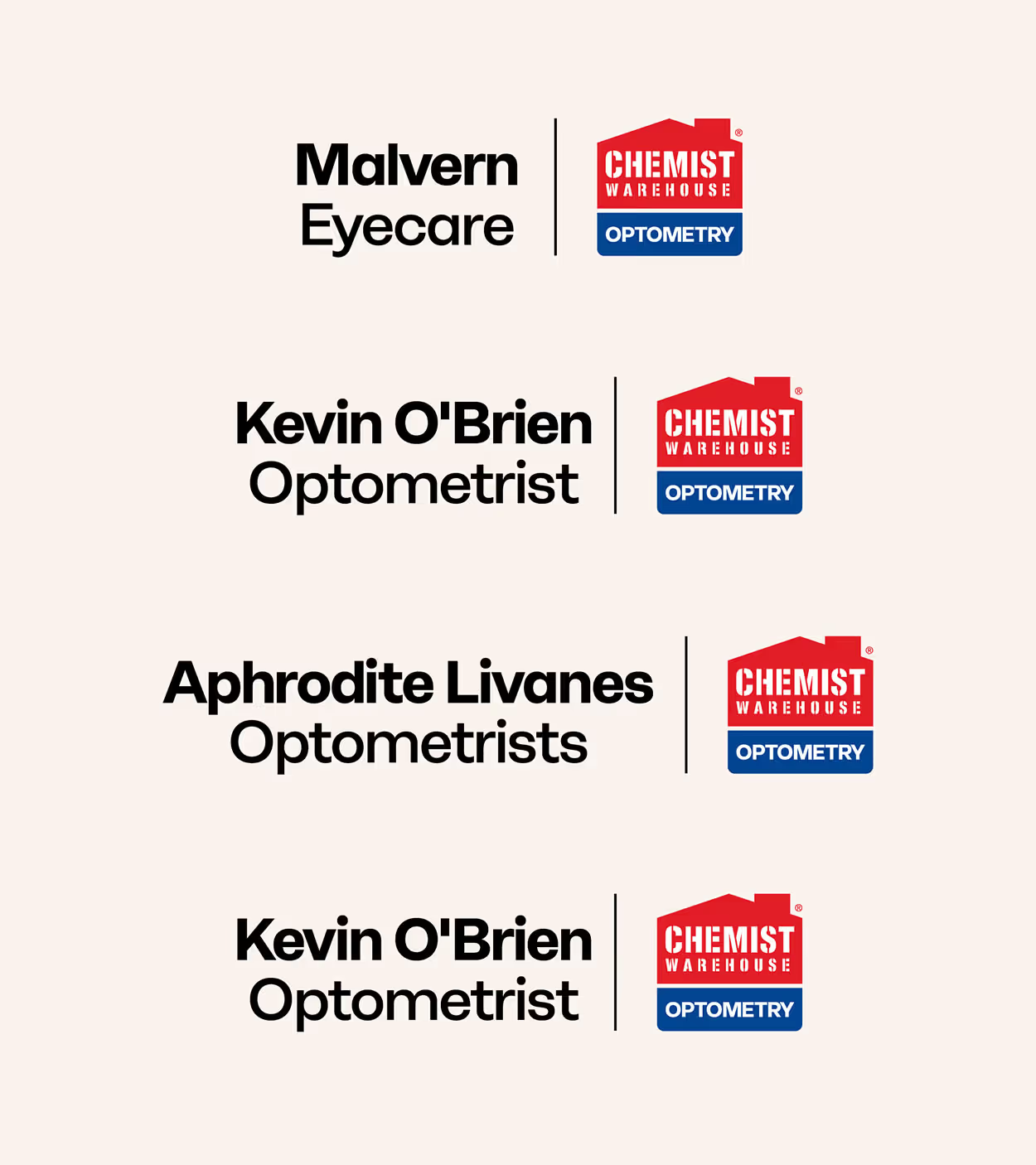

The type system is clear, accessible and easy to read, supported by a serif typeface that brings a sense of trust, care and sophistication. Together, these elements create a distinctive identity for Chemist Warehouse Optometry, while clearly separating it from the Chemist Warehouse master brand.
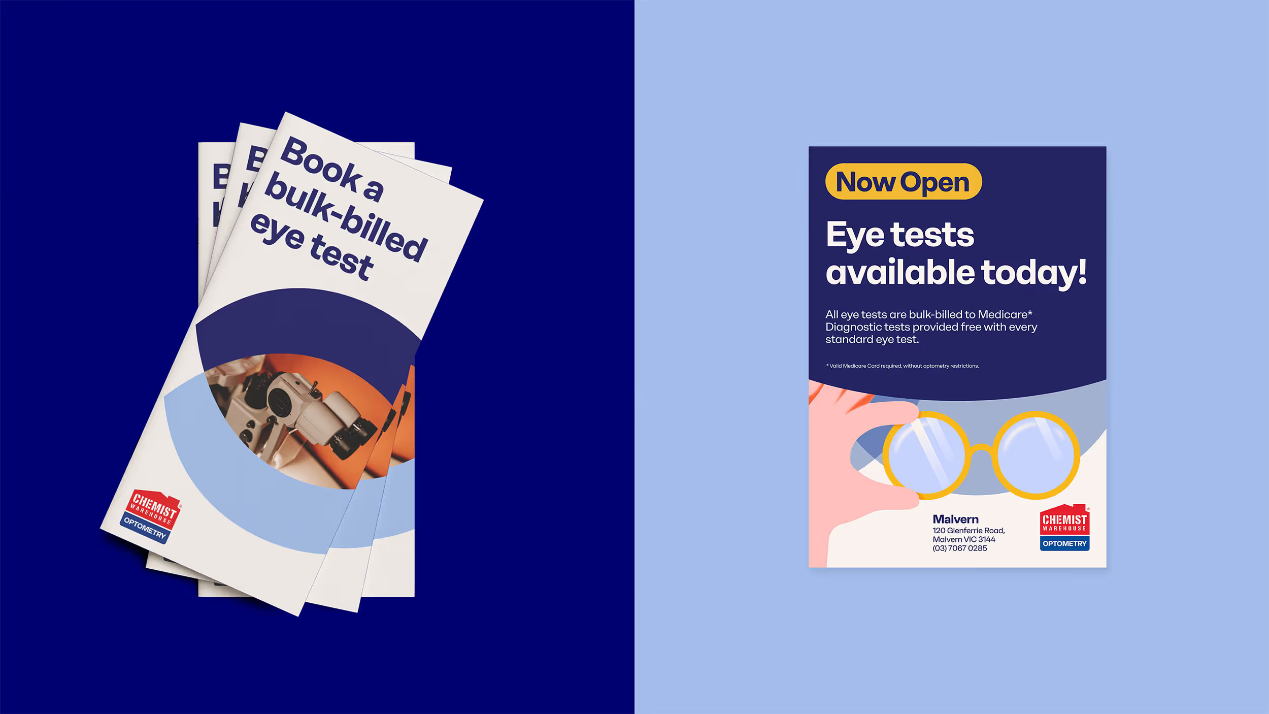
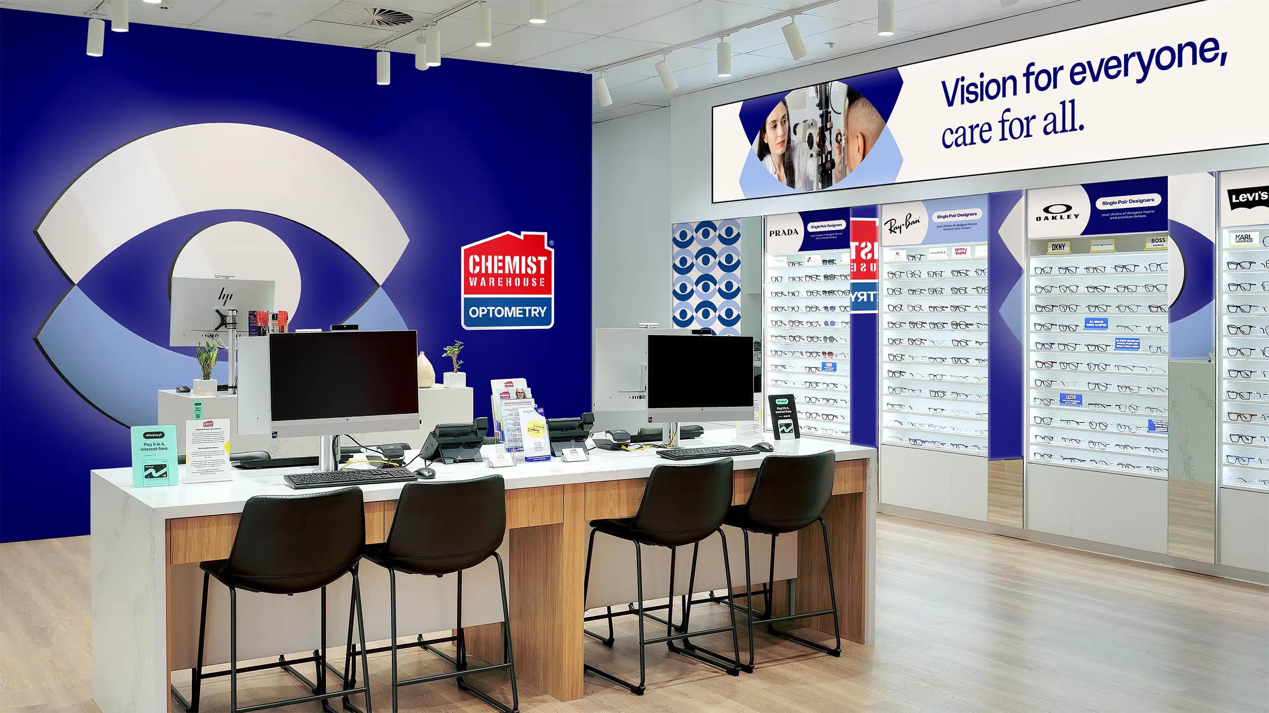
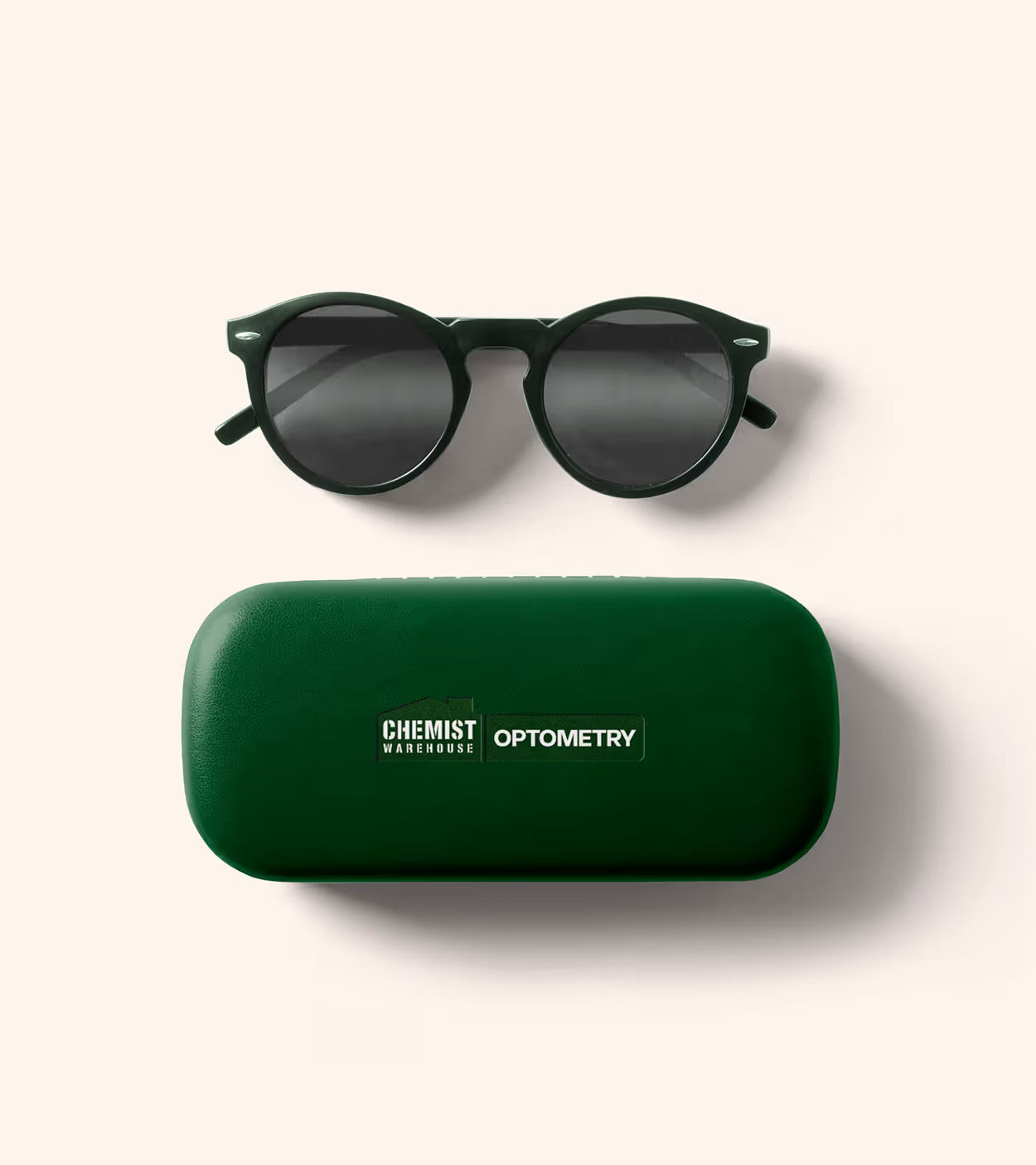


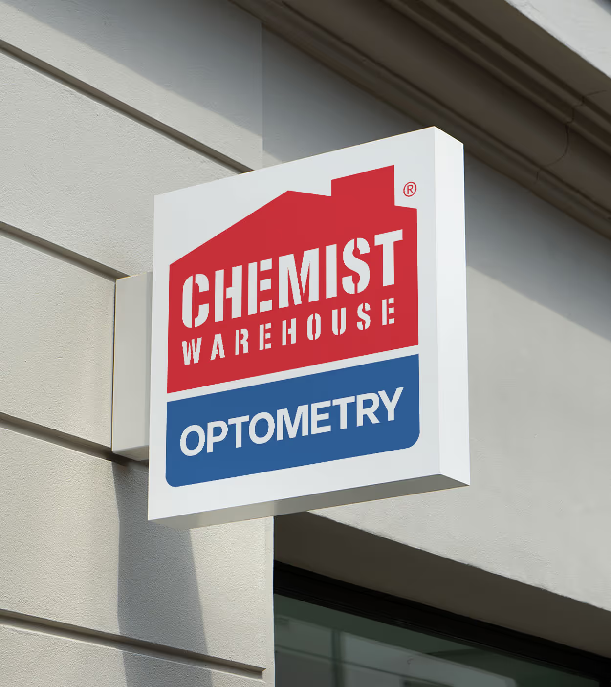

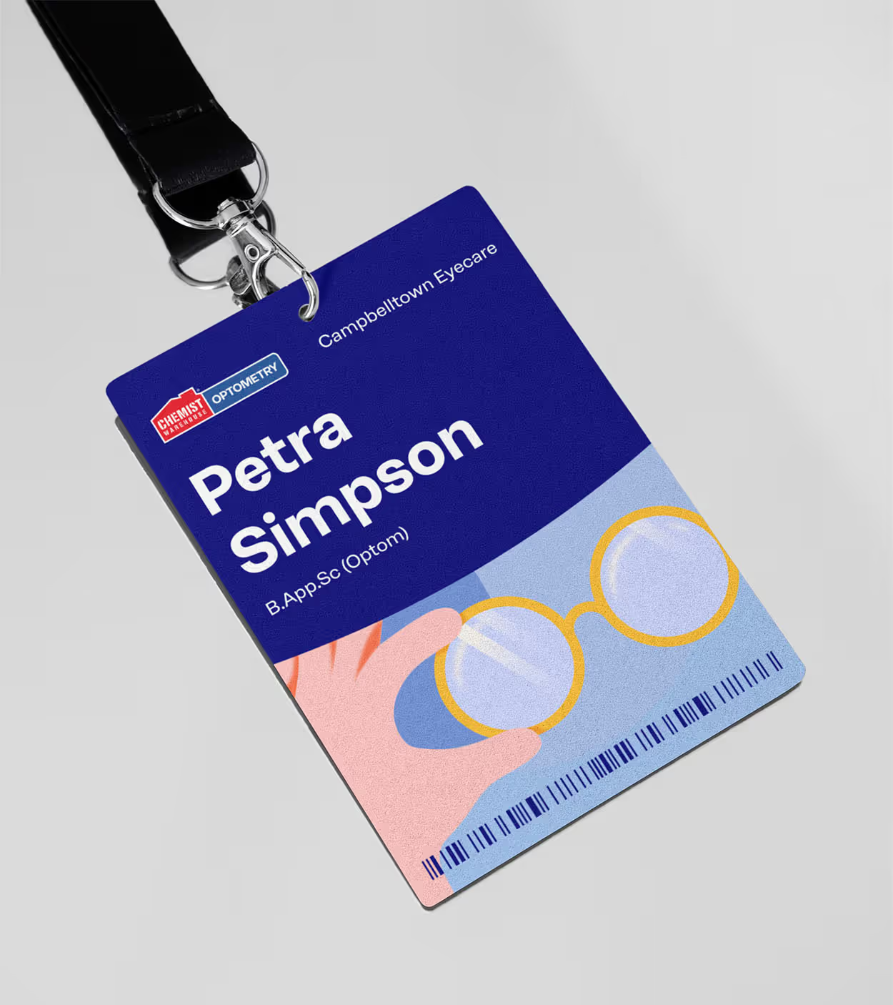
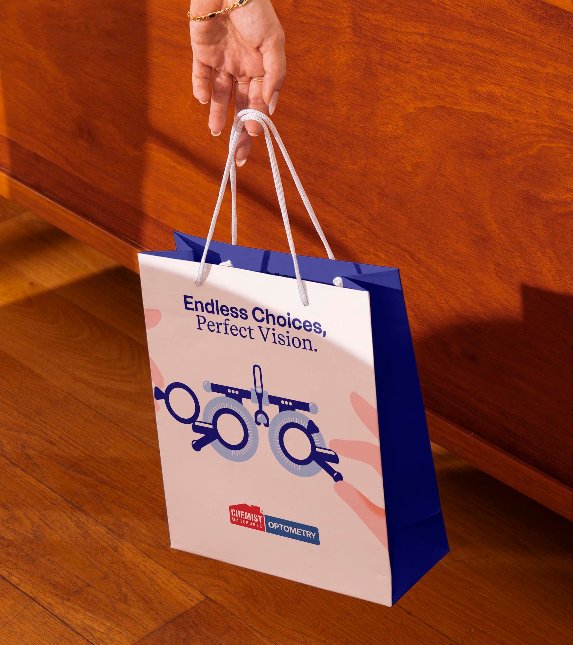

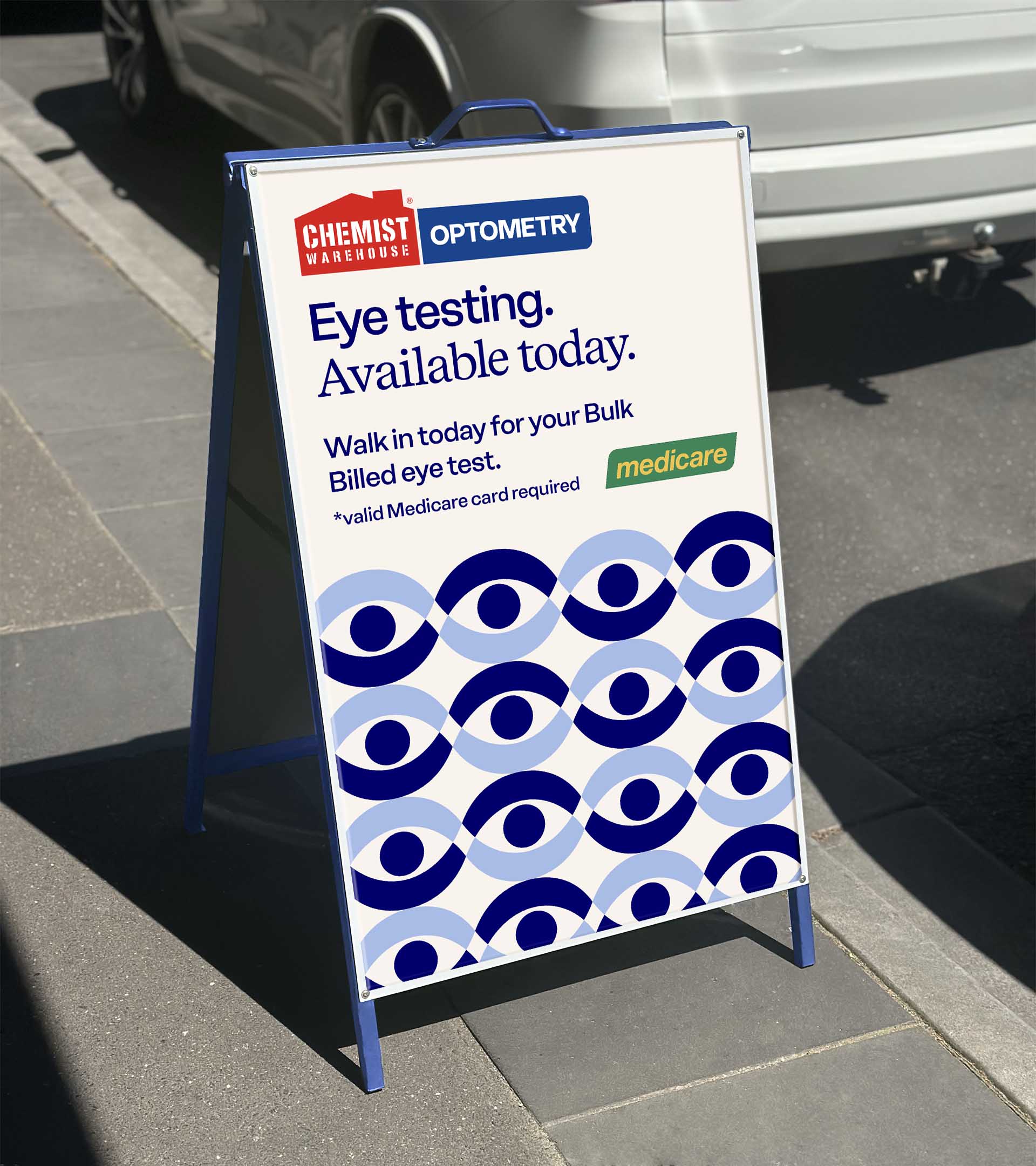

By balancing professional eye care cues with the familiarity of Chemist Warehouse, the identity helps communicate the breadth of its testing capabilities, build trust with customers and position Chemist Warehouse Optometry as a credible, everyday destination for affordable vision care.